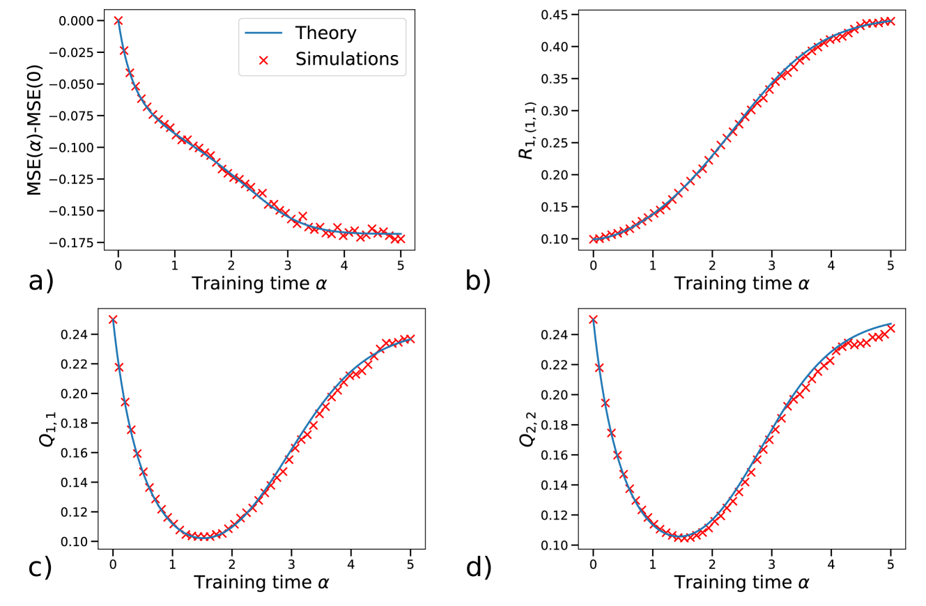
## Multi-Panel Line Chart: Theory vs. Simulations Over Training Time
### Overview
The image displays a 2x2 grid of four line charts, labeled a), b), c), and d). Each chart compares a theoretical prediction (solid blue line) against simulation results (red 'x' markers) for a different metric plotted against a common x-axis, "Training time α". The overall purpose is to validate a theoretical model by showing its close agreement with empirical simulation data across multiple quantities.
### Components/Axes
* **Common X-Axis (All Plots):** Label: "Training time α". Scale: Linear, ranging from 0 to 5, with major ticks at integer intervals (0, 1, 2, 3, 4, 5).
* **Legend (Located in top-left of plot a):**
* Blue Line: "Theory"
* Red 'x' Marker: "Simulations"
* **Plot a) (Top-Left):**
* **Y-Axis Label:** "MSE(α)-MSE(0)"
* **Y-Axis Scale:** Linear, ranging from approximately -0.175 to 0.000.
* **Plot b) (Top-Right):**
* **Y-Axis Label:** "R_{1,(1,1)}"
* **Y-Axis Scale:** Linear, ranging from 0.10 to 0.45.
* **Plot c) (Bottom-Left):**
* **Y-Axis Label:** "Q_{1,1}"
* **Y-Axis Scale:** Linear, ranging from 0.10 to 0.24.
* **Plot d) (Bottom-Right):**
* **Y-Axis Label:** "Q_{2,2}"
* **Y-Axis Scale:** Linear, ranging from 0.10 to 0.24.
### Detailed Analysis
**Trend Verification & Data Points:**
* **Plot a) MSE(α)-MSE(0):**
* **Trend:** The curve slopes downward monotonically, starting at 0 and decreasing at a decelerating rate.
* **Data Points (Approximate):**
* α=0: y=0.000
* α=1: y≈ -0.090
* α=2: y≈ -0.130
* α=3: y≈ -0.160
* α=4: y≈ -0.170
* α=5: y≈ -0.175
* **Agreement:** Simulation markers (red 'x') lie almost perfectly on the theoretical blue line throughout.
* **Plot b) R_{1,(1,1)}:**
* **Trend:** The curve slopes upward in a sigmoidal (S-shaped) fashion, starting slowly, accelerating in the middle, and then leveling off.
* **Data Points (Approximate):**
* α=0: y≈ 0.10
* α=1: y≈ 0.12
* α=2: y≈ 0.22
* α=3: y≈ 0.35
* α=4: y≈ 0.42
* α=5: y≈ 0.44
* **Agreement:** Excellent match between simulations and theory across the entire range.
* **Plot c) Q_{1,1}:**
* **Trend:** The curve is U-shaped (convex). It decreases to a minimum and then increases.
* **Data Points (Approximate):**
* α=0: y≈ 0.25
* α=1: y≈ 0.11 (near minimum)
* α=2: y≈ 0.12
* α=3: y≈ 0.18
* α=4: y≈ 0.22
* α=5: y≈ 0.24
* **Agreement:** Very strong alignment. The simulation points trace the theoretical curve precisely, including the minimum around α≈1.5.
* **Plot d) Q_{2,2}:**
* **Trend:** Nearly identical U-shaped (convex) trend to plot c).
* **Data Points (Approximate):**
* α=0: y≈ 0.25
* α=1: y≈ 0.11 (near minimum)
* α=2: y≈ 0.12
* α=3: y≈ 0.18
* α=4: y≈ 0.22
* α=5: y≈ 0.24
* **Agreement:** Again, near-perfect correspondence between the red simulation markers and the blue theoretical line.
### Key Observations
1. **High-Fidelity Validation:** The most striking observation is the exceptional agreement between the theoretical model (blue line) and the simulation results (red 'x's) across all four metrics and the entire range of training time α. The simulation points show minimal scatter around the theoretical prediction.
2. **Diverse Metric Behaviors:** The four tracked quantities exhibit fundamentally different temporal dynamics:
* **MSE Difference (a):** Monotonic decrease.
* **R Metric (b):** Monotonic, sigmoidal increase.
* **Q Metrics (c, d):** Non-monotonic, U-shaped behavior with a clear minimum.
3. **Similarity of Q Metrics:** The plots for Q_{1,1} and Q_{2,2} are visually almost identical, suggesting these two components of the system evolve in a very similar manner over training time.
### Interpretation
This set of charts serves as a strong empirical validation of a theoretical framework describing a learning or optimization process (indicated by "Training time α"). The near-perfect overlap between theory and simulation suggests the theoretical model successfully captures the essential dynamics of the system.
The different trends reveal the complex, multi-faceted nature of the process:
* The decreasing **MSE(α)-MSE(0)** in plot a) indicates the system's error (or loss) is consistently improving relative to its initial state as training progresses.
* The increasing **R_{1,(1,1)}** in plot b) suggests a correlation or response metric is strengthening over time.
* The U-shaped **Q_{1,1}** and **Q_{2,2}** in plots c) and d) are particularly insightful. They imply an **optimal training duration** (around α ≈ 1.5) where these specific quantities are minimized. Training for shorter or longer than this optimal point results in higher values for Q. This could represent a trade-off, such as the balance between learning speed and stability, or the evolution of internal model parameters.
In summary, the data demonstrates that the theoretical model is highly accurate, and it reveals that the learning process involves a combination of monotonic improvements (in error and correlation) alongside non-monotonic, optimized evolution of internal system states (the Q metrics). The consistency between Q_{1,1} and Q_{2,2} may indicate symmetry or similar roles for these components within the modeled system.