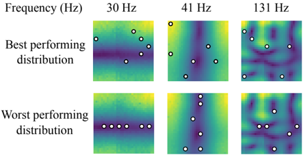
## Heatmap: Frequency Distribution Performance Comparison
### Overview
The image presents a comparative analysis of two distribution patterns ("Best performing distribution" and "Worst performing distribution") across three frequency bands (30 Hz, 41 Hz, 131 Hz). Each heatmap uses a color gradient (purple to yellow) to represent intensity values, with white dots marking specific data points. The spatial arrangement of dots and color intensity variations suggest differences in distribution efficiency or signal characteristics.
### Components/Axes
- **X-axis**: Frequency (Hz) with three labeled categories: 30 Hz, 41 Hz, 131 Hz.
- **Y-axis**: Two rows labeled "Best performing distribution" (top) and "Worst performing distribution" (bottom).
- **Color Scale**: Implied gradient from purple (low intensity) to yellow (high intensity), though no explicit legend is present.
- **Data Points**: White dots overlaid on heatmaps, positioned to indicate specific values or thresholds.
### Detailed Analysis
#### Best Performing Distribution
- **30 Hz**: Dots are scattered across the heatmap, with moderate intensity (green-yellow gradient). No clear clustering.
- **41 Hz**: Dots are distributed with a slight central clustering, showing moderate intensity (green-yellow).
- **131 Hz**: Dots are spread unevenly, with some areas of higher intensity (yellow) and others lower (purple).
#### Worst Performing Distribution
- **30 Hz**: Dots are aligned horizontally in a straight line, indicating uniform but low intensity (green).
- **41 Hz**: Dots are vertically aligned, suggesting a narrow distribution with moderate intensity (green-yellow).
- **131 Hz**: Dots are scattered but show a slight diagonal clustering, with mixed intensity (purple-yellow).
### Key Observations
1. **Best Performing Distribution**:
- Dots are more dispersed across all frequencies, suggesting a broader or more uniform distribution.
- At 131 Hz, the presence of yellow areas indicates higher intensity values compared to other frequencies.
2. **Worst Performing Distribution**:
- Dots are more clustered or aligned, indicating concentrated or less efficient distributions.
- At 30 Hz, the horizontal alignment suggests a rigid or constrained distribution pattern.
3. **Frequency Impact**:
- Higher frequencies (131 Hz) show more variability in both distributions, with the Best distribution exhibiting greater intensity diversity.
### Interpretation
The data suggests that the "Best performing distribution" achieves a more balanced or widespread distribution of values across frequencies, while the "Worst performing distribution" exhibits concentrated or constrained patterns. The color intensity variations (purple to yellow) likely represent signal strength, error rates, or another metric where higher values (yellow) indicate better performance. The alignment of dots in the Worst distribution (e.g., horizontal/vertical lines) may indicate systematic biases or limitations in the distribution mechanism. The increased variability at 131 Hz could reflect frequency-dependent challenges in maintaining uniform distribution. This analysis highlights the importance of frequency-specific optimization in achieving optimal performance.