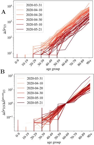
## Line Charts: Age Group vs. COVID-19 Data
### Overview
The image contains two line charts, labeled A and B, that display COVID-19 related data across different age groups over time. The x-axis represents age groups (0-9, 10-19, 20-29, 30-39, 40-49, 50-59, 60-69, 70-79, 80-89, 90+), and the y-axis represents different metrics related to COVID-19 cases. Each line represents data from a specific date, ranging from March 31, 2020, to May 21, 2020.
### Components/Axes
**Chart A:**
* **Title:** Implicitly, "COVID-19 Cases by Age Group Over Time"
* **Y-axis:** ΔD^(a)(t) (Logarithmic scale)
* Axis markers: 10^1, 10^2, 10^3, 10^4
* **X-axis:** age group
* Categories: 0-9, 10-19, 20-29, 30-39, 40-49, 50-59, 60-69, 70-79, 80-89, 90+
* **Legend:** (Top-right)
* 2020-03-31 (lightest shade of red)
* 2020-04-10 (light red)
* 2020-04-20 (medium red)
* 2020-04-30 (red)
* 2020-05-10 (dark red)
* 2020-05-21 (darkest red)
**Chart B:**
* **Title:** Implicitly, "Normalized COVID-19 Cases by Age Group Over Time"
* **Y-axis:** ΔD^(a)(t) / ΔD^(60-69)(t) (Logarithmic scale)
* Axis markers: 10^-1, 10^0, 10^1, 10^2
* **X-axis:** age group
* Categories: 0-9, 10-19, 20-29, 30-39, 40-49, 50-59, 60-69, 70-79, 80-89, 90+
* **Legend:** (Top-left)
* 2020-03-31 (lightest shade of red)
* 2020-04-10 (light red)
* 2020-04-20 (medium red)
* 2020-04-30 (red)
* 2020-05-10 (dark red)
* 2020-05-21 (darkest red)
### Detailed Analysis
**Chart A:**
* **General Trend:** The number of cases, represented by ΔD^(a)(t), generally increases with age group, especially after the 50-59 age group. The lines representing later dates (darker shades of red) tend to be higher, indicating an increase in cases over time.
* **Specific Values and Trends:**
* **0-9 age group:** All lines are close to 10^1, indicating a low number of cases.
* **10-19 age group:** Similar to the 0-9 group, values remain low, around 10^1.
* **20-29 to 50-59 age groups:** The lines show some variability, with some lines remaining relatively flat and others increasing slightly. The values generally range between 10^1 and 10^2.
* **60-69 age group and above:** A clear upward trend is visible. The lines increase significantly, reaching values between 10^2 and 10^4 for the 90+ age group. The lines representing later dates (darker reds) are consistently higher.
* **2020-03-31 (lightest red):** Starts low and shows a gradual increase with age.
* **2020-05-21 (darkest red):** Shows the highest values across all age groups, indicating the most significant increase in cases.
**Chart B:**
* **General Trend:** This chart normalizes the data by dividing by the value for the 60-69 age group. This highlights the relative difference in case numbers compared to this reference group.
* **Specific Values and Trends:**
* **0-9 age group:** Values are significantly below 10^0 (i.e., less than 1), indicating a much lower case rate compared to the 60-69 age group.
* **10-19 to 50-59 age groups:** Values are generally below 10^0, showing lower case rates than the 60-69 group.
* **60-69 age group:** All lines converge at 10^0, as this is the reference group used for normalization.
* **70-79 age group and above:** Values increase above 10^0, indicating higher case rates compared to the 60-69 group. The values for the 90+ age group are the highest, reaching close to 10^2 for the later dates.
* **2020-03-31 (lightest red):** Shows the lowest relative increase in cases for older age groups.
* **2020-05-21 (darkest red):** Shows the highest relative increase in cases for older age groups.
### Key Observations
* **Chart A:** Shows the absolute increase in COVID-19 cases across age groups over time. Older age groups experienced a more significant increase in cases, especially in later months.
* **Chart B:** Normalizes the data to the 60-69 age group, highlighting the relative difference in case rates. It shows that older age groups (70+) had significantly higher case rates compared to the 60-69 group, while younger age groups had lower rates.
* **Time Trend:** Both charts show a clear increase in cases over time, with the lines representing later dates (May 2020) consistently higher than earlier dates (March 2020).
* **Age Disparity:** The data reveals a significant age disparity in COVID-19 cases, with older age groups being disproportionately affected.
### Interpretation
The data suggests that older age groups were more vulnerable to COVID-19 during the period from March to May 2020. The normalization in Chart B emphasizes that the increase in cases among older individuals was not just an absolute increase but also a relative increase compared to the 60-69 age group. This could be due to a variety of factors, including weaker immune systems, higher prevalence of underlying health conditions, or different social behaviors. The increasing trend over time indicates that the pandemic was evolving, and the impact on different age groups was changing. The charts highlight the importance of targeted interventions and protection measures for vulnerable populations, particularly older adults.