\n
## Line Chart: Age-Specific and Relative Mortality Trends
### Overview
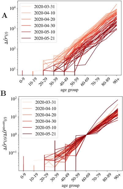
The image presents two line charts (labeled A and B) depicting mortality trends across different age groups over time. Both charts use a logarithmic y-axis. Chart A shows the absolute change in deaths (ΔD^(t)(t)) while Chart B shows the relative change in deaths (ΔD^(t)(t) / ΔD^(60-69)(t)). The x-axis represents age groups, and the legend indicates different dates in 2020.
### Components/Axes
* **Chart A:**
* **X-axis:** Age group (0-9, 10-19, 20-29, 30-39, 40-49, 50-59, 60-69, 70-79, 80-89, 90+)
* **Y-axis:** ΔD^(t)(t) - Change in deaths (logarithmic scale, ranging from approximately 1 to 10^4)
* **Legend:** Dates (2020-03-31, 2020-04-10, 2020-04-20, 2020-04-30, 2020-05-10, 2020-05-21) with corresponding line colors.
* **Chart B:**
* **X-axis:** Age group (0-9, 10-19, 20-29, 30-39, 40-49, 50-59, 60-69, 70-79, 80-89, 90+)
* **Y-axis:** ΔD^(t)(t) / ΔD^(60-69)(t) - Relative change in deaths (logarithmic scale, ranging from approximately 10^-1 to 10^2)
* **Legend:** Dates (2020-03-31, 2020-04-10, 2020-04-20, 2020-04-30, 2020-05-10, 2020-05-21) with corresponding line colors.
### Detailed Analysis or Content Details
**Chart A: Absolute Change in Deaths**
* **2020-03-31 (Lightest Red):** Starts at approximately 1 for age group 0-9, and increases steadily to approximately 10^3 for age group 90+.
* **2020-04-10 (Second Lightest Red):** Starts at approximately 1 for age group 0-9, and increases steadily to approximately 10^3 for age group 90+.
* **2020-04-20 (Third Lightest Red):** Starts at approximately 1 for age group 0-9, and increases steadily to approximately 10^3 for age group 90+.
* **2020-04-30 (Fourth Lightest Red):** Starts at approximately 1 for age group 0-9, and increases steadily to approximately 10^3 for age group 90+.
* **2020-05-10 (Fifth Lightest Red):** Starts at approximately 1 for age group 0-9, and increases steadily to approximately 10^3 for age group 90+.
* **2020-05-21 (Darkest Red):** Starts at approximately 1 for age group 0-9, and increases steadily to approximately 10^4 for age group 90+.
The lines generally trend upwards, indicating an increase in absolute deaths with increasing age. The lines for later dates (2020-05-10 and 2020-05-21) are consistently higher than earlier dates, suggesting a growing number of deaths over time. There is a noticeable jump in the 2020-05-21 line, particularly for older age groups.
**Chart B: Relative Change in Deaths**
* **2020-03-31 (Lightest Red):** Starts at approximately -0.1 for age group 0-9, increases to approximately 1 for age group 50-59, and then increases to approximately 10^1 for age group 90+.
* **2020-04-10 (Second Lightest Red):** Starts at approximately -0.1 for age group 0-9, increases to approximately 1 for age group 50-59, and then increases to approximately 10^1 for age group 90+.
* **2020-04-20 (Third Lightest Red):** Starts at approximately -0.1 for age group 0-9, increases to approximately 1 for age group 50-59, and then increases to approximately 10^1 for age group 90+.
* **2020-04-30 (Fourth Lightest Red):** Starts at approximately -0.1 for age group 0-9, increases to approximately 1 for age group 50-59, and then increases to approximately 10^1 for age group 90+.
* **2020-05-10 (Fifth Lightest Red):** Starts at approximately -0.1 for age group 0-9, increases to approximately 1 for age group 50-59, and then increases to approximately 10^1 for age group 90+.
* **2020-05-21 (Darkest Red):** Starts at approximately -0.1 for age group 0-9, increases to approximately 1 for age group 50-59, and then increases to approximately 10^2 for age group 90+.
The lines generally trend upwards, indicating an increase in relative deaths with increasing age. The lines for later dates (2020-05-10 and 2020-05-21) are consistently higher than earlier dates, suggesting a growing relative number of deaths over time. There is a noticeable jump in the 2020-05-21 line, particularly for older age groups.
### Key Observations
* Both charts show a clear age-related increase in mortality.
* The mortality trends generally increased over time, as indicated by the consistently higher lines for later dates.
* The jump in mortality observed on 2020-05-21 is particularly pronounced in both charts, especially for older age groups.
* Chart B normalizes the data by the 60-69 age group, highlighting the relative impact of mortality across different age groups.
### Interpretation
These charts likely represent the impact of a pandemic (potentially COVID-19, given the 2020 dates) on mortality rates across different age groups. The increasing trends over time suggest a worsening situation. The significant jump in mortality on 2020-05-21 could represent a peak in cases or a change in the pandemic's dynamics.
Chart A provides the absolute number of deaths, while Chart B provides a relative comparison to the 60-69 age group. This relative comparison is useful for understanding which age groups are disproportionately affected. The negative values in Chart B for younger age groups suggest that the mortality increase in the 60-69 age group was greater than in those younger groups.
The logarithmic scale on the y-axis compresses the data, making it easier to visualize the trends across a wide range of values. This is particularly important for Chart A, where the absolute number of deaths increases dramatically with age. The consistent upward trend across all dates suggests a systemic increase in mortality, rather than isolated incidents.