\n
## Line Charts: Age-Group Trends Over Time (March-May 2020)
### Overview
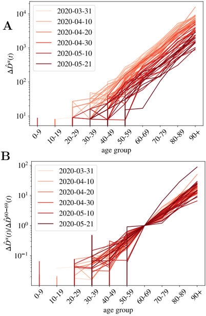
The image contains two vertically stacked line charts (labeled A and B) that plot data across age groups over a series of dates in early 2020. Both charts use a logarithmic y-axis and share the same x-axis (age groups). The data is represented by multiple lines, each corresponding to a specific date, with a color gradient from light to dark red indicating progression through time.
### Components/Axes
* **Chart A (Top):**
* **Y-axis:** Labeled `ΔΔŷ(t)`. Scale is logarithmic, with major tick marks at `10¹`, `10²`, `10³`, and `10⁴`.
* **X-axis:** Labeled `age group`. Categories are: `0-9`, `10-19`, `20-29`, `30-39`, `40-49`, `50-59`, `60-69`, `70-79`, `80-89`, `90+`.
* **Legend:** Positioned in the top-left corner. Contains six entries, each a colored line segment with a date label:
* Lightest red: `2020-03-31`
* Light red: `2020-04-10`
* Medium-light red: `2020-04-20`
* Medium red: `2020-04-30`
* Dark red: `2020-05-10`
* Darkest red: `2020-05-21`
* **Chart B (Bottom):**
* **Y-axis:** Labeled `ΔΔŷ(t)/ΔΔŷ⁰(t)`. Scale is logarithmic, with major tick marks at `10⁻¹`, `10⁰`, and `10²`.
* **X-axis:** Identical to Chart A: `age group` with the same categories.
* **Legend:** Identical in content, color scheme, and top-left positioning to the legend in Chart A.
### Detailed Analysis
**Chart A: `ΔΔŷ(t)` vs. Age Group**
* **Trend Verification:** All six data series (lines) show a strong, consistent upward trend with increasing age. The slope is relatively shallow for age groups below 50-59 and becomes significantly steeper for groups from 60-69 onward.
* **Data Points & Values (Approximate):**
* For age groups `0-9` and `10-19`, values are very low, often near or below the `10¹` baseline, with significant noise and overlap between dates.
* A noticeable increase begins around the `30-39` and `40-49` groups, with values typically ranging between `10¹` and `10²`.
* A sharp inflection point occurs at the `50-59` group. From `60-69` to `90+`, values rise dramatically.
* **Final Points (90+ group):** The lines are most separated here. The lightest line (2020-03-31) is near `10³`. The darkest line (2020-05-21) is the highest, approaching or slightly exceeding `10⁴`. The other lines are distributed between these values, generally following the date order (darker = higher).
**Chart B: Ratio `ΔΔŷ(t)/ΔΔŷ⁰(t)` vs. Age Group**
* **Trend Verification:** The general trend is also upward with age, but with more complex behavior in the middle age ranges. Lines converge and cross between the `40-49` and `60-69` groups before diverging again.
* **Data Points & Values (Approximate):**
* For age groups `0-9` to `30-39`, values are scattered around or below `10⁻¹` (0.1), with no clear separation by date.
* Between `40-49` and `50-59`, there is a notable dip or period of high variability for many lines.
* All lines converge tightly around the `60-69` age group, clustering near the `10⁰` (1.0) mark.
* After `60-69`, the lines diverge again and trend upward. The darkest line (2020-05-21) shows the steepest increase, reaching close to `10²` (100) for the `90+` group. The lightest line (2020-03-31) shows the least increase, remaining closer to `10⁰`.
### Key Observations
1. **Age Dependency:** Both metrics show a profound dependency on age, with values increasing by several orders of magnitude from the youngest to the oldest groups.
2. **Temporal Progression:** In the oldest age groups (`80-89`, `90+`), there is a clear stratification by date in both charts: later dates (darker red lines) correspond to higher values. This suggests the measured phenomenon intensified over the March-May 2020 period, particularly for the elderly.
3. **Critical Age Threshold:** The `50-59` age group appears as a critical transition zone. In Chart A, it marks the start of the steep rise. In Chart B, it is a zone of convergence and variability before the final upward trend.
4. **Convergence Point:** Chart B shows a striking convergence of all time-series lines at the `60-69` age group, where the ratio is approximately 1.0 for all dates.
### Interpretation
The charts likely visualize the evolution of an epidemiological or social metric during the early phase of the COVID-19 pandemic (March-May 2020). `ΔΔŷ(t)` could represent a change in a rate (e.g., cases, mortality) relative to a baseline, while the ratio in Chart B normalizes this change against an earlier or expected baseline (`ΔΔŷ⁰(t)`).
* **What the data suggests:** The data demonstrates that the impact of the measured event was overwhelmingly concentrated in older populations and grew more severe over time within those groups. The near-exponential rise with age (linear on a log scale) is a hallmark of age-stratified risk.
* **Relationship between elements:** Chart A shows the absolute growth of the metric. Chart B reveals the *relative* growth. The convergence at age 60-69 in Chart B is particularly insightful—it indicates that by that age, the relative increase in the metric was consistent across all observed dates in spring 2020. The subsequent divergence shows that for the oldest old, the situation continued to worsen at different rates as time progressed.
* **Notable anomalies:** The dip and high variability in Chart B for the 40-59 age range could indicate a period where the metric was unstable or influenced by confounding factors different from those affecting younger or older groups. The clean convergence at 60-69 suggests a more uniform driver of change for that demographic.