## Grouped Bar Chart: Accuracy by Category and Number of Rows
### Overview
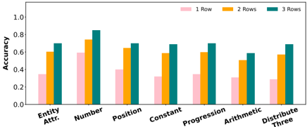
The image displays a grouped bar chart comparing the accuracy of a system or model across seven different categories, with performance further broken down by the number of rows of input data (1, 2, or 3). The chart suggests an evaluation of how data quantity (rows) impacts performance across various task types.
### Components/Axes
* **Chart Type:** Grouped Bar Chart.
* **X-Axis (Categories):** Seven distinct categories are listed from left to right:
1. Entity Attr.
2. Number
3. Position
4. Constant
5. Progression
6. Arithmetic
7. Distribute Three
* **Y-Axis:** Labeled "Accuracy". The scale runs from 0.0 to 1.0, with major tick marks at 0.0, 0.2, 0.4, 0.6, 0.8, and 1.0.
* **Legend:** Positioned in the top-right corner of the chart area. It defines three data series by color:
* **Pink/Light Red:** "1 Row"
* **Orange/Yellow:** "2 Rows"
* **Teal/Green:** "3 Rows"
* **Data Series:** For each of the seven categories on the x-axis, there is a cluster of three bars, one for each row count defined in the legend.
### Detailed Analysis
Below is an analysis of each category, describing the visual trend and estimating the accuracy values for each bar. Values are approximate based on visual alignment with the y-axis grid.
1. **Entity Attr.**
* **Trend:** Accuracy increases with the number of rows.
* **Values:** 1 Row ≈ 0.35, 2 Rows ≈ 0.60, 3 Rows ≈ 0.70.
2. **Number**
* **Trend:** Accuracy increases with the number of rows. This category shows the highest overall accuracy for the 3 Rows condition.
* **Values:** 1 Row ≈ 0.65, 2 Rows ≈ 0.75, 3 Rows ≈ 0.85.
3. **Position**
* **Trend:** Accuracy increases with the number of rows.
* **Values:** 1 Row ≈ 0.40, 2 Rows ≈ 0.65, 3 Rows ≈ 0.70.
4. **Constant**
* **Trend:** Accuracy increases with the number of rows.
* **Values:** 1 Row ≈ 0.35, 2 Rows ≈ 0.60, 3 Rows ≈ 0.70.
5. **Progression**
* **Trend:** Accuracy increases with the number of rows.
* **Values:** 1 Row ≈ 0.35, 2 Rows ≈ 0.60, 3 Rows ≈ 0.70.
6. **Arithmetic**
* **Trend:** Accuracy increases with the number of rows.
* **Values:** 1 Row ≈ 0.30, 2 Rows ≈ 0.50, 3 Rows ≈ 0.60.
7. **Distribute Three**
* **Trend:** Accuracy increases with the number of rows.
* **Values:** 1 Row ≈ 0.30, 2 Rows ≈ 0.60, 3 Rows ≈ 0.70.
### Key Observations
* **Universal Positive Trend:** In every single category, accuracy is lowest with 1 Row, higher with 2 Rows, and highest with 3 Rows. This is a perfectly consistent pattern across the entire chart.
* **Highest Performance:** The "Number" category achieves the highest accuracy scores across all row conditions, peaking at approximately 0.85 for 3 Rows.
* **Lowest Performance:** The "Arithmetic" and "Distribute Three" categories show the lowest accuracy for the 1 Row condition (≈0.30).
* **Magnitude of Improvement:** The performance jump from 1 Row to 2 Rows is generally larger than the jump from 2 Rows to 3 Rows. For example, in "Entity Attr.", the increase is ~0.25 from 1 to 2 rows, and ~0.10 from 2 to 3 rows.
* **Category Similarity:** The categories "Constant" and "Progression" show nearly identical accuracy profiles across all three row conditions.
### Interpretation
The data strongly suggests that the system's performance is **highly dependent on the amount of input data provided**. The consistent, step-wise improvement from 1 to 2 to 3 rows indicates that the model or algorithm benefits significantly from additional context or examples within a single task instance.
The variation in baseline performance (1 Row accuracy) across categories implies that some tasks (like "Number") are inherently easier for the system to solve with minimal data, while others (like "Arithmetic" or "Entity Attr.") are more challenging and require more data to achieve comparable accuracy. The fact that the relative ranking of categories remains fairly consistent across row counts (e.g., "Number" is always top, "Arithmetic" is often near the bottom) suggests that the intrinsic difficulty of the task type is a stable factor, independent of data quantity.
This chart would be critical for understanding the system's data efficiency and for identifying which task categories might require more sophisticated models or different training approaches to improve performance, especially in low-data scenarios.