\n
## Reliability Diagrams: Model Calibration Analysis
### Overview
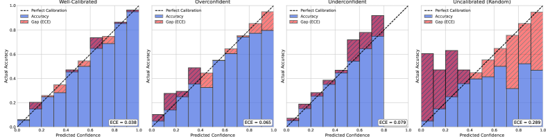
The image displays four reliability diagrams (calibration plots) arranged horizontally, each evaluating the calibration performance of a different predictive model or scenario. The plots compare predicted confidence against actual accuracy, with a diagonal line representing perfect calibration. The four scenarios are labeled: "Well-Calibrated", "Overconfident", "Underconfident", and "Uncalibrated (Random)".
### Components/Axes
* **Chart Type:** Reliability Diagrams (Calibration Plots)
* **X-Axis (All Plots):** "Predicted Confidence" (Range: 0.0 to 1.0)
* **Y-Axis (All Plots):** "Actual Accuracy" (Range: 0.0 to 1.0)
* **Legend (Top-Left of each plot):**
* `--- Perfect Calibration` (Black dashed diagonal line from (0,0) to (1,1))
* `■ Accuracy` (Blue bars)
* `■ Gap (ECE)` (Red bars stacked on top of blue bars)
* **Metric (Bottom-Right of each plot):** ECE (Expected Calibration Error) value.
* **Language:** All text is in English.
### Detailed Analysis
The analysis is segmented by plot, from left to right.
**1. Plot: Well-Calibrated**
* **Trend:** The blue "Accuracy" bars closely follow the "Perfect Calibration" dashed line across all confidence bins.
* **Data Points & Gaps:** The red "Gap (ECE)" segments are very small and uniform, indicating minimal deviation between confidence and accuracy.
* **ECE Value:** `ECE = 0.038` (displayed in bottom-right corner).
* **Spatial Grounding:** The legend is in the top-left quadrant. The ECE value is in the bottom-right quadrant. The bars are centered on the x-axis bins.
**2. Plot: Overconfident**
* **Trend:** The blue "Accuracy" bars are consistently *below* the "Perfect Calibration" line. This indicates the model's predicted confidence is higher than its actual accuracy.
* **Data Points & Gaps:** The red "Gap (ECE)" segments are visibly larger than in the first plot, especially in the mid-to-high confidence range (approx. 0.4 to 0.9). The gap grows as confidence increases.
* **ECE Value:** `ECE = 0.065`.
* **Spatial Grounding:** Layout is identical to the first plot. The systematic negative gap (blue below dashed line) is the defining spatial feature.
**3. Plot: Underconfident**
* **Trend:** The blue "Accuracy" bars are consistently *above* the "Perfect Calibration" line. This indicates the model's predicted confidence is lower than its actual accuracy.
* **Data Points & Gaps:** The red "Gap (ECE)" segments are substantial, particularly in the lower confidence bins (approx. 0.0 to 0.5). The model is most underconfident when it predicts low probabilities.
* **ECE Value:** `ECE = 0.079`.
* **Spatial Grounding:** Layout is identical. The systematic positive gap (blue above dashed line) is the defining spatial feature.
**4. Plot: Uncalibrated (Random)**
* **Trend:** The blue "Accuracy" bars show no consistent relationship with the "Perfect Calibration" line. They fluctuate randomly above and below it across the confidence spectrum.
* **Data Points & Gaps:** The red "Gap (ECE)" segments are very large and vary dramatically from bin to bin. There is no discernible pattern to the errors.
* **ECE Value:** `ECE = 0.289`.
* **Spatial Grounding:** Layout is identical. The chaotic, non-systematic arrangement of blue bars relative to the dashed line is the defining spatial feature.
### Key Observations
1. **Calibration Quality Progression:** There is a clear degradation in calibration from left to right, quantified by the increasing ECE values: 0.038 → 0.065 → 0.079 → 0.289.
2. **Systematic vs. Random Error:** The "Overconfident" and "Underconfident" plots show *systematic bias* (errors consistently on one side of the diagonal). The "Uncalibrated (Random)" plot shows *high variance with no bias*.
3. **Gap Correlation:** The size of the red "Gap" bars directly correlates with the ECE value and the visual deviation from the diagonal.
4. **Bin Consistency:** All plots use the same binning strategy for the x-axis (Predicted Confidence), allowing for direct comparison.
### Interpretation
These diagrams are a fundamental tool for assessing the trustworthiness of a machine learning model's probability estimates. A well-calibrated model (Plot 1) is crucial for decision-making under uncertainty, as its confidence scores are reliable indicators of its likely correctness.
* **What the data suggests:** The "Overconfident" model (Plot 2) is dangerous in high-stakes applications (e.g., medical diagnosis, autonomous driving) because it assigns high confidence to incorrect predictions. The "Underconfident" model (Plot 3) is overly cautious, which may lead to missed opportunities or unnecessary second-guessing. The "Uncalibrated (Random)" model (Plot 4) provides no meaningful probability information; its confidence scores are essentially arbitrary.
* **How elements relate:** The blue bar height (Accuracy) for a given confidence bin should equal the x-axis value (Predicted Confidence) for perfect calibration. The red bar (Gap) visually represents the calibration error for that bin. The ECE is the weighted average of these gaps across all bins.
* **Notable Anomaly:** The "Uncalibrated (Random)" plot is an extreme case, likely representing a model with no training, a broken output layer, or predictions generated by a random number generator. Its high ECE (0.289) is a quantitative measure of its complete lack of calibration.