## Calibration Plots: Model Confidence vs. Accuracy
### Overview
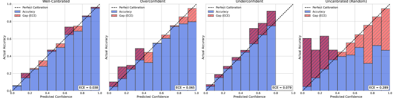
The image presents four calibration plots, each visualizing the relationship between predicted confidence and actual accuracy for a classification model under different calibration scenarios: "Well-Calibrated", "Overconfident", "Underconfident", and "Uncalibrated (Random)". Each plot displays the accuracy and the gap (ECE - Expected Calibration Error) as stacked bars, along with a dashed line representing perfect calibration.
### Components/Axes
* **Titles:**
* Top-left: "Well-Calibrated"
* Top-middle-left: "Overconfident"
* Top-middle-right: "Underconfident"
* Top-right: "Uncalibrated (Random)"
* **Y-axis (Actual Accuracy):** Ranges from 0.0 to 1.0, with tick marks at 0.2 intervals (0.0, 0.2, 0.4, 0.6, 0.8, 1.0).
* **X-axis (Predicted Confidence):** Ranges from 0.0 to 1.0, without explicit tick marks, but implicitly divided into 10 bins of width 0.1.
* **Legend (Top-left of each plot):**
* Dashed Black Line: "Perfect Calibration"
* Blue Bars: "Accuracy"
* Red Bars: "Gap (ECE)"
* **ECE Value:** Each plot displays the ECE (Expected Calibration Error) value at the bottom-right.
### Detailed Analysis
**1. Well-Calibrated**
* **Trend:** The blue "Accuracy" bars closely follow the "Perfect Calibration" line. The red "Gap (ECE)" bars are relatively small.
* **Data Points:**
* ECE = 0.038
**2. Overconfident**
* **Trend:** The "Accuracy" bars are generally above the "Perfect Calibration" line for lower predicted confidence values and below the line for higher confidence values. This indicates overconfidence in low-confidence predictions and underconfidence in high-confidence predictions. The "Gap (ECE)" bars are more prominent than in the "Well-Calibrated" plot.
* **Data Points:**
* ECE = 0.065
**3. Underconfident**
* **Trend:** The "Accuracy" bars are generally below the "Perfect Calibration" line for lower predicted confidence values and above the line for higher confidence values. This indicates underconfidence in low-confidence predictions and overconfidence in high-confidence predictions. The "Gap (ECE)" bars are more prominent than in the "Well-Calibrated" plot.
* **Data Points:**
* ECE = 0.079
**4. Uncalibrated (Random)**
* **Trend:** The "Accuracy" bars show a scattered relationship with the "Perfect Calibration" line. The "Gap (ECE)" bars are large and inconsistent.
* **Data Points:**
* ECE = 0.289
### Key Observations
* The "Well-Calibrated" plot demonstrates the ideal scenario where predicted confidence aligns with actual accuracy.
* The "Overconfident" plot shows a tendency for the model to overestimate its accuracy, especially at lower confidence levels.
* The "Underconfident" plot shows a tendency for the model to underestimate its accuracy, especially at lower confidence levels.
* The "Uncalibrated (Random)" plot represents a poorly calibrated model with a high ECE, indicating a significant mismatch between predicted confidence and actual accuracy.
### Interpretation
The calibration plots provide a visual assessment of how well a classification model's predicted probabilities reflect the true likelihood of its predictions being correct. A well-calibrated model is crucial in applications where confidence scores are used for decision-making. The plots highlight the importance of calibration techniques to improve the reliability of model outputs, especially when dealing with overconfident or underconfident models. The ECE values quantify the degree of miscalibration, with lower values indicating better calibration. The "Uncalibrated (Random)" plot serves as a baseline, demonstrating the impact of poor calibration on the relationship between predicted confidence and actual accuracy.