## Violin Plot: Kimina-7B Distribution Comparison
### Overview
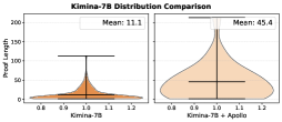
The image contains two side-by-side violin plots comparing the distribution of "Proof Length" for two groups: "Kimina-7B" (left) and "Kimina-7B + Apollo" (right). The plots visualize the spread and central tendency of the data, with annotated mean values and shaded distributions.
---
### Components/Axes
- **Y-Axis**: Labeled "Proof Length" with a scale from 0 to 200.
- **X-Axis**:
- Left plot: Labeled "Kimina-7B".
- Right plot: Labeled "Kimina-7B + Apollo".
- **Legends**:
- Top-left: "Kimina-7B" (orange shading).
- Top-right: "Kimina-7B + Apollo" (beige shading).
- **Annotations**:
- Left plot: "Mean: 11.1" (black text box).
- Right plot: "Mean: 45.4" (black text box).
---
### Detailed Analysis
#### Left Plot (Kimina-7B)
- **Distribution**: Narrow, symmetric peak centered around 1.0 on the x-axis.
- **Mean**: 11.1 (black horizontal line within the plot).
- **Spread**: Most data points cluster tightly between 0.8 and 1.2 on the x-axis, with a peak at 1.0.
- **Outliers**: Minimal; the distribution tapers sharply at the edges.
#### Right Plot (Kimina-7B + Apollo)
- **Distribution**: Broad, asymmetric shape with a peak near 1.0 but extending further right (up to 1.2).
- **Mean**: 45.4 (black horizontal line), significantly higher than the left plot.
- **Spread**: Data spans a wider range (0.8 to 1.2 on the x-axis), with a long tail extending to higher proof lengths.
- **Outliers**: A single extreme outlier at the top of the plot (~200 proof length).
---
### Key Observations
1. **Mean Shift**: The mean proof length increases from 11.1 (Kimina-7B) to 45.4 (Kimina-7B + Apollo), a 306% increase.
2. **Variability**: The right plot shows greater variability, with a wider distribution and a long tail.
3. **Concentration**: Kimina-7B’s data is tightly clustered, while Kimina-7B + Apollo’s data is more dispersed.
4. **Outlier Impact**: The extreme outlier in the right plot skews the mean upward but does not affect the median (black line).
---
### Interpretation
- **Technical Implications**: Adding Apollo to Kimina-7B significantly increases the average proof length, suggesting Apollo introduces complexity or computational overhead. The wider distribution indicates inconsistent performance gains or variability in how Apollo affects different proofs.
- **Anomaly**: The extreme outlier (~200) in the right plot warrants investigation—it may represent a pathological case or a bug in the system.
- **Design Trade-offs**: While Apollo improves performance (implied by the title "Distribution Comparison"), it introduces variability, which could impact reliability or user experience.
---
### Spatial Grounding & Color Matching
- **Legends**: Top-left (orange) and top-right (beige) match the shading in their respective plots.
- **Mean Lines**: Black horizontal lines in both plots align with the annotated mean values.
- **Distribution Shading**: Orange for Kimina-7B, beige for Kimina-7B + Apollo, consistent with legend labels.
---
### Content Details
- **Textual Elements**:
- "Kimina-7B Distribution Comparison" (title).
- "Mean: 11.1" and "Mean: 45.4" (annotations).
- Axis labels: "Proof Length" (y-axis), "Kimina-7B" and "Kimina-7B + Apollo" (x-axis).
- **Numerical Values**:
- Left plot: Mean = 11.1, x-axis range = 0.8–1.2.
- Right plot: Mean = 45.4, x-axis range = 0.8–1.2, outlier at ~200.
---
### Final Notes
The image provides no additional textual content beyond the labels and annotations described. The data suggests Apollo’s integration alters the system’s behavior in measurable ways, but further analysis is needed to determine causality or optimization opportunities.