\n
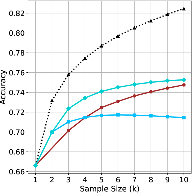
## Line Chart: Accuracy vs. Sample Size
### Overview
This image presents a line chart illustrating the relationship between sample size (in thousands) and accuracy. Four distinct data series are plotted, each represented by a different colored line. The chart appears to demonstrate how accuracy improves with increasing sample size, but at a diminishing rate.
### Components/Axes
* **X-axis:** Labeled "Sample Size (k)". The scale ranges from 1 to 10, in increments of 1.
* **Y-axis:** Labeled "Accuracy". The scale ranges from 0.66 to 0.82, in increments of 0.02.
* **Data Series:** Four lines are present, each with a unique color and style:
* Black dotted line
* Teal solid line
* Red solid line
* Light blue dashed line
### Detailed Analysis
Let's analyze each line individually, noting trends and approximate data points.
* **Black Dotted Line:** This line exhibits the steepest upward trend. It starts at approximately 0.67 at a sample size of 1k and rises rapidly, reaching approximately 0.82 at a sample size of 10k.
* **Teal Solid Line:** This line shows a moderate upward trend, but plateaus at higher sample sizes. It begins at approximately 0.67 at 1k, rises to around 0.75 at 5k, and then plateaus around 0.75-0.76 for sample sizes greater than 5k.
* **Red Solid Line:** This line demonstrates a slower, more gradual increase in accuracy. It starts at approximately 0.67 at 1k, reaches around 0.73 at 5k, and continues to rise slowly, reaching approximately 0.75 at 10k.
* **Light Blue Dashed Line:** This line shows a slight initial increase, followed by a plateau and even a slight decrease at higher sample sizes. It starts at approximately 0.68 at 1k, rises to around 0.72 at 3k, and then remains relatively constant around 0.72, with a slight dip to approximately 0.71 at 10k.
Here's a table summarizing approximate data points:
| Sample Size (k) | Black Dotted (Accuracy) | Teal Solid (Accuracy) | Red Solid (Accuracy) | Light Blue Dashed (Accuracy) |
|---|---|---|---|---|
| 1 | 0.67 | 0.67 | 0.67 | 0.68 |
| 2 | 0.74 | 0.71 | 0.70 | 0.71 |
| 3 | 0.78 | 0.73 | 0.72 | 0.72 |
| 4 | 0.80 | 0.74 | 0.73 | 0.72 |
| 5 | 0.81 | 0.75 | 0.73 | 0.72 |
| 6 | 0.81 | 0.75 | 0.74 | 0.72 |
| 7 | 0.81 | 0.75 | 0.74 | 0.72 |
| 8 | 0.82 | 0.76 | 0.75 | 0.71 |
| 9 | 0.82 | 0.76 | 0.75 | 0.71 |
| 10 | 0.82 | 0.76 | 0.75 | 0.71 |
### Key Observations
* The black dotted line consistently outperforms the other three lines across all sample sizes.
* The light blue dashed line shows a limited benefit from increasing sample size beyond 3k, and even a slight decrease in accuracy at 10k.
* The teal solid line demonstrates diminishing returns, with accuracy plateauing after 5k.
* The red solid line shows the slowest rate of improvement in accuracy.
### Interpretation
The chart suggests that increasing the sample size generally improves accuracy, but the extent of improvement varies depending on the method or model being used. The black dotted line likely represents a method that benefits significantly from larger sample sizes, while the light blue dashed line represents a method that is less sensitive to sample size or may even be negatively affected by excessively large samples (potentially due to overfitting or other issues). The teal and red lines represent intermediate cases.
The plateauing observed in the teal and light blue lines indicates that there is a point of diminishing returns, where adding more data does not significantly improve accuracy. This could be due to factors such as the inherent limitations of the method, the quality of the data, or the presence of noise.
The differences between the lines highlight the importance of selecting an appropriate method and sample size for a given task. The optimal choice will depend on the specific requirements of the application and the characteristics of the data. The chart provides valuable insights into the trade-offs between sample size, accuracy, and computational cost.