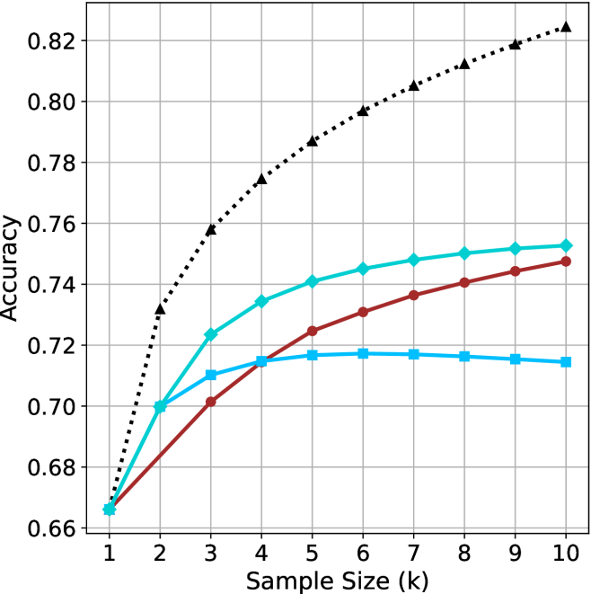
## Line Chart: Accuracy vs. Sample Size (k)
### Overview
The image is a line chart plotting the performance (Accuracy) of four different methods or models as a function of increasing sample size (k). The chart demonstrates how the accuracy of each method changes as more data samples are used, from k=1 to k=10.
### Components/Axes
* **X-Axis (Horizontal):** Labeled "Sample Size (k)". It has discrete integer markers from 1 to 10.
* **Y-Axis (Vertical):** Labeled "Accuracy". It has a linear scale ranging from 0.66 to 0.82, with major gridlines at intervals of 0.02.
* **Data Series:** Four distinct lines, each identified by a unique color and marker shape. There is no separate legend box; the markers serve as the key.
1. **Black, dotted line with upward-pointing triangle markers (▲).**
2. **Cyan (light blue), solid line with diamond markers (◆).**
3. **Red (dark red), solid line with circle markers (●).**
4. **Blue (medium blue), solid line with square markers (■).**
### Detailed Analysis
**Trend Verification & Data Point Extraction:**
All four series show an overall upward trend in accuracy as sample size increases, but at markedly different rates and with different saturation points.
1. **Black Dotted Line (▲):**
* **Trend:** Steepest and most consistent upward slope across the entire range. Shows no sign of plateauing.
* **Data Points (Approximate):**
* k=1: 0.665
* k=2: 0.732
* k=3: 0.758
* k=4: 0.774
* k=5: 0.787
* k=6: 0.797
* k=7: 0.805
* k=8: 0.812
* k=9: 0.819
* k=10: 0.825
2. **Cyan Line (◆):**
* **Trend:** Strong initial improvement from k=1 to k=5, then the rate of improvement slows significantly, approaching a gentle upward slope.
* **Data Points (Approximate):**
* k=1: 0.665 (overlaps with others)
* k=2: 0.700
* k=3: 0.723
* k=4: 0.735
* k=5: 0.741
* k=6: 0.745
* k=7: 0.748
* k=8: 0.750
* k=9: 0.752
* k=10: 0.753
3. **Red Line (●):**
* **Trend:** Steady, nearly linear increase from k=1 to k=10. The slope is less steep than the black line but more consistent than the cyan line in the later stages.
* **Data Points (Approximate):**
* k=1: 0.665 (overlaps with others)
* k=2: 0.680
* k=3: 0.701
* k=4: 0.715
* k=5: 0.725
* k=6: 0.731
* k=7: 0.737
* k=8: 0.741
* k=9: 0.745
* k=10: 0.748
4. **Blue Line (■):**
* **Trend:** Increases from k=1 to k=5, then plateaus and shows a very slight *decrease* from k=7 to k=10. This is the only series that does not show continuous improvement.
* **Data Points (Approximate):**
* k=1: 0.665 (overlaps with others)
* k=2: 0.700
* k=3: 0.710
* k=4: 0.715
* k=5: 0.717
* k=6: 0.718
* k=7: 0.718
* k=8: 0.717
* k=9: 0.716
* k=10: 0.715
### Key Observations
1. **Performance Hierarchy:** A clear and consistent ranking is established by k=3 and maintained thereafter: Black (▲) > Cyan (◆) > Red (●) > Blue (■).
2. **Convergence at k=1:** All four methods start at approximately the same accuracy (~0.665) when the sample size is minimal (k=1).
3. **Divergence with Data:** The performance gap between the best (Black) and worst (Blue) method widens dramatically as sample size increases, from 0 at k=1 to ~0.11 at k=10.
4. **Plateauing Behavior:** The Blue line's performance saturates and slightly degrades after k=5. The Cyan line's improvement slows markedly after k=5. The Red and Black lines show no plateau within the observed range.
5. **Relative Gain:** The Black method gains approximately 0.16 in accuracy from k=1 to k=10, while the Blue method gains only ~0.05.
### Interpretation
This chart likely compares different machine learning models, algorithms, or training strategies. The data suggests:
* **The method represented by the black dotted line (▲) is superior and most data-efficient.** It not only achieves the highest final accuracy but also improves most rapidly with additional data, indicating it effectively leverages larger datasets. This could represent a more complex model (e.g., a deep neural network) or a more sophisticated algorithm.
* **The cyan (◆) and red (●) methods are intermediate performers.** The cyan method has a higher ceiling than the red one, but both show more modest gains from data compared to the black method. They might represent simpler models or baseline approaches.
* **The blue method (■) is the least effective for larger datasets.** Its plateau and slight decline suggest it may be a simple model that quickly reaches its capacity (underfitting) or a method that becomes unstable or overfits with more data in this specific context. It is only competitive at very small sample sizes (k=2, where it matches the cyan line).
* **The choice of method is critical and depends on available data.** If data is extremely scarce (k=1), all methods perform similarly. However, for any application where more than a couple of samples are available, the black method is the clear choice. The chart makes a strong case for investing in the approach represented by the black line, as its return on investment (in terms of accuracy per added sample) is the highest.