## Line Chart: Accuracy vs. Sample Size (k)
### Overview
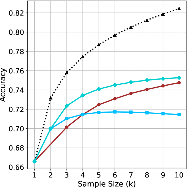
The chart illustrates the relationship between sample size (k) and accuracy for three distinct data series. Accuracy is measured on the y-axis (0.66–0.82), while the x-axis represents sample size (k) from 1 to 10. Three lines are plotted: a dotted black line, a solid teal line, and a solid red line, each with unique trends.
### Components/Axes
- **X-axis (Sample Size, k)**: Labeled "Sample Size (k)" with integer ticks from 1 to 10.
- **Y-axis (Accuracy)**: Labeled "Accuracy" with increments of 0.02 from 0.66 to 0.82.
- **Legend**: Located in the top-right corner, associating:
- Dotted black line → "Model A"
- Solid teal line → "Model B"
- Solid red line → "Model C"
### Detailed Analysis
1. **Dotted Black Line (Model A)**:
- Starts at (1, 0.66) and rises sharply to (2, 0.74).
- Gradually plateaus after k=5, reaching 0.82 at k=10.
- Key data points:
- k=1: 0.66
- k=2: 0.74
- k=3: 0.76
- k=4: 0.78
- k=5: 0.79
- k=6: 0.80
- k=7: 0.81
- k=8: 0.81
- k=9: 0.82
- k=10: 0.82
2. **Solid Teal Line (Model B)**:
- Begins at (1, 0.66) and increases steadily but less steeply than Model A.
- Plateaus at 0.75 after k=7.
- Key data points:
- k=1: 0.66
- k=2: 0.70
- k=3: 0.72
- k=4: 0.73
- k=5: 0.74
- k=6: 0.74
- k=7: 0.75
- k=8: 0.75
- k=9: 0.75
- k=10: 0.75
3. **Solid Red Line (Model C)**:
- Starts at (1, 0.68) and rises gradually, overtaking Model B at k=5.
- Plateaus at 0.74 after k=6.
- Key data points:
- k=1: 0.68
- k=2: 0.70
- k=3: 0.71
- k=4: 0.72
- k=5: 0.73
- k=6: 0.74
- k=7: 0.74
- k=8: 0.74
- k=9: 0.74
- k=10: 0.74
### Key Observations
- **Model A** (dotted black) achieves the highest accuracy, particularly for larger sample sizes (k ≥ 5), suggesting it scales better with data volume.
- **Model B** (teal) and **Model C** (red) plateau earlier, with Model C underperforming Model B for k ≥ 7.
- All models show diminishing returns as sample size increases beyond k=5–7.
### Interpretation
The chart demonstrates that larger sample sizes generally improve accuracy, but the rate of improvement varies by model. Model A’s steep initial rise and sustained performance suggest it is optimized for high-dimensional data, while Models B and C may be constrained by algorithmic limitations or overfitting. The divergence between Model C and the others highlights potential inefficiencies in its design. Notably, Model A’s plateau at 0.82 implies a theoretical upper bound for accuracy in this context.