\n
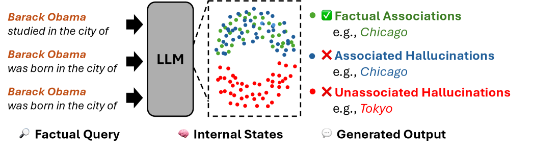
## Diagram: LLM Factual Query and Hallucination Visualization
### Overview
This diagram illustrates the process of a Large Language Model (LLM) responding to factual queries, and visualizes the occurrence of both factual associations and hallucinations. The diagram shows how queries are processed internally and the resulting outputs, categorizing them into factual responses, associated hallucinations, and unassociated hallucinations.
### Components/Axes
The diagram is segmented into three main areas: "Factual Query", "Internal States", and "Generated Output", separated by dashed vertical lines.
* **Factual Query (Left):** Contains three example queries in black text:
* "Barack Obama studied in the city of"
* "Barack Obama was born in the city of" (appears twice)
* **LLM (Center-Left):** A gray rectangular box labeled "LLM" represents the Large Language Model itself. Arrows indicate the flow of queries *into* the LLM.
* **Internal States (Center):** A region filled with scattered dots representing the LLM's internal processing. Dots are colored to represent different output types.
* **Generated Output (Right):** Displays the types of outputs generated, with examples.
* **Legend (Right):** A legend explains the color-coding of the dots:
* Green: "Factual Associations" (e.g., Chicago)
* Blue: "Associated Hallucinations" (e.g., Chicago)
* Red: "Unassociated Hallucinations" (e.g., Tokyo)
* **Icons (Bottom):** Icons representing each section: a magnifying glass for "Factual Query", a brain for "Internal States", and a speech bubble for "Generated Output".
### Detailed Analysis or Content Details
The diagram visually represents the following:
* **Factual Query:** Three queries are input into the LLM.
* **Internal States:** The LLM's internal processing is represented by a dense scattering of dots.
* Green dots (Factual Associations) are clustered in the upper-center area. Approximately 20-30 green dots are visible.
* Blue dots (Associated Hallucinations) are scattered around the green dots, with approximately 15-25 visible.
* Red dots (Unassociated Hallucinations) are concentrated in the lower-center area, with approximately 30-40 visible.
* **Generated Output:**
* **Factual Associations:** "e.g., Chicago" is provided as an example.
* **Associated Hallucinations:** "e.g., Chicago" is provided as an example.
* **Unassociated Hallucinations:** "e.g., Tokyo" is provided as an example.
### Key Observations
* The diagram suggests that LLMs can generate outputs that are factually correct (green dots), but also prone to both associated and unassociated hallucinations (blue and red dots, respectively).
* The density of red dots (Unassociated Hallucinations) appears to be higher than the density of green dots (Factual Associations), suggesting that hallucinations may be more frequent than accurate responses.
* The presence of "Chicago" as an example for both Factual Associations and Associated Hallucinations is noteworthy. This could indicate that the LLM is correctly associating Chicago with Barack Obama, but also generating incorrect information *related* to Chicago.
* The example of "Tokyo" for Unassociated Hallucinations suggests the LLM is generating completely unrelated information.
### Interpretation
This diagram is a conceptual visualization of the challenges in ensuring the reliability of LLM outputs. It highlights the distinction between factual correctness, hallucinations that are related to the query (but incorrect), and hallucinations that are entirely unrelated. The diagram suggests that LLMs do not simply retrieve information; they engage in internal processing that can lead to both accurate and inaccurate outputs. The clustering of the dots in the "Internal States" area implies that the LLM's internal representations are complex and not always directly tied to factual accuracy. The diagram serves as a visual metaphor for the "black box" nature of LLMs and the difficulty in understanding *why* they generate certain outputs. The use of examples like Chicago and Tokyo helps to ground the abstract concept of hallucinations in concrete terms. The diagram is not presenting quantitative data, but rather a qualitative illustration of a phenomenon.