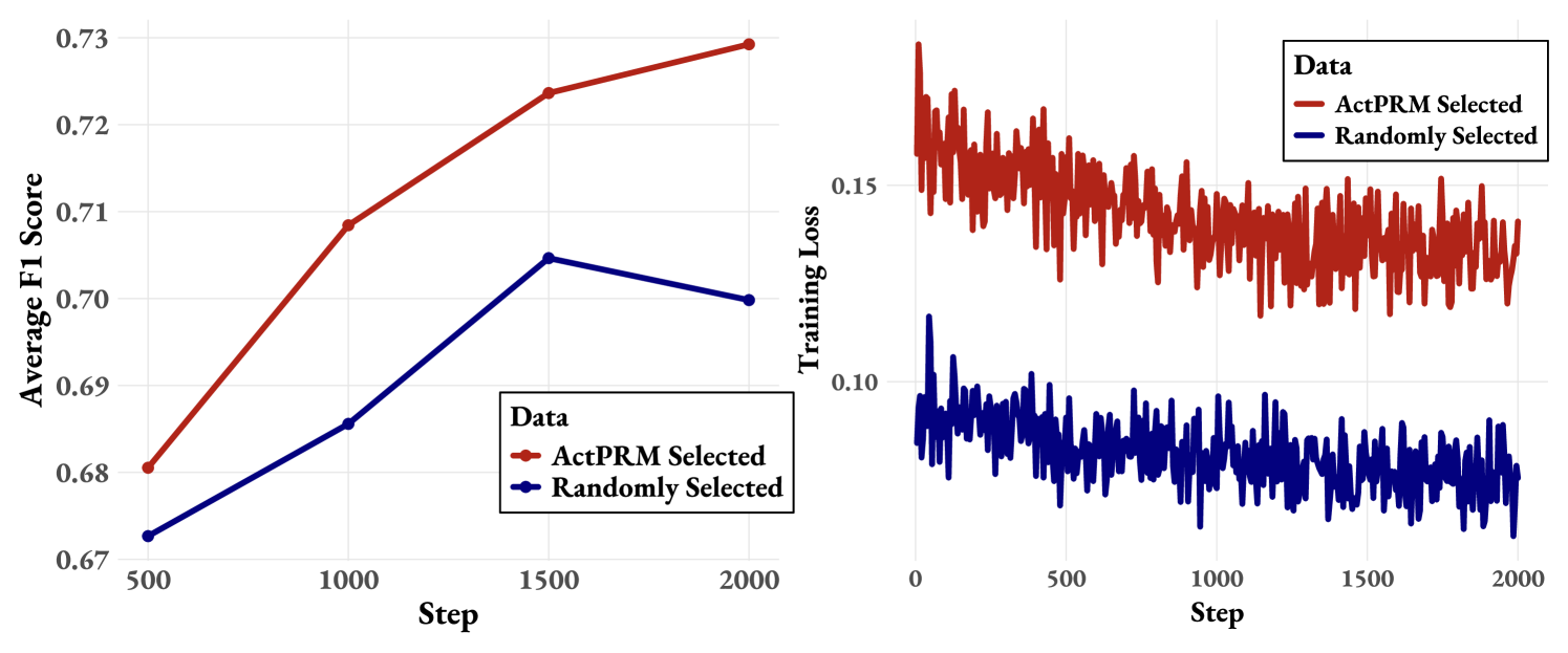
## Line Charts: Performance Comparison of ActPRM Selected vs. Randomly Selected Data
### Overview
The image contains two line charts comparing the performance of "ActPRM Selected" data against "Randomly Selected" data. The left chart displays the "Average F1 Score" over "Step" iterations, while the right chart shows the "Training Loss" over "Step" iterations. Both charts share a common x-axis ("Step") and a legend that distinguishes between the two data selection methods.
### Components/Axes
**Left Chart:**
* **Title:** Average F1 Score vs. Step
* **X-axis:**
* Label: "Step"
* Scale: 500, 1000, 1500, 2000
* **Y-axis:**
* Label: "Average F1 Score"
* Scale: 0.67, 0.68, 0.69, 0.70, 0.71, 0.72, 0.73
* **Legend:** Located in the bottom-right of the left chart.
* "ActPRM Selected" - Represented by a red line.
* "Randomly Selected" - Represented by a blue line.
**Right Chart:**
* **Title:** Training Loss vs. Step
* **X-axis:**
* Label: "Step"
* Scale: 0, 500, 1000, 1500, 2000
* **Y-axis:**
* Label: "Training Loss"
* Scale: 0.10, 0.15
* **Legend:** Located in the top-right of the right chart.
* "ActPRM Selected" - Represented by a red line.
* "Randomly Selected" - Represented by a blue line.
### Detailed Analysis
**Left Chart (Average F1 Score):**
* **ActPRM Selected (Red Line):** The line slopes upward, indicating an increasing F1 score as the step increases.
* Step 500: F1 Score ≈ 0.68
* Step 1000: F1 Score ≈ 0.71
* Step 1500: F1 Score ≈ 0.725
* Step 2000: F1 Score ≈ 0.73
* **Randomly Selected (Blue Line):** The line initially slopes upward, then plateaus and slightly decreases.
* Step 500: F1 Score ≈ 0.67
* Step 1000: F1 Score ≈ 0.69
* Step 1500: F1 Score ≈ 0.705
* Step 2000: F1 Score ≈ 0.70
**Right Chart (Training Loss):**
* **ActPRM Selected (Red Line):** The line generally slopes downward with significant fluctuations, indicating a decreasing training loss over time. The line is consistently above the "Randomly Selected" line.
* The training loss starts around 0.16 and decreases to approximately 0.135 by step 2000.
* **Randomly Selected (Blue Line):** The line slopes downward with fluctuations, indicating a decreasing training loss over time. The line is consistently below the "ActPRM Selected" line.
* The training loss starts around 0.10 and decreases to approximately 0.075 by step 2000.
### Key Observations
* In the left chart, the "ActPRM Selected" method consistently outperforms the "Randomly Selected" method in terms of Average F1 Score.
* In the right chart, the "Randomly Selected" method consistently achieves a lower Training Loss compared to the "ActPRM Selected" method.
* Both methods show a decreasing trend in Training Loss as the number of steps increases.
* The "ActPRM Selected" method shows a more pronounced increase in F1 score compared to the "Randomly Selected" method.
### Interpretation
The data suggests that while the "ActPRM Selected" method leads to a higher Average F1 Score (better performance), it also results in a higher Training Loss compared to the "Randomly Selected" method. This could indicate that the "ActPRM Selected" method is more effective at learning relevant features, but requires more computational resources or is more prone to overfitting. The "Randomly Selected" method, on the other hand, might be more stable and less resource-intensive, but at the cost of lower overall performance.
The relationship between the two charts highlights a potential trade-off between performance (F1 score) and efficiency (training loss). Depending on the specific application and constraints, one method might be preferred over the other. The trends observed suggest that both methods benefit from increased training steps, as evidenced by the decreasing training loss.