\n
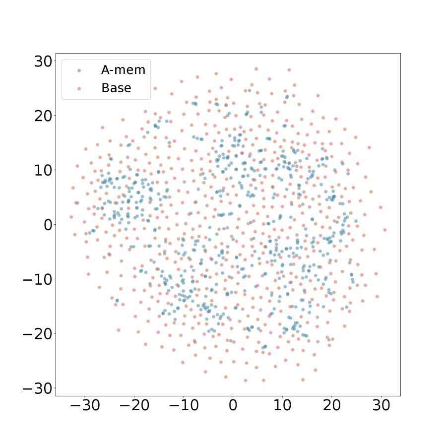
## Scatter Plot: A-mem vs. Base
### Overview
The image presents a scatter plot comparing two datasets, labeled "A-mem" and "Base". The plot displays the distribution of data points across a two-dimensional space, with both axes ranging from approximately -30 to 30. The data appears to be randomly distributed, with some clustering visible.
### Components/Axes
* **X-axis:** Ranges from approximately -30 to 30, unlabeled.
* **Y-axis:** Ranges from approximately -30 to 30, unlabeled.
* **Legend:** Located in the top-left corner.
* "A-mem" - Represented by blue dots.
* "Base" - Represented by light-red dots.
### Detailed Analysis
The plot contains a large number of data points for both "A-mem" and "Base". Due to the density of points, precise numerical values cannot be extracted without further data. However, we can describe the distribution and approximate ranges.
**A-mem (Blue Dots):**
The A-mem data points are scattered throughout the plot. The data appears to be centered around the y-axis, with a concentration of points between y = 0 and y = 10. The x-values range from approximately -25 to 25. There is a slight tendency for the points to cluster in the positive x-axis region (x > 0).
**Base (Light-Red Dots):**
The Base data points are also scattered throughout the plot. They appear to be more evenly distributed across the x-axis, ranging from approximately -30 to 20. The y-values range from approximately -25 to 25. There is a noticeable concentration of points in the negative y-axis region (y < 0).
### Key Observations
* Both datasets exhibit a wide range of values along both axes.
* The "A-mem" dataset appears to have a higher concentration of points in the upper-right quadrant (positive x and y values) compared to the "Base" dataset.
* The "Base" dataset appears to have a higher concentration of points in the lower-left quadrant (negative x and y values) compared to the "A-mem" dataset.
* There is significant overlap between the two datasets, indicating some correlation or shared characteristics.
* The data does not appear to follow any clear linear or non-linear trend.
### Interpretation
The scatter plot suggests a comparison between two sets of measurements or observations, "A-mem" and "Base". The lack of a strong trend indicates that there is no simple relationship between the two variables represented on the axes. The differing distributions of the two datasets suggest that they may represent different underlying processes or populations. The overlap between the datasets indicates that there is some degree of similarity or shared influence.
Without knowing what the axes represent, it is difficult to draw more specific conclusions. However, the plot could be used to investigate whether there are statistically significant differences between the two datasets, or to identify potential outliers or anomalies. The plot could also be used to explore the relationship between the two datasets and other variables. The data suggests that the two datasets are not entirely independent, but also not strongly correlated. Further analysis would be needed to determine the nature of their relationship.