## Scatter Plot: Comparison of "A-mem" and "Base" Data Distributions
### Overview
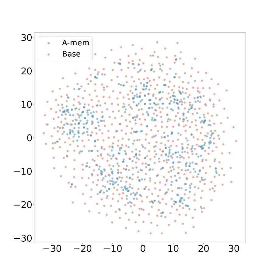
The image is a 2D scatter plot comparing the spatial distribution of two data series, labeled "A-mem" and "Base". The plot displays a large number of individual data points plotted against a common, unlabeled coordinate system. The visual suggests a comparison of clustering, spread, and central tendency between the two groups.
### Components/Axes
* **Chart Type:** Scatter Plot.
* **Legend:** Located in the top-left corner of the plot area.
* **A-mem:** Represented by blue/teal colored dots.
* **Base:** Represented by pink/salmon colored dots.
* **X-Axis:**
* **Scale:** Linear.
* **Range:** Approximately -30 to +30.
* **Major Tick Marks:** At intervals of 10 (-30, -20, -10, 0, 10, 20, 30).
* **Label:** No explicit axis title is present.
* **Y-Axis:**
* **Scale:** Linear.
* **Range:** Approximately -30 to +30.
* **Major Tick Marks:** At intervals of 10 (-30, -20, -10, 0, 10, 20, 30).
* **Label:** No explicit axis title is present.
* **Plot Area:** A square region bounded by the axes, containing all data points.
### Detailed Analysis
* **Data Series - "A-mem" (Blue/Teal Points):**
* **Spatial Distribution:** The points form a relatively dense, roughly circular cluster centered near the origin (0,0).
* **Spread:** The majority of points are concentrated within the range of approximately -15 to +15 on both axes. The density decreases noticeably towards the periphery of this range.
* **Trend/Pattern:** Shows a clear central tendency with moderate dispersion. There is no obvious linear or non-linear trend; the distribution appears isotropic (similar in all directions from the center).
* **Data Series - "Base" (Pink/Salmon Points):**
* **Spatial Distribution:** The points are much more widely and diffusely scattered across the entire plot area.
* **Spread:** Points are present across the full visible range, from approximately -30 to +30 on both axes. The density is lower than the "A-mem" series in the central region but higher in the outer regions.
* **Trend/Pattern:** Exhibits a high degree of variance with no strong central cluster. The distribution appears roughly uniform or randomly scattered within the bounded square area, with a slight visual impression of being more dispersed than a perfect uniform distribution.
* **Relative Comparison:**
* The "A-mem" series is visually nested within the broader "Base" series.
* The central region (e.g., within ±10 on both axes) is dominated by blue "A-mem" points, though pink "Base" points are also present.
* The peripheral regions (e.g., beyond ±20 on either axis) are almost exclusively populated by pink "Base" points.
### Key Observations
1. **Distinct Clustering vs. Dispersion:** The most salient feature is the stark contrast in spatial distribution. "A-mem" demonstrates tight clustering, while "Base" shows wide dispersion.
2. **Overlap Zone:** There is a significant area of overlap in the central region of the plot where both data series are present, though "A-mem" points are denser there.
3. **Boundary Effects:** The "Base" series appears to fill the entire plotted square, suggesting its data range may extend to or beyond the axis limits. The "A-mem" series is fully contained within the plot boundaries.
4. **No Apparent Correlation:** For either series individually, there is no visible correlation between the X and Y values (e.g., no diagonal banding). The points appear randomly distributed within their respective envelopes.
### Interpretation
This scatter plot likely visualizes the output of a dimensionality reduction technique (like t-SNE or PCA) applied to two different datasets or model states, projecting high-dimensional data into 2D for comparison.
* **What the data suggests:** The "A-mem" data points occupy a much smaller, more defined region of the feature space compared to the "Base" points. This implies that the entities or samples represented by "A-mem" are more similar to each other (have lower variance) in the underlying measured characteristics than those represented by "Base".
* **Relationship between elements:** The plot directly contrasts two conditions. "Base" could represent a baseline, control, or initial state with high variability. "A-mem" could represent a state after some process (e.g., training, memory consolidation, filtering) that has reduced variability and increased consistency, pulling the data points toward a central prototype or mean.
* **Notable implications:** The visualization strongly argues that the "A-mem" condition leads to a more focused and consistent representation. If this relates to a machine learning model, "A-mem" might produce more confident or specialized representations. If it relates to experimental data, "A-mem" might indicate a treatment that reduces noise or standardizes responses. The lack of axis labels is a critical limitation; the interpretation hinges on knowing what the X and Y dimensions represent (e.g., principal components, latent variables).