## Scatter Plot Series: Model Performance vs. Prior Distance
### Overview
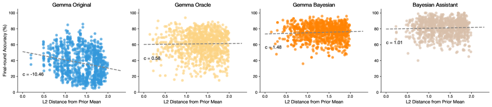
The image displays a series of four horizontally arranged scatter plots. Each plot visualizes the relationship between the "L2 Distance from Prior Mean" (x-axis) and "Few-shot Accuracy (%)" (y-axis) for a different model or method. The plots share identical axes scales and labels, allowing for direct comparison. Each plot contains a cloud of data points and a dashed trend line with an annotated slope coefficient (`c`).
### Components/Axes
* **Titles (Top-Center of each subplot):**
1. Gemma Original
2. Gemma Oracle
3. Gemma Bayesian
4. Bayesian Assistant
* **X-Axis (Bottom of each subplot):** Label: "L2 Distance from Prior Mean". Scale: Linear, from 0.0 to 2.0, with major ticks at 0.0, 0.5, 1.0, 1.5, 2.0.
* **Y-Axis (Left of each subplot):** Label: "Few-shot Accuracy (%)". Scale: Linear, from 0 to 100, with major ticks at 0, 20, 40, 60, 80, 100.
* **Data Series & Legend:** Each plot uses a distinct color for its data points, which serves as its own legend:
* Plot 1: Blue points.
* Plot 2: Yellow points.
* Plot 3: Orange points.
* Plot 4: Beige/Light Brown points.
* **Trend Lines:** A black dashed line is fitted to the data in each plot.
* **Annotations:** Each plot contains a text annotation of the form `c = [value]`, positioned near the left side of the trend line.
### Detailed Analysis
**Plot 1: Gemma Original**
* **Trend:** The dashed trend line has a clear negative slope, descending from left to right.
* **Annotation:** `c = -10.46`. This indicates a negative correlation: as L2 distance increases, few-shot accuracy tends to decrease.
* **Data Distribution:** The blue points are widely scattered. At low L2 distance (~0.2-0.5), accuracy values range broadly from ~20% to ~80%. The cloud of points drifts downward as distance increases, with fewer high-accuracy points beyond L2=1.5.
**Plot 2: Gemma Oracle**
* **Trend:** The dashed trend line is nearly horizontal, with a very slight positive slope.
* **Annotation:** `c = 0.58`. This indicates a very weak positive correlation.
* **Data Distribution:** The yellow points form a dense, broad cloud. Accuracy values are concentrated between ~40% and ~90% across the entire range of L2 distance. There is no strong visual trend of accuracy changing with distance.
**Plot 3: Gemma Bayesian**
* **Trend:** The dashed trend line has a clear positive slope, ascending from left to right.
* **Annotation:** `c = 1.48`. This indicates a positive correlation: as L2 distance increases, few-shot accuracy tends to increase.
* **Data Distribution:** The orange points show a visible upward drift. At low L2 distance, points are spread from ~30% to ~90%. At higher distances (L2 > 1.5), the density of points with accuracy >80% increases noticeably.
**Plot 4: Bayesian Assistant**
* **Trend:** The dashed trend line has the steepest positive slope among the four plots.
* **Annotation:** `c = 1.01`. This indicates a positive correlation, though the slope value is slightly lower than Gemma Bayesian's. Visually, the line appears steep due to the data distribution.
* **Data Distribution:** The beige points are densely clustered in the upper region of the plot. Most points lie between 60% and 100% accuracy. The upward trend is evident, with the lowest accuracy values becoming rarer as L2 distance increases.
### Key Observations
1. **Divergent Correlations:** The fundamental relationship between L2 distance and accuracy reverses across models. "Gemma Original" shows a negative correlation (`c = -10.46`), while the three other methods show positive correlations (`c = 0.58, 1.48, 1.01`).
2. **Performance Ceiling:** "Bayesian Assistant" and "Gemma Bayesian" show a higher density of points near the top of the accuracy scale (80-100%) compared to "Gemma Original" and "Gemma Oracle".
3. **Variance:** "Gemma Original" exhibits high variance in accuracy at any given L2 distance. "Bayesian Assistant" shows lower variance, with points more tightly clustered at higher accuracy levels.
4. **Trend Line Steepness:** While "Gemma Bayesian" has the highest annotated slope (`c=1.48`), the trend line for "Bayesian Assistant" appears visually steep because its data cloud is concentrated in the high-accuracy region, creating a strong upward pull from a high baseline.
### Interpretation
This visualization compares how different model variants perform on tasks that are "distant" from their prior knowledge (measured by L2 distance). The key insight is that **incorporating Bayesian methods fundamentally changes the model's relationship with out-of-distribution or novel data.**
* **Gemma Original** struggles with tasks far from its prior, showing a performance degradation (negative slope). This is the expected behavior for a standard model.
* **Gemma Oracle** shows almost no relationship (`c≈0`). This suggests it may have access to some form of ground truth or idealized information that neutralizes the difficulty posed by distance.
* **Gemma Bayesian** and **Bayesian Assistant** exhibit a *positive* correlation. This is a significant and non-intuitive finding. It suggests these Bayesian-inspired models not only handle distant tasks well but may actually *benefit* from or be specifically calibrated for scenarios where the task is far from the average prior. Their accuracy improves as the task becomes more "unusual" relative to the prior.
The progression from left to right illustrates a shift from a standard model that degrades on novel tasks, to Bayesian-infused models that are robust and even excel in those conditions. The "Bayesian Assistant" appears to be the most refined, achieving high accuracy with lower variance across the board. The data argues for the efficacy of Bayesian approaches in improving few-shot learning robustness and performance on distribution-shifted tasks.