\n
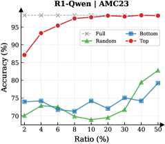
## Line Chart: Accuracy vs. Ratio for Different Data Selection Methods
### Overview
This line chart displays the accuracy of a model (likely a machine learning model) under different data selection ratios. Four data selection methods are compared: "Full", "Random", "Bottom", and "Top". The x-axis represents the "Ratio (%)" of data used, ranging from 2% to 50%, and the y-axis represents the "Accuracy (%)", ranging from approximately 60% to 98%. The chart title is "R1-Qwen | AMC23".
### Components/Axes
* **Title:** R1-Qwen | AMC23 (positioned at the top-center)
* **X-axis Label:** Ratio (%) (positioned at the bottom-center)
* Axis Markers: 2, 4, 6, 8, 10, 20, 30, 40, 50
* **Y-axis Label:** Accuracy (%) (positioned at the left-center)
* Axis Markers: 60, 65, 70, 75, 80, 85, 90, 95, 98
* **Legend:** Located in the top-right corner.
* "Full" - Grey dashed line with 'x' markers
* "Random" - Green line with triangle markers
* "Bottom" - Blue line with diamond markers
* "Top" - Red line with circle markers
### Detailed Analysis
* **Full (Grey):** The "Full" line starts at approximately 97% accuracy at 2% ratio and remains relatively flat, fluctuating around 96-97% accuracy until 50% ratio.
* **Random (Green):** The "Random" line begins at approximately 65% accuracy at 2% ratio. It generally increases with increasing ratio, showing a slight dip around 6-8% ratio, reaching approximately 82% accuracy at 50% ratio.
* **Bottom (Blue):** The "Bottom" line starts at approximately 73% accuracy at 2% ratio. It fluctuates between approximately 72% and 76% accuracy until 30% ratio, then increases to approximately 79% accuracy at 50% ratio.
* **Top (Red):** The "Top" line starts at approximately 84% accuracy at 2% ratio. It shows a strong upward trend, increasing to approximately 96% accuracy at 8% ratio, and then plateaus, remaining around 96-97% accuracy until 50% ratio.
Here's a table summarizing approximate data points:
| Ratio (%) | Full (%) | Random (%) | Bottom (%) | Top (%) |
|---|---|---|---|---|
| 2 | 97 | 65 | 73 | 84 |
| 4 | 97 | 68 | 74 | 93 |
| 6 | 97 | 66 | 72 | 95 |
| 8 | 97 | 65 | 71 | 96 |
| 10 | 97 | 67 | 73 | 96 |
| 20 | 97 | 72 | 74 | 96 |
| 30 | 97 | 75 | 75 | 96 |
| 40 | 97 | 80 | 75 | 96 |
| 50 | 97 | 82 | 79 | 96 |
### Key Observations
* The "Top" data selection method consistently achieves the highest accuracy, especially at lower ratios.
* The "Full" data selection method maintains high accuracy across all ratios.
* The "Random" and "Bottom" methods show lower accuracy compared to "Top" and "Full", with "Random" showing a more consistent increase with ratio.
* The "Bottom" method exhibits relatively stable accuracy, with minimal variation across ratios.
### Interpretation
The data suggests that selecting the "Top" performing data points (likely based on some metric) is the most effective strategy for achieving high accuracy with limited data. Using the full dataset also yields high accuracy, but the benefit of using the entire dataset diminishes as the ratio increases, as the accuracy remains relatively constant. The "Random" selection method improves with more data, but remains less accurate than the "Top" or "Full" methods. The "Bottom" method appears to be the least effective, as its accuracy remains relatively low and stable across all ratios.
The chart likely represents a scenario where data is limited, and the goal is to maximize model performance by strategically selecting a subset of the available data. The "Top" method likely identifies the most informative or representative data points, leading to better generalization and higher accuracy. The "Bottom" method, conversely, selects the least informative data points, resulting in lower accuracy. The "Full" method provides a baseline performance when all data is available. The "Random" method provides a baseline performance when data is selected without any specific criteria.