## Line Chart: Competition Level Accuracy (%)
### Overview
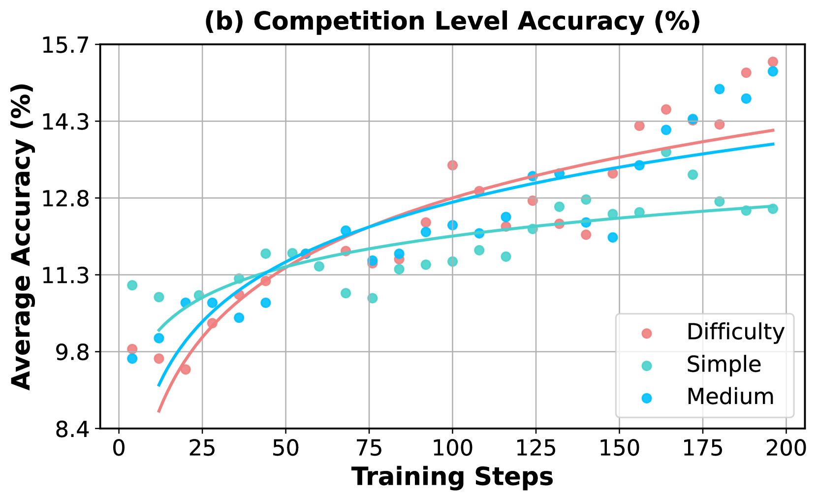
The chart illustrates the relationship between training steps and average accuracy (%) across three competition levels: Difficulty (red), Simple (teal), and Medium (blue). Data points are plotted with corresponding trend lines, showing performance progression over 200 training steps.
### Components/Axes
- **Title**: "(b) Competition Level Accuracy (%)" (top-center)
- **Y-Axis**: "Average Accuracy (%)" (left, 8.4–15.7 range)
- **X-Axis**: "Training Steps" (bottom, 0–200 range)
- **Legend**: Bottom-right corner, with color-coded labels:
- Red: Difficulty
- Teal: Simple
- Blue: Medium
### Detailed Analysis
1. **Difficulty (Red)**:
- Starts at ~9.8% accuracy at 0 steps.
- Peaks at ~14.5% at 200 steps.
- Trend line shows steady upward slope with moderate curvature.
- Data points cluster tightly around the line, with minor scatter.
2. **Medium (Blue)**:
- Begins at ~9.8% at 0 steps.
- Reaches ~14.3% at 200 steps.
- Trend line is smoother and less curved than Difficulty.
- Data points exhibit slightly more variability, especially at mid-steps (e.g., ~11.5% at 50 steps).
3. **Simple (Teal)**:
- Starts at ~11.3% at 0 steps.
- Ends at ~12.2% at 200 steps.
- Trend line has gentle upward slope with minimal curvature.
- Data points are more dispersed, with outliers at lower steps (~10.5% at 25 steps).
### Key Observations
- **Performance Trends**: All categories improve with training steps, but Difficulty shows the steepest gain (+4.7% over 200 steps vs. +0.9% for Simple).
- **Accuracy Gaps**: At 200 steps, Difficulty outperforms Medium by ~0.2% and Simple by ~2.3%.
- **Early Variability**: Simple category has lower initial accuracy but stabilizes faster than Medium/Difficulty.
- **Outliers**: Teal data points at 25 steps (~10.5%) and 75 steps (~11.0%) deviate slightly below trend lines.
### Interpretation
The data demonstrates that increased training steps correlate with higher accuracy across all competition levels. However, the **Difficulty** category achieves the highest performance gains, suggesting it may represent more complex or optimized training scenarios. The **Simple** category’s slower improvement implies inherent limitations in its training framework, despite starting with higher baseline accuracy. The **Medium** category acts as an intermediary, showing balanced progression. The tight clustering of red data points indicates consistent training efficacy for Difficulty, while teal’s dispersion highlights potential instability in simpler models. This chart underscores the importance of training duration and complexity in achieving competitive accuracy.