\n
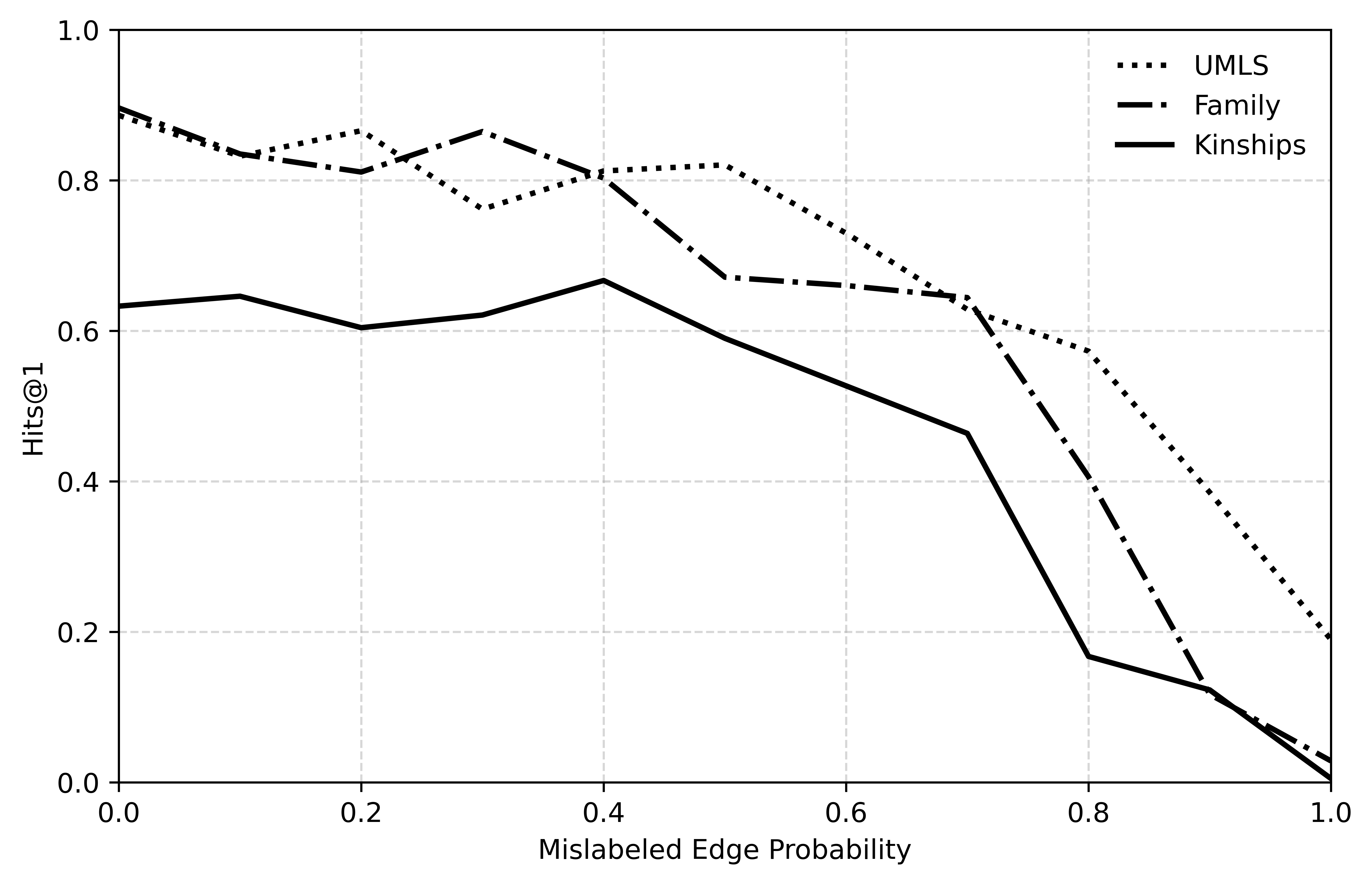
## Line Chart: Performance vs. Mislabeled Edge Probability
### Overview
This is a line chart illustrating the relationship between "Mislabeled Edge Probability" (x-axis) and a performance metric called "Hits@1" (y-axis). It compares the performance degradation of three distinct datasets or models—UMLS, Family, and Kinships—as the probability of incorrect labels in the data increases.
### Components/Axes
* **Chart Type:** Line chart with three data series.
* **X-Axis:**
* **Label:** "Mislabeled Edge Probability"
* **Scale:** Linear, ranging from 0.0 to 1.0.
* **Major Ticks:** 0.0, 0.2, 0.4, 0.6, 0.8, 1.0.
* **Y-Axis:**
* **Label:** "Hits@1"
* **Scale:** Linear, ranging from 0.0 to 1.0.
* **Major Ticks:** 0.0, 0.2, 0.4, 0.6, 0.8, 1.0.
* **Legend:** Located in the top-right corner of the plot area.
* **UMLS:** Represented by a dotted line (`...`).
* **Family:** Represented by a dash-dot line (`-.-`).
* **Kinships:** Represented by a solid line (`-`).
* **Grid:** Dashed horizontal and vertical grid lines are present at each major tick mark.
### Detailed Analysis
The chart plots the Hits@1 score against increasing levels of label noise. Below are the approximate trends and data points for each series, verified by matching line style to legend.
**1. UMLS (Dotted Line)**
* **Trend:** Starts highest, shows a general downward trend with some fluctuation, and maintains the highest performance until very high noise levels.
* **Approximate Data Points:**
* At x=0.0, y ≈ 0.90
* At x=0.2, y ≈ 0.86
* At x=0.3, y ≈ 0.77 (local dip)
* At x=0.4, y ≈ 0.81
* At x=0.5, y ≈ 0.82
* At x=0.6, y ≈ 0.73
* At x=0.7, y ≈ 0.62
* At x=0.8, y ≈ 0.58
* At x=0.9, y ≈ 0.40
* At x=1.0, y ≈ 0.19
**2. Family (Dash-Dot Line)**
* **Trend:** Starts high, dips, recovers to a peak, then begins a steady decline, crossing below the UMLS line around x=0.65.
* **Approximate Data Points:**
* At x=0.0, y ≈ 0.90
* At x=0.1, y ≈ 0.84
* At x=0.2, y ≈ 0.81
* At x=0.3, y ≈ 0.87 (peak)
* At x=0.4, y ≈ 0.81
* At x=0.5, y ≈ 0.67
* At x=0.6, y ≈ 0.66
* At x=0.7, y ≈ 0.64
* At x=0.8, y ≈ 0.40
* At x=0.9, y ≈ 0.12
* At x=1.0, y ≈ 0.03
**3. Kinships (Solid Line)**
* **Trend:** Starts significantly lower than the other two, shows a slight initial increase to a peak, then declines, with a very sharp drop-off after x=0.7.
* **Approximate Data Points:**
* At x=0.0, y ≈ 0.63
* At x=0.1, y ≈ 0.64
* At x=0.2, y ≈ 0.60
* At x=0.3, y ≈ 0.62
* At x=0.4, y ≈ 0.67 (peak)
* At x=0.5, y ≈ 0.59
* At x=0.6, y ≈ 0.53
* At x=0.7, y ≈ 0.46
* At x=0.8, y ≈ 0.17
* At x=0.9, y ≈ 0.12
* At x=1.0, y ≈ 0.00
### Key Observations
1. **Universal Degradation:** All three datasets show a clear negative correlation between Hits@1 and Mislabeled Edge Probability. Performance decreases as label noise increases.
2. **Performance Hierarchy:** At low noise (x < 0.6), UMLS and Family perform similarly and significantly better than Kinships. UMLS generally maintains the lead.
3. **Differential Robustness:** The datasets exhibit different robustness profiles. UMLS degrades most gradually. Family has a mid-range collapse. Kinships is the least robust, suffering a catastrophic drop in performance between x=0.7 and x=0.8.
4. **Convergence at High Noise:** At extreme noise levels (x > 0.9), the performance of all three models converges toward zero, with Kinships reaching it first.
### Interpretation
This chart likely evaluates the robustness of knowledge graph embedding models or link prediction algorithms on different datasets when subjected to increasing levels of incorrect training data (mislabeled edges).
* **What the data suggests:** The "Kinships" dataset appears to be the most sensitive to label noise, suggesting its underlying structure or the model's reliance on it is more fragile. The "UMLS" dataset (a medical ontology) shows the most graceful degradation, indicating either more redundant information or a model that generalizes better despite noise. The "Family" dataset shows an interesting non-monotonic response, where a small amount of noise (x=0.3) might even slightly improve performance before causing decline.
* **Relationship between elements:** The x-axis represents the independent variable (noise level), and the y-axis represents the dependent variable (model accuracy). The diverging lines highlight how the same noise level impacts different data domains unequally.
* **Notable anomaly:** The peak for "Family" at x=0.3 and for "Kinships" at x=0.4 are anomalies. In a controlled experiment, this could indicate that a very small amount of noise acts as a regularizer, preventing overfitting and slightly improving generalization before the detrimental effects of corruption dominate.
* **Practical implication:** The results argue for the importance of data cleaning and noise-robust training methods, especially for domains like kinship relation modeling which appear highly vulnerable. The choice of evaluation dataset significantly impacts conclusions about a model's robustness.