## Line Charts: Llama-3 Model Layer-wise ΔP Analysis
### Overview
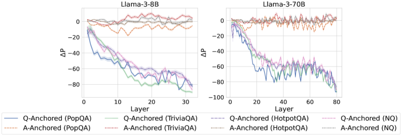
The image contains two side-by-side line charts comparing the performance change (ΔP) across layers for two different-sized language models: Llama-3-8B (left) and Llama-3-70B (right). Each chart plots multiple data series representing different question-answering datasets under two anchoring conditions: "Q-Anchored" and "A-Anchored". The charts illustrate how the performance metric ΔP evolves as information propagates through the model's layers.
### Components/Axes
* **Chart Titles:**
* Left Chart: "Llama-3-8B"
* Right Chart: "Llama-3-70B"
* **X-Axis (Both Charts):**
* Label: "Layer"
* Scale (Llama-3-8B): 0 to 30, with major ticks at 0, 10, 20, 30.
* Scale (Llama-3-70B): 0 to 80, with major ticks at 0, 20, 40, 60, 80.
* **Y-Axis (Both Charts):**
* Label: "ΔP" (Delta P)
* Scale (Llama-3-8B): -100 to 0, with major ticks at -100, -80, -60, -40, -20, 0.
* Scale (Llama-3-70B): -100 to 0, with major ticks at -100, -80, -60, -40, -20, 0.
* **Legend (Bottom of Image, spanning both charts):**
* The legend is positioned below the x-axes of both charts.
* It contains 8 entries, organized in two rows and four columns.
* **First Row (Q-Anchored, Solid Lines):**
1. `Q-Anchored (PopQA)` - Solid blue line.
2. `Q-Anchored (TriviaQA)` - Solid green line.
3. `Q-Anchored (HotpotQA)` - Solid purple line.
4. `Q-Anchored (NQ)` - Solid pink line.
* **Second Row (A-Anchored, Dashed Lines):**
1. `A-Anchored (PopQA)` - Dashed orange line.
2. `A-Anchored (TriviaQA)` - Dashed red line.
3. `A-Anchored (HotpotQA)` - Dashed gray line.
4. `A-Anchored (NQ)` - Dashed light blue/cyan line.
### Detailed Analysis
**Llama-3-8B Chart (Left):**
* **Q-Anchored Series (Solid Lines):** All four datasets (PopQA, TriviaQA, HotpotQA, NQ) show a strong, consistent downward trend. Starting near ΔP = 0 at Layer 0, they decline steeply. By Layer 30, all have dropped significantly, clustering between approximately ΔP = -70 and -90. The lines are tightly grouped, with TriviaQA (green) often appearing as the lowest (most negative) and PopQA (blue) slightly higher, but the differences are small relative to the overall drop.
* **A-Anchored Series (Dashed Lines):** All four datasets show a fundamentally different pattern. They fluctuate around ΔP = 0 across all layers, with no clear downward trend. The values oscillate roughly between -20 and +10. The lines are interwoven and do not show a consistent hierarchy.
**Llama-3-70B Chart (Right):**
* **Q-Anchored Series (Solid Lines):** The same steep downward trend is present but extends over more layers (up to 80). The decline appears slightly less smooth than in the 8B model, with more pronounced fluctuations. By Layer 80, the series converge in a range from approximately ΔP = -70 to -95. The relative ordering of the datasets is less consistent than in the 8B chart.
* **A-Anchored Series (Dashed Lines):** Similar to the 8B model, these series fluctuate around ΔP = 0 without a sustained downward trend. The range of fluctuation appears slightly wider, perhaps between -25 and +15. The lines remain interwoven.
### Key Observations
1. **Fundamental Dichotomy:** There is a stark, consistent difference between Q-Anchored and A-Anchored conditions across both model sizes. Q-Anchored performance (ΔP) degrades dramatically with layer depth, while A-Anchored performance remains stable near zero.
2. **Model Size Scaling:** The trend observed in the 8B model is replicated and extended in the larger 70B model, suggesting the phenomenon is consistent across model scales. The 70B model's chart simply has a longer x-axis (more layers).
3. **Dataset Similarity:** Within each anchoring condition (Q or A), the four different QA datasets (PopQA, TriviaQA, HotpotQA, NQ) exhibit very similar behavior. Their lines are tightly clustered, indicating the anchoring method, not the specific dataset, is the primary driver of the observed trend.
4. **Visual Noise:** The lines, especially for the A-Anchored condition and the later layers of the Q-Anchored condition in the 70B model, are jagged. This indicates high variance or noise in the ΔP measurement at individual layers.
### Interpretation
The data strongly suggests that the mechanism measured by ΔP is highly sensitive to the anchoring point in the input.
* **Q-Anchored (Question-Anchored):** The steep negative slope indicates that as information moves from the input layers (where the question is processed) toward the output layers, the model's internal state diverges significantly from the initial "question-anchored" reference point. This could represent the model transforming the question into an answer representation, a process that inherently changes the internal activation patterns.
* **A-Anchored (Answer-Anchored):** The stable, near-zero ΔP suggests that when anchored to the answer, the model's internal state remains relatively consistent across layers. This might imply that the answer representation is more stable or that the model's processing from middle to later layers is focused on refining or verifying this answer representation rather than constructing it from scratch.
* **Why It Matters:** This visualization provides empirical evidence for a fundamental difference in how large language models process information depending on the prompt structure. It highlights that the "path" from question to answer involves a significant transformation of the model's internal state (Q-Anchored decline), while the state associated with the answer itself is more preserved (A-Anchored stability). This has implications for understanding model interpretability, the flow of information in transformers, and potentially for designing more effective prompting or fine-tuning strategies. The consistency across datasets and model sizes underscores that this is a core architectural or training characteristic, not an artifact of a specific task.