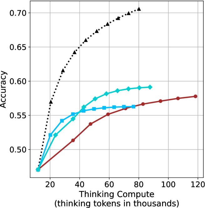
## Line Chart: Accuracy vs. Thinking Compute
### Overview
This image presents a line chart illustrating the relationship between "Thinking Compute" (measured in thousands of tokens) and "Accuracy". Four distinct data series are plotted, each represented by a different colored line with varying styles. The chart appears to demonstrate how accuracy improves with increased computational effort, with different approaches exhibiting varying degrees of efficiency.
### Components/Axes
* **X-axis:** "Thinking Compute (thinking tokens in thousands)". Scale ranges from approximately 0 to 120, with markers at 20, 40, 60, 80, 100, and 120.
* **Y-axis:** "Accuracy". Scale ranges from approximately 0.48 to 0.72, with markers at 0.50, 0.55, 0.60, 0.65, and 0.70.
* **Data Series:** Four lines are present, each with a unique color and style:
* Black dashed line (dotted-dashed)
* Light blue solid line
* Dark blue solid line with circular markers
* Red solid line with circular markers
### Detailed Analysis
Let's analyze each line individually, noting trends and approximate data points.
* **Black Dashed Line:** This line exhibits the steepest upward slope, indicating the fastest improvement in accuracy with increasing compute.
* At approximately 20 (thousands of tokens), Accuracy is around 0.52.
* At approximately 40 (thousands of tokens), Accuracy is around 0.64.
* At approximately 60 (thousands of tokens), Accuracy is around 0.68.
* At approximately 80 (thousands of tokens), Accuracy is around 0.70.
* At approximately 100 (thousands of tokens), Accuracy is around 0.71.
* **Light Blue Solid Line:** This line shows a moderate upward trend, leveling off after approximately 60 (thousands of tokens).
* At approximately 20 (thousands of tokens), Accuracy is around 0.54.
* At approximately 40 (thousands of tokens), Accuracy is around 0.57.
* At approximately 60 (thousands of tokens), Accuracy is around 0.59.
* At approximately 80 (thousands of tokens), Accuracy is around 0.59.
* At approximately 100 (thousands of tokens), Accuracy is around 0.59.
* **Dark Blue Solid Line (with circular markers):** This line demonstrates a slower, but steady, increase in accuracy.
* At approximately 20 (thousands of tokens), Accuracy is around 0.55.
* At approximately 40 (thousands of tokens), Accuracy is around 0.57.
* At approximately 60 (thousands of tokens), Accuracy is around 0.59.
* At approximately 80 (thousands of tokens), Accuracy is around 0.59.
* At approximately 100 (thousands of tokens), Accuracy is around 0.59.
* **Red Solid Line (with circular markers):** This line shows the slowest rate of improvement, with accuracy plateauing around 0.58.
* At approximately 20 (thousands of tokens), Accuracy is around 0.50.
* At approximately 40 (thousands of tokens), Accuracy is around 0.53.
* At approximately 60 (thousands of tokens), Accuracy is around 0.56.
* At approximately 80 (thousands of tokens), Accuracy is around 0.57.
* At approximately 100 (thousands of tokens), Accuracy is around 0.58.
### Key Observations
* The black dashed line consistently outperforms the other methods, achieving the highest accuracy at all compute levels.
* The light blue and dark blue lines converge, suggesting they reach a similar performance ceiling.
* The red line exhibits the lowest accuracy and the slowest improvement rate.
* Diminishing returns are apparent for all methods as compute increases, with the rate of accuracy improvement slowing down.
### Interpretation
The chart likely represents the performance of different algorithms or approaches to a problem, where "Thinking Compute" represents the computational resources allocated to problem-solving. The data suggests that the black dashed line method is the most efficient, achieving high accuracy with relatively less compute. The other methods demonstrate varying levels of efficiency, with the red line being the least effective. The plateauing of the lines indicates that there's a limit to how much accuracy can be gained by simply increasing compute, suggesting that alternative strategies or algorithmic improvements may be necessary to achieve further gains. The convergence of the light blue and dark blue lines suggests that they may be approaching a similar performance limit. This data could be used to inform resource allocation decisions, guiding developers to prioritize the most efficient methods for achieving desired accuracy levels.