TECHNICAL ASSET FINGERPRINT
a463283c63a4c6c618251b3b
Click to view fullscreen
Press ESC or click to close
FOUND IN PAPERS
EXPERT: gemini-2.0-flash VERSION 1
RUNTIME: nugit/gemini/gemini-2.0-flash
INTEL_VERIFIED
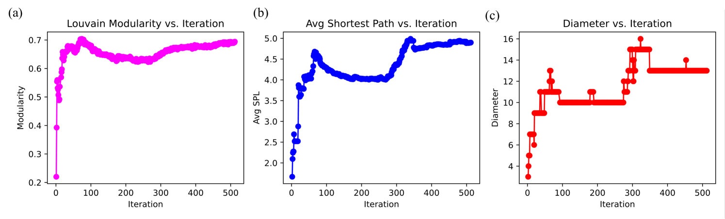
## Line Charts: Network Analysis Metrics vs. Iteration
### Overview
The image presents three line charts, each displaying a different network analysis metric (Louvain Modularity, Average Shortest Path Length, and Diameter) plotted against the number of iterations. The charts are arranged horizontally, labeled (a), (b), and (c) respectively.
### Components/Axes
**Chart (a): Louvain Modularity vs. Iteration**
* **Title:** Louvain Modularity vs. Iteration
* **Y-axis:** Modularity, ranging from 0.2 to 0.7
* **X-axis:** Iteration, ranging from 0 to 500
* **Data Series:** A single magenta line representing the Louvain Modularity.
**Chart (b): Avg Shortest Path vs. Iteration**
* **Title:** Avg Shortest Path vs. Iteration
* **Y-axis:** Avg SPL (Average Shortest Path Length), ranging from 2.0 to 5.0
* **X-axis:** Iteration, ranging from 0 to 500
* **Data Series:** A single blue line representing the Average Shortest Path Length.
**Chart (c): Diameter vs. Iteration**
* **Title:** Diameter vs. Iteration
* **Y-axis:** Diameter, ranging from 4 to 16
* **X-axis:** Iteration, ranging from 0 to 500
* **Data Series:** A single red line representing the Diameter.
### Detailed Analysis
**Chart (a): Louvain Modularity vs. Iteration**
* **Trend:** The magenta line initially increases sharply, reaching a peak around iteration 100, then decreases slightly before stabilizing around a value of approximately 0.68.
* **Data Points:**
* Iteration 0: Modularity ≈ 0.22
* Iteration 100: Modularity ≈ 0.70
* Iteration 500: Modularity ≈ 0.69
**Chart (b): Avg Shortest Path vs. Iteration**
* **Trend:** The blue line initially increases sharply, reaching a peak around iteration 50, then decreases to a local minimum around iteration 250, before increasing again and stabilizing around a value of approximately 4.9.
* **Data Points:**
* Iteration 0: Avg SPL ≈ 1.7
* Iteration 50: Avg SPL ≈ 4.7
* Iteration 250: Avg SPL ≈ 4.0
* Iteration 500: Avg SPL ≈ 4.9
**Chart (c): Diameter vs. Iteration**
* **Trend:** The red line shows a step-wise increase, with plateaus at different diameter values. It increases rapidly in the beginning, then plateaus around 10, then increases again and plateaus around 13.
* **Data Points:**
* Iteration 0: Diameter ≈ 3
* Iteration 50: Diameter ≈ 10
* Iteration 300: Diameter ≈ 15
* Iteration 500: Diameter ≈ 13
### Key Observations
* The Louvain Modularity (magenta line) reaches a relatively stable value after an initial increase.
* The Average Shortest Path Length (blue line) shows more fluctuation, with an initial increase, a decrease, and then a final increase to a stable value.
* The Diameter (red line) increases in discrete steps, indicating changes in the network's overall size or connectivity.
### Interpretation
The charts illustrate how different network properties evolve as the Louvain community detection algorithm iterates. The Louvain Modularity, which measures the quality of the community structure, quickly reaches a high value, suggesting that the algorithm effectively identifies communities early on. The Average Shortest Path Length and Diameter, which reflect the network's connectivity and size, exhibit more complex behavior, indicating that the network's structure is still evolving even after the community structure has stabilized. The step-wise increase in diameter suggests that the network is growing or becoming more interconnected in discrete stages.
DECODING INTELLIGENCE...
EXPERT: gemini-3.1-pro-preview VERSION 1
RUNTIME: gemini/gemini-3.1-pro-preview
INTEL_VERIFIED
## Multi-Panel Line Chart: Network Topology Metrics over Iterations
### Overview
This image contains three side-by-side line charts, labeled (a), (b), and (c) from left to right. The charts display the progression of three different network topology metrics—Louvain Modularity, Average Shortest Path Length (Avg SPL), and Diameter—over a series of iterations. All text in the image is in English.
### Components/Axes
**Global Elements (Shared across all charts):**
* **X-axis (Bottom):** Labeled "Iteration" on all three charts. The scale is linear, with major tick marks and labels at `0`, `100`, `200`, `300`, `400`, and `500`. The data extends slightly past the 500 mark (approximately to iteration 510-520).
**Chart (a) - Left Panel:**
* **Spatial Position:** Leftmost chart.
* **Panel Label:** "(a)" located in the top-left corner outside the chart area.
* **Title:** "Louvain Modularity vs. Iteration" located top-center above the chart.
* **Y-axis (Left):** Labeled "Modularity". The scale is linear, with major tick marks and labels at `0.2`, `0.3`, `0.4`, `0.5`, `0.6`, and `0.7`.
* **Data Series:** A single line with circular markers, colored magenta/pink.
**Chart (b) - Center Panel:**
* **Spatial Position:** Center chart.
* **Panel Label:** "(b)" located in the top-left corner outside the chart area.
* **Title:** "Avg Shortest Path vs. Iteration" located top-center above the chart.
* **Y-axis (Left):** Labeled "Avg SPL". The scale is linear, with major tick marks and labels at `2.0`, `2.5`, `3.0`, `3.5`, `4.0`, `4.5`, and `5.0`.
* **Data Series:** A single line with circular markers, colored blue.
**Chart (c) - Right Panel:**
* **Spatial Position:** Rightmost chart.
* **Panel Label:** "(c)" located in the top-left corner outside the chart area.
* **Title:** "Diameter vs. Iteration" located top-center above the chart.
* **Y-axis (Left):** Labeled "Diameter". The scale is linear, with major tick marks and labels at `4`, `6`, `8`, `10`, `12`, `14`, and `16`.
* **Data Series:** A single line with circular markers, colored red.
---
### Detailed Analysis
#### Chart (a): Louvain Modularity vs. Iteration
* **Trend Verification:** The magenta line exhibits a rapid initial ascent, reaches an early peak, experiences a shallow, prolonged dip, and then gradually climbs to a stable plateau.
* **Data Points (Approximate):**
* **Start:** At Iteration 0, the modularity starts at its lowest point, ~0.22.
* **Initial Climb:** Between iterations 0 and ~20, there is a near-vertical spike, reaching ~0.65.
* **First Peak:** The metric hits a global maximum of ~0.70 around iteration 75.
* **Trough:** From iteration 75 to ~250, the modularity slowly declines to a local minimum of ~0.62.
* **Recovery & Plateau:** From iteration 250 to 400, it climbs back up to ~0.68. From iteration 400 to the end (~510), the line plateaus, remaining highly stable just below 0.70 (approx. 0.69).
#### Chart (b): Avg Shortest Path vs. Iteration
* **Trend Verification:** The blue line shows a volatile early phase with sharp spikes and drops, followed by a gradual decline, a secondary sharp spike to a global maximum, and finally a high-level plateau.
* **Data Points (Approximate):**
* **Start:** At Iteration 0, the Avg SPL is at its lowest, ~1.7.
* **First Spike:** It rises sharply to ~3.9 around iteration 20, dips briefly to ~3.6 at iteration 30, and then spikes again to a local peak of ~4.7 around iteration 70.
* **Decline:** Between iterations 70 and 250, the Avg SPL gradually decreases, forming a shallow bowl shape that bottoms out at ~4.0.
* **Second Spike:** Between iterations 250 and 300, there is a steep climb to the global maximum of ~5.0.
* **Plateau:** After a brief drop to ~4.7 at iteration 310, the metric slowly rises and stabilizes, plateauing around ~4.9 from iteration 400 to the end (~510).
#### Chart (c): Diameter vs. Iteration
* **Trend Verification:** The red line behaves like a step function, indicating discrete integer values. It steps up rapidly, holds steady, experiences mid-iteration volatility with sharp spikes, and eventually settles into a flat plateau.
* **Data Points (Approximate):**
* **Start:** At Iteration 0, the diameter is 3.
* **Initial Steps:** Between iterations 0 and 30, it steps up rapidly through values 4, 5, 6, 7, and 9.
* **First Plateau:** It holds at 9 until iteration 50.
* **Volatility:** Around iteration 60-70, it spikes to 13, drops to 11, and holds at 11 until iteration 100.
* **Second Plateau:** From iteration 100 to ~270, it drops to and holds steady at 10 (with one brief, single-point spike to 11 around iteration 180).
* **Late Spikes:** Between iterations 270 and 320, it steps up to 11, 12, 13, spikes to 15, drops to 14, and hits a global maximum of 16.
* **Final Plateau:** It holds at 15 until iteration 350, then drops to 13. From iteration 350 to the end (~510), it forms a solid plateau at 13 (with one brief, single-point spike to 14 around iteration 450).
---
### Key Observations
1. **Convergence:** All three metrics show significant volatility in the first 350 iterations but reach a state of equilibrium or plateau between iterations 350 and 500.
2. **Correlated Volatility:** The major shifts in the network occur in similar phases. For example, around iteration 250-300, Modularity begins to recover (Chart a), Avg SPL spikes dramatically (Chart b), and Diameter experiences its highest volatility and peak (Chart c).
3. **Discrete vs. Continuous:** While Modularity and Avg SPL are continuous floating-point metrics (showing smooth curves between points), Diameter is strictly an integer metric, resulting in the rigid, stepped visual appearance of Chart (c).
### Interpretation
These charts likely represent the evolution of a network graph undergoing an iterative algorithm, such as a community detection process (explicitly named "Louvain" in chart a), a network pruning process, or a generative growth model.
* **Modularity (Chart a):** The rapid increase in modularity indicates that the algorithm is successfully finding and isolating dense communities (clusters) within the network. The high final plateau (~0.69) suggests a network with very strong community structure (dense internal connections, sparse external connections).
* **Avg Shortest Path & Diameter (Charts b & c):** As the network becomes more modular, the average distance between any two random nodes (Avg SPL) and the maximum distance between the two furthest nodes (Diameter) both increase significantly.
* **Synthesis:** Reading between the lines, the data demonstrates a structural trade-off. As the algorithm forces the network into distinct, tight-knit communities (high modularity), it likely removes or stretches the "bridge" edges that connect these different communities. Consequently, traversing the network from one community to another takes more steps, driving up both the average shortest path and the overall diameter of the graph. The stabilization of all three metrics after iteration 350 indicates that the algorithm has converged on a final, optimized network topology.
DECODING INTELLIGENCE...
EXPERT: gemma-3-27b-it-free VERSION 1
RUNTIME: google-free/gemma-3-27b-it
INTEL_VERIFIED
\n
## Charts: Network Community Detection Metrics vs. Iteration
### Overview
The image presents three separate line charts (labeled a, b, and c) illustrating the evolution of network community detection metrics – Louvain Modularity, Average Shortest Path Length, and Network Diameter – as a function of iteration number. Each chart displays a single data series with error bars (in chart c).
### Components/Axes
Each chart shares a common x-axis labeled "Iteration," ranging from 0 to 500. The y-axis labels and scales differ for each chart:
* **(a) Louvain Modularity vs. Iteration:** Y-axis labeled "Modularity," ranging from 0.2 to 0.7.
* **(b) Avg Shortest Path vs. Iteration:** Y-axis labeled "Avg SPL" (Average Shortest Path Length), ranging from 2.0 to 5.0.
* **(c) Diameter vs. Iteration:** Y-axis labeled "Diameter," ranging from 4 to 16.
There are no explicit legends, but the chart titles clearly indicate the data series being plotted.
### Detailed Analysis or Content Details
**Chart (a): Louvain Modularity vs. Iteration**
The line, colored red, initially decreases from approximately 0.68 at iteration 0 to a minimum of around 0.62 at iteration 50. It then fluctuates between approximately 0.62 and 0.68 for the remainder of the iterations, showing a relatively stable modularity value.
**Chart (b): Avg Shortest Path vs. Iteration**
The line, colored blue, starts at approximately 4.2 at iteration 0 and decreases to a minimum of around 3.8 at iteration 100. It then increases, reaching a maximum of approximately 4.6 at iteration 500. The trend is generally upward after the initial decrease.
**Chart (c): Diameter vs. Iteration**
The line, colored red, represents the average diameter, and the error bars indicate the standard deviation. The diameter starts at approximately 11.5 at iteration 0, decreases to a minimum of around 9.5 at iteration 100, and then increases to approximately 13 at iteration 400. There is a slight decrease to around 12.5 at iteration 500. The error bars are relatively consistent throughout, ranging from approximately 1 to 2.
### Key Observations
* **Modularity:** The Louvain Modularity appears to stabilize after an initial decrease, suggesting the community structure converges.
* **Average Shortest Path:** The Average Shortest Path Length initially decreases and then increases, potentially indicating a change in network connectivity.
* **Diameter:** The Diameter exhibits a similar pattern to the Average Shortest Path Length, decreasing initially and then increasing, which is consistent with changes in network connectivity.
* **Error Bars:** The consistent error bars in Chart (c) suggest that the diameter measurements are relatively stable across iterations.
### Interpretation
These charts likely represent the results of a community detection algorithm (Louvain) applied to a dynamic network. The iteration number could correspond to steps in a network evolution process or iterations of the Louvain algorithm itself.
The initial decrease in modularity, average shortest path length, and diameter suggests that the network is initially becoming more tightly connected and organized into communities. The subsequent stabilization of modularity and the increase in average shortest path length and diameter could indicate that the network is evolving towards a state where communities are more distinct, and the overall network connectivity is increasing.
The error bars in the diameter plot suggest that the network structure is relatively stable, despite the observed changes in diameter. The fluctuations in modularity suggest that the community structure is not entirely fixed, even after the initial convergence.
The relationship between these metrics is important for understanding the network's structure and dynamics. A decrease in average shortest path length and diameter typically indicates a more efficient network, while an increase in modularity suggests a stronger community structure. The observed patterns suggest a complex interplay between these factors as the network evolves.
DECODING INTELLIGENCE...
EXPERT: healer-alpha-free VERSION 1
RUNTIME: free/openrouter/healer-alpha
INTEL_VERIFIED
## [Multi-Panel Line Chart]: Network Metric Evolution Over Iterations
### Overview
The image displays three separate line charts arranged horizontally, labeled (a), (b), and (c). Each chart plots a different network metric against the number of iterations (from 0 to 500) of an algorithm, likely a community detection or network optimization process. The charts share a common x-axis but have different y-axes and data series colors.
### Components/Axes
* **Common X-Axis (All Charts):**
* **Label:** `Iteration`
* **Scale:** Linear, from 0 to 500.
* **Major Tick Marks:** 0, 100, 200, 300, 400, 500.
* **Chart (a) - Left Panel:**
* **Title:** `Louvain Modularity vs. Iteration`
* **Y-Axis Label:** `Modularity`
* **Y-Axis Scale:** Linear, from 0.2 to 0.7.
* **Data Series:** Magenta line with circular markers.
* **Chart (b) - Center Panel:**
* **Title:** `Avg Shortest Path vs. Iteration`
* **Y-Axis Label:** `Avg SPL` (presumably Average Shortest Path Length)
* **Y-Axis Scale:** Linear, from 2.0 to 5.0.
* **Data Series:** Blue line with circular markers.
* **Chart (c) - Right Panel:**
* **Title:** `Diameter vs. Iteration`
* **Y-Axis Label:** `Diameter`
* **Y-Axis Scale:** Linear, from 4 to 16.
* **Data Series:** Red line with circular markers.
### Detailed Analysis
**Chart (a) - Louvain Modularity:**
* **Trend:** The magenta line shows a very rapid, near-vertical increase from a low starting point, followed by a period of high-frequency fluctuation and a gradual, noisy ascent to a plateau.
* **Data Points (Approximate):**
* Iteration 0: Modularity ≈ 0.22
* Iteration ~10: Sharp rise to ≈ 0.65
* Iteration ~50: Reaches a local peak near 0.70
* Iteration 100-300: Fluctuates between ≈ 0.63 and 0.68
* Iteration 300-500: Gradually climbs and stabilizes near 0.70.
**Chart (b) - Average Shortest Path Length (Avg SPL):**
* **Trend:** The blue line exhibits a steep initial increase, a distinct peak, a subsequent decline to a trough, and then a final rise to a stable high value.
* **Data Points (Approximate):**
* Iteration 0: Avg SPL ≈ 1.7
* Iteration ~50: Sharp rise to a peak of ≈ 4.7
* Iteration ~150: Declines to a trough of ≈ 4.0
* Iteration ~300: Rises again to ≈ 5.0
* Iteration 350-500: Stabilizes with minor fluctuations around 4.9.
**Chart (c) - Network Diameter:**
* **Trend:** The red line demonstrates a step-like, discontinuous increase. It features sharp vertical jumps followed by extended horizontal plateaus.
* **Data Points (Approximate):**
* Iteration 0: Diameter = 3
* Iteration ~10: Jumps to 7
* Iteration ~20: Jumps to 9
* Iteration ~30: Jumps to 11
* Iteration ~50: Jumps to 13
* Iteration ~80-280: Plateaus at 10 (with a brief spike to 11 around iteration 180)
* Iteration ~290: Jumps to 12
* Iteration ~300: Jumps to 15
* Iteration ~350-500: Drops to and stabilizes at 13.
### Key Observations
1. **Phase Transition:** All three metrics undergo dramatic changes within the first 100 iterations, suggesting a rapid restructuring of the network.
2. **Modularity vs. Path Length Correlation:** The initial spike in modularity (a) coincides with the spike in average shortest path length (b). This is a known trade-off in community detection: forming tight communities can increase the distance between nodes in different communities.
3. **Diameter Behavior:** The diameter (c) shows the most discrete, step-wise changes, indicating specific iterations where the longest shortest path in the network increases or decreases abruptly.
4. **Convergence:** All three metrics appear to reach a relatively stable state after approximately 350-400 iterations, suggesting the algorithm has converged.
### Interpretation
This set of charts visualizes the evolution of a network's structural properties during an iterative optimization process, likely the Louvain method for community detection.
* **What the data suggests:** The process successfully increases modularity (a measure of community strength) from a low value to a high, stable value (~0.7). However, this comes at the cost of increasing the average distance between nodes (Avg SPL) and the overall network diameter, especially in the early phases. The step-like changes in diameter are particularly insightful, revealing critical moments where the global connectivity of the network is reconfigured.
* **How elements relate:** The three metrics are interconnected. As the algorithm partitions the network into more defined communities (rising modularity), it initially makes the network more "stretched" (rising SPL and diameter). The later dip in SPL while modularity remains high might indicate a secondary optimization phase where inter-community connections are refined without breaking apart the communities.
* **Notable anomalies:** The temporary drop in diameter to 10 between iterations ~80-280, while modularity and SPL are still evolving, is interesting. It suggests a period where the network became more compact globally, even as its community structure was still being optimized. The final stabilization of all metrics indicates a robust, final community structure has been found.
DECODING INTELLIGENCE...
EXPERT: nemotron-free VERSION 1
RUNTIME: free/nvidia/nemotron-nano-12b-v2-vl:free
INTEL_VERIFIED
## Line Graphs: Metric Evolution vs. Iteration
### Overview
The image contains three vertically stacked line graphs (a, b, c) depicting the evolution of three network metrics (Louvain Modularity, Average Shortest Path Length, and Diameter) across 500 iterations. Each graph uses a distinct color-coded line to represent its metric.
### Components/Axes
**Subplot (a): Louvain Modularity vs. Iteration**
- **Y-axis**: Modularity (0.2–0.7, increments of 0.1)
- **X-axis**: Iteration (0–500, increments of 100)
- **Legend**: Magenta line labeled "Modularity"
**Subplot (b): Avg Shortest Path vs. Iteration**
- **Y-axis**: Avg SSPL (2.0–5.0, increments of 0.5)
- **X-axis**: Iteration (0–500, increments of 100)
- **Legend**: Blue line labeled "Avg SSPL"
**Subplot (c): Diameter vs. Iteration**
- **Y-axis**: Diameter (4–16, increments of 2)
- **X-axis**: Iteration (0–500, increments of 100)
- **Legend**: Red line labeled "Diameter"
### Detailed Analysis
**Subplot (a) Trends**:
- Modularity starts at ~0.2 (iteration 0), spikes to ~0.7 by iteration 50, then fluctuates between ~0.6–0.7 until iteration 500.
- Sharp initial increase suggests rapid community structure formation, followed by stabilization.
**Subplot (b) Trends**:
- Avg SSPL begins at ~4.5 (iteration 0), drops to ~3.0 by iteration 100, rises to ~4.5 by iteration 300, then stabilizes near ~4.8.
- U-shaped pattern indicates initial network fragmentation, followed by community-driven connectivity.
**Subplot (c) Trends**:
- Diameter starts at ~4 (iteration 0), increases to ~12 by iteration 100, drops to ~10 by iteration 200, spikes to ~16 by iteration 300, then declines to ~12 by iteration 500.
- Volatile pattern reflects temporary network expansion/contraction during community optimization.
### Key Observations
1. **Modularity Stabilization**: Modularity plateaus after iteration 100, suggesting convergence of community detection.
2. **SSPL-U Pattern**: Avg SSPL’s U-shape implies initial network disintegration followed by community-driven reconnection.
3. **Diameter Peaks**: Diameter’s peak at iteration 300 (~16) indicates a temporary maximum network spread before stabilization.
### Interpretation
The graphs collectively illustrate the dynamic behavior of a network optimization process:
- **Louvain Modularity**’s rapid rise and stabilization demonstrate effective community detection, with diminishing returns after iteration 100.
- **Avg SSPL**’s U-shaped curve suggests the network initially becomes more fragmented (lower SSPL) as communities form, then reconnects via community-level links (higher SSPL).
- **Diameter**’s volatility highlights transient network expansion/contraction, with the largest spread occurring at iteration 300. This could reflect temporary community boundary adjustments before final stabilization.
The metrics are inversely related: high modularity (a) correlates with lower Avg SSPL (b) and smaller diameter (c), consistent with community-driven network compaction. The iteration 300 peak in diameter may indicate a transitional phase where community structures are reorganizing before settling into a stable configuration.
DECODING INTELLIGENCE...