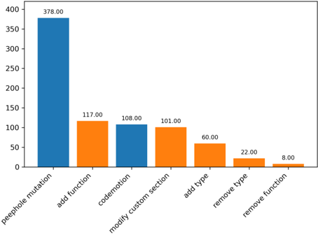
## Bar Chart: Operation Frequency
### Overview
The image is a bar chart displaying the frequency of different operations. The x-axis represents the operation types, and the y-axis represents the frequency of each operation. The bars are colored either blue or orange.
### Components/Axes
* **X-axis:** Operation types (peephole mutation, add function, codemotion, modify custom section, add type, remove type, remove function).
* **Y-axis:** Frequency (implied, but not explicitly labeled). The scale ranges from 0 to approximately 400.
* **Bar Colors:** Blue and Orange.
### Detailed Analysis
Here's a breakdown of the frequency for each operation:
* **peephole mutation:** Blue bar, frequency = 378.00
* **add function:** Orange bar, frequency = 117.00
* **codemotion:** Blue bar, frequency = 108.00
* **modify custom section:** Orange bar, frequency = 101.00
* **add type:** Orange bar, frequency = 60.00
* **remove type:** Orange bar, frequency = 22.00
* **remove function:** Orange bar, frequency = 8.00
### Key Observations
* "peephole mutation" has a significantly higher frequency than all other operations.
* The frequency decreases from left to right, with "remove function" having the lowest frequency.
* The bars alternate in color between blue and orange.
### Interpretation
The chart indicates the relative prevalence of different operations. "peephole mutation" is by far the most frequent operation, suggesting it is a critical or commonly used function. The "remove function" operation is the least frequent, implying it is either rarely needed or highly optimized. The alternating colors of the bars do not appear to have any specific meaning related to the data itself. The data suggests a focus on mutation operations, with less emphasis on removal operations.