## Line Chart: Explained Variance over Training Steps
### Overview
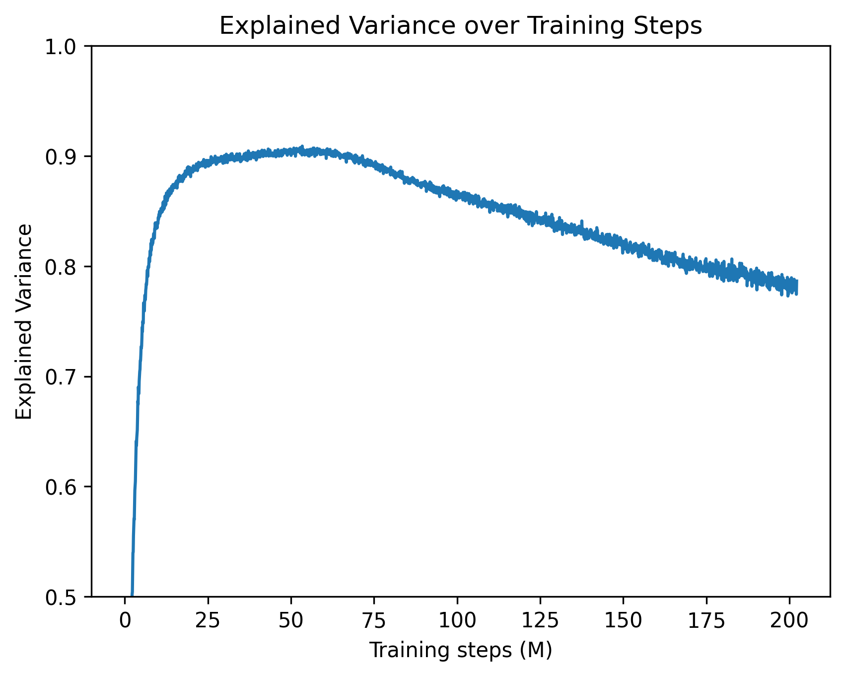
The image is a single-line chart plotting the "Explained Variance" of a model or system against the number of "Training steps (M)". The chart demonstrates a non-linear relationship where the explained variance increases rapidly at the beginning of training, reaches a peak, and then gradually declines as training continues.
### Components/Axes
* **Title:** "Explained Variance over Training Steps" (centered at the top).
* **X-Axis (Horizontal):**
* **Label:** "Training steps (M)" (centered below the axis). The "(M)" indicates the unit is millions of steps.
* **Scale:** Linear scale from 0 to 200.
* **Major Tick Marks:** At 0, 25, 50, 75, 100, 125, 150, 175, and 200.
* **Y-Axis (Vertical):**
* **Label:** "Explained Variance" (rotated 90 degrees, centered to the left of the axis).
* **Scale:** Linear scale from 0.5 to 1.0.
* **Major Tick Marks:** At 0.5, 0.6, 0.7, 0.8, 0.9, and 1.0.
* **Data Series:** A single, somewhat noisy blue line representing the explained variance metric over time. There is no legend, as only one series is plotted.
### Detailed Analysis
The data series follows a distinct three-phase trend:
1. **Rapid Ascent (0 to ~25M steps):** The line starts at approximately 0.5 (the bottom of the y-axis) at 0 steps. It exhibits a very steep, near-vertical climb, reaching an explained variance of ~0.85 by 25 million steps.
2. **Peak and Plateau (~25M to ~60M steps):** The rate of increase slows dramatically. The line curves and forms a broad peak. The maximum explained variance is achieved in this region, visually estimated at **~0.905** (±0.005). This peak appears to occur between 50 and 60 million training steps.
3. **Gradual Decline (~60M to 200M steps):** After the peak, the line begins a steady, linear decline. The slope is negative but much shallower than the initial ascent. By the end of the plotted data at 200 million steps, the explained variance has fallen to approximately **0.78** (±0.01). The line also shows increased high-frequency noise or variance in its measurements during this decline phase.
**Approximate Key Data Points:**
* At 0 M steps: Explained Variance ≈ 0.50
* At 25 M steps: Explained Variance ≈ 0.85
* At 50 M steps (near peak): Explained Variance ≈ 0.905
* At 100 M steps: Explained Variance ≈ 0.86
* At 150 M steps: Explained Variance ≈ 0.82
* At 200 M steps: Explained Variance ≈ 0.78
### Key Observations
* **Optimal Training Point:** The model's performance, as measured by explained variance, is maximized between 50 and 60 million training steps.
* **Overtraining Signal:** The consistent decline after ~60M steps is a classic visual indicator of potential overtraining or overfitting, where additional training on the same data begins to degrade the model's generalizable performance.
* **Noise Increase:** The thickness/noise of the line increases during the decline phase, suggesting the metric becomes less stable or more variable as training progresses beyond the optimum.
* **Asymmetric Curve:** The rise to peak performance is much faster than the subsequent decline.
### Interpretation
This chart illustrates a fundamental concept in machine learning model training: the trade-off between underfitting and overfitting. The initial rapid rise shows the model quickly learning the dominant patterns in the data. The peak represents the point of optimal generalization, where the model has captured the signal without fitting too much noise. The subsequent decline indicates that prolonged training is causing the model to overfit to the specific training dataset, losing its ability to explain variance in new, unseen data. The increasing noise in the metric during the decline phase further supports this, as the model's predictions become more erratic. For a practitioner, this chart is a clear directive to implement **early stopping** around the 50-60 million step mark to preserve model performance.