TECHNICAL ASSET FINGERPRINT
a4b7d0dfceb624bb8cd9477c
Click to view fullscreen
Press ESC or click to close
FOUND IN PAPERS
EXPERT: healer-alpha-free VERSION 1
RUNTIME: free/openrouter/healer-alpha
INTEL_VERIFIED
\n
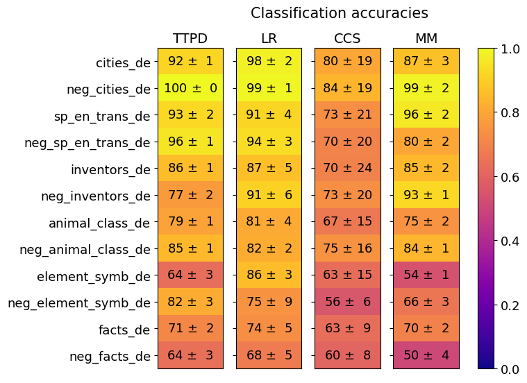
## Heatmap: Classification Accuracies of Four Methods Across Twelve Datasets
### Overview
The image is a heatmap titled "Classification accuracies." It visually compares the performance (accuracy) of four different classification methods (TTPD, LR, CCS, MM) across twelve distinct datasets. Performance is represented by both a numerical value (accuracy percentage ± uncertainty) and a color gradient, where yellow indicates high accuracy (close to 1.0 or 100%) and dark purple indicates low accuracy (close to 0.0 or 0%).
### Components/Axes
* **Title:** "Classification accuracies" (centered at the top).
* **Y-axis (Rows):** Lists twelve dataset names. From top to bottom:
1. `cities_de`
2. `neg_cities_de`
3. `sp_en_trans_de`
4. `neg_sp_en_trans_de`
5. `inventors_de`
6. `neg_inventors_de`
7. `animal_class_de`
8. `neg_animal_class_de`
9. `element_symb_de`
10. `neg_element_symb_de`
11. `facts_de`
12. `neg_facts_de`
* **X-axis (Columns):** Lists four method abbreviations. From left to right:
1. `TTPD`
2. `LR`
3. `CCS`
4. `MM`
* **Color Scale/Legend:** Positioned on the far right of the chart. It is a vertical bar showing a gradient from dark purple (bottom, labeled `0.0`) to bright yellow (top, labeled `1.0`). Intermediate ticks are at `0.2`, `0.4`, `0.6`, and `0.8`. This scale maps the color of each cell to a numerical accuracy value between 0 and 1.
* **Data Cells:** A 12x4 grid. Each cell contains the mean accuracy and its uncertainty (standard deviation or error) formatted as `XX ± Y`. The cell's background color corresponds to the mean accuracy value according to the legend.
### Detailed Analysis
Below is the extracted data for each dataset (row), listed by method (column). Values are accuracy percentages ± uncertainty.
**Row 1: `cities_de`**
* TTPD: `92 ± 1` (Bright Yellow)
* LR: `98 ± 2` (Bright Yellow)
* CCS: `80 ± 19` (Orange)
* MM: `87 ± 3` (Yellow-Orange)
**Row 2: `neg_cities_de`**
* TTPD: `100 ± 0` (Bright Yellow)
* LR: `99 ± 1` (Bright Yellow)
* CCS: `84 ± 19` (Orange)
* MM: `99 ± 2` (Bright Yellow)
**Row 3: `sp_en_trans_de`**
* TTPD: `93 ± 2` (Bright Yellow)
* LR: `91 ± 4` (Bright Yellow)
* CCS: `73 ± 21` (Orange-Red)
* MM: `96 ± 2` (Bright Yellow)
**Row 4: `neg_sp_en_trans_de`**
* TTPD: `96 ± 1` (Bright Yellow)
* LR: `94 ± 3` (Bright Yellow)
* CCS: `70 ± 20` (Orange-Red)
* MM: `80 ± 2` (Orange)
**Row 5: `inventors_de`**
* TTPD: `86 ± 1` (Yellow)
* LR: `87 ± 5` (Yellow)
* CCS: `70 ± 24` (Orange-Red)
* MM: `85 ± 2` (Yellow)
**Row 6: `neg_inventors_de`**
* TTPD: `77 ± 2` (Orange)
* LR: `91 ± 6` (Bright Yellow)
* CCS: `73 ± 20` (Orange-Red)
* MM: `93 ± 1` (Bright Yellow)
**Row 7: `animal_class_de`**
* TTPD: `79 ± 1` (Orange)
* LR: `81 ± 4` (Orange-Yellow)
* CCS: `67 ± 15` (Red-Orange)
* MM: `75 ± 2` (Orange)
**Row 8: `neg_animal_class_de`**
* TTPD: `85 ± 1` (Yellow)
* LR: `82 ± 2` (Orange-Yellow)
* CCS: `75 ± 16` (Orange)
* MM: `84 ± 1` (Yellow)
**Row 9: `element_symb_de`**
* TTPD: `64 ± 3` (Red-Orange)
* LR: `86 ± 3` (Yellow)
* CCS: `63 ± 15` (Red-Orange)
* MM: `54 ± 1` (Red-Purple)
**Row 10: `neg_element_symb_de`**
* TTPD: `82 ± 3` (Orange-Yellow)
* LR: `75 ± 9` (Orange)
* CCS: `56 ± 6` (Red-Purple)
* MM: `66 ± 3` (Red-Orange)
**Row 11: `facts_de`**
* TTPD: `71 ± 2` (Orange-Red)
* LR: `74 ± 5` (Orange)
* CCS: `63 ± 9` (Red-Orange)
* MM: `70 ± 2` (Orange-Red)
**Row 12: `neg_facts_de`**
* TTPD: `64 ± 3` (Red-Orange)
* LR: `68 ± 5` (Red-Orange)
* CCS: `60 ± 8` (Red-Orange)
* MM: `50 ± 4` (Purple-Red)
### Key Observations
1. **Method Performance Hierarchy:** LR and TTPD consistently achieve the highest accuracies across most datasets, frequently scoring in the 90s. MM shows high performance on several datasets but is more variable. CCS generally has the lowest mean accuracies and the highest uncertainty (largest ± values).
2. **Dataset Difficulty:** The `element_symb_de` and `neg_facts_de` datasets appear to be the most challenging, with multiple methods scoring in the 50s and 60s. Conversely, `cities_de` and `neg_cities_de` are the easiest, with near-perfect scores from multiple methods.
3. **"Neg" Prefix Pattern:** For many dataset pairs (e.g., `cities_de` vs. `neg_cities_de`), the version with the "neg_" prefix often shows equal or higher accuracy for the top-performing methods (TTPD, LR, MM). This is particularly stark for `neg_inventors_de` (MM: 93) vs. `inventors_de` (MM: 85).
4. **Uncertainty (±):** The CCS method exhibits very high uncertainty on many datasets (e.g., `± 24` on `inventors_de`), suggesting its performance is highly variable or the evaluation had high variance. In contrast, TTPD and MM often have low uncertainty (± 0 to ± 3).
5. **Color-Value Correlation:** The color gradient accurately reflects the numerical values. Cells with accuracies in the 90s are bright yellow, those in the 70s-80s are orange/yellow-orange, those in the 60s are red-orange, and the lowest values (50s) approach purple.
### Interpretation
This heatmap provides a comparative benchmark of four classification methods. The data suggests that **LR (Logistic Regression?) and TTPD are the most robust and accurate methods** across this diverse set of tasks, which appear to be related to German language data (indicated by the `_de` suffix) involving cities, translations, inventors, animal classification, chemical element symbols, and general facts.
The consistently high performance on "neg_" datasets is intriguing. It may indicate that the negative examples in these tasks are more easily distinguishable or that the methods are particularly well-suited for the type of classification boundary presented by the negative sets. The poor and uncertain performance of CCS on several tasks suggests it may be less suitable for this domain or requires different tuning.
The visualization effectively uses a heatmap to allow for quick visual comparison. A viewer can instantly identify the best-performing method for any dataset (brightest yellow cell in a row) and the most difficult datasets (rows with generally darker colors). The inclusion of uncertainty values adds critical context, showing that while CCS's mean accuracy might sometimes be close to another method, its results are far less reliable. This chart would be essential for a researcher selecting a model for one of these specific German-language classification tasks.
DECODING INTELLIGENCE...