## Chart Type: Pie Chart of Text Categories
### Overview
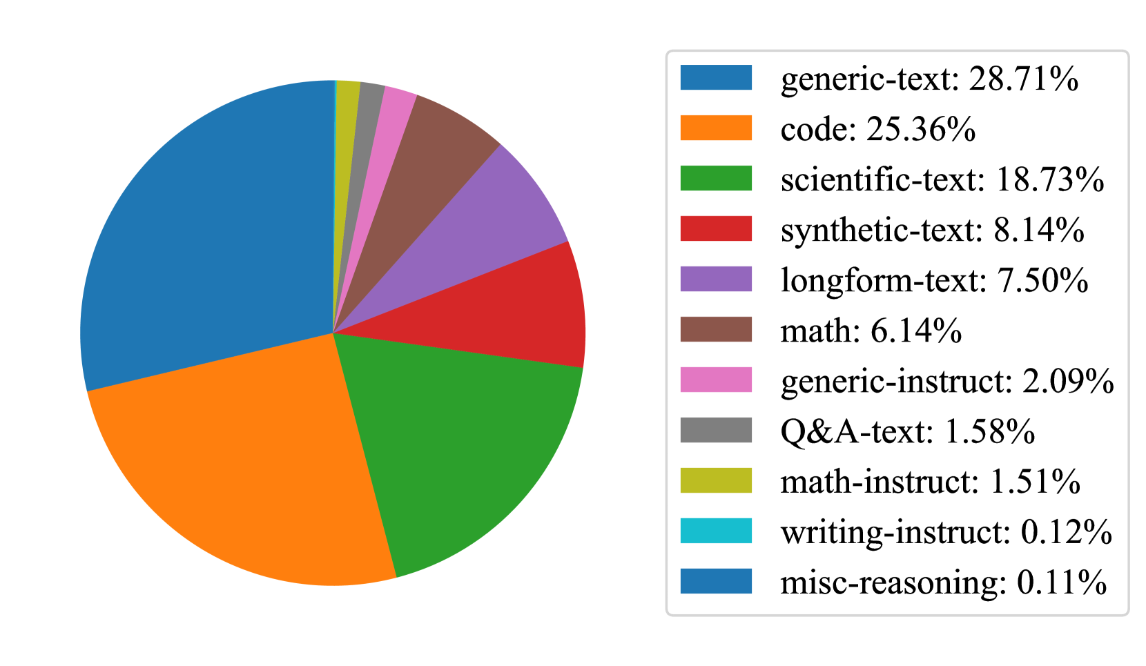
The image is a pie chart illustrating the distribution of different categories of text. The chart shows the percentage breakdown of each category, with "generic-text" and "code" representing the largest portions. The legend on the right side of the chart maps each text category to a specific color.
### Components/Axes
* **Chart Type:** Pie Chart
* **Categories:**
* generic-text
* code
* scientific-text
* synthetic-text
* longform-text
* math
* generic-instruct
* Q&A-text
* math-instruct
* writing-instruct
* misc-reasoning
* **Legend:** Located on the right side of the pie chart. Each category is associated with a specific color.
* Blue: generic-text: 28.71%
* Orange: code: 25.36%
* Green: scientific-text: 18.73%
* Red: synthetic-text: 8.14%
* Purple: longform-text: 7.50%
* Brown: math: 6.14%
* Pink: generic-instruct: 2.09%
* Gray: Q&A-text: 1.58%
* Yellow: math-instruct: 1.51%
* Teal: writing-instruct: 0.12%
* Dark Blue: misc-reasoning: 0.11%
### Detailed Analysis
The pie chart is divided into slices, each representing a different category of text. The size of each slice corresponds to the percentage of that category.
* **generic-text:** (Blue) 28.71% - Largest slice
* **code:** (Orange) 25.36% - Second largest slice
* **scientific-text:** (Green) 18.73%
* **synthetic-text:** (Red) 8.14%
* **longform-text:** (Purple) 7.50%
* **math:** (Brown) 6.14%
* **generic-instruct:** (Pink) 2.09%
* **Q&A-text:** (Gray) 1.58%
* **math-instruct:** (Yellow) 1.51%
* **writing-instruct:** (Teal) 0.12%
* **misc-reasoning:** (Dark Blue) 0.11% - Smallest slice
### Key Observations
* "generic-text" and "code" constitute the majority of the text categories, accounting for over half of the total distribution.
* "scientific-text" is the third largest category, representing a significant portion of the distribution.
* The remaining categories each represent a relatively small percentage of the total.
* "writing-instruct" and "misc-reasoning" are the smallest categories, with percentages close to zero.
### Interpretation
The pie chart provides a clear visualization of the distribution of different text categories. The dominance of "generic-text" and "code" suggests that these types of text are the most prevalent in the dataset being analyzed. The relatively small percentages of "writing-instruct" and "misc-reasoning" indicate that these categories are less common. The data suggests a diverse range of text types, with a concentration in generic and code-related content.