\n
## Pie Chart: Data Distribution by Category
### Overview
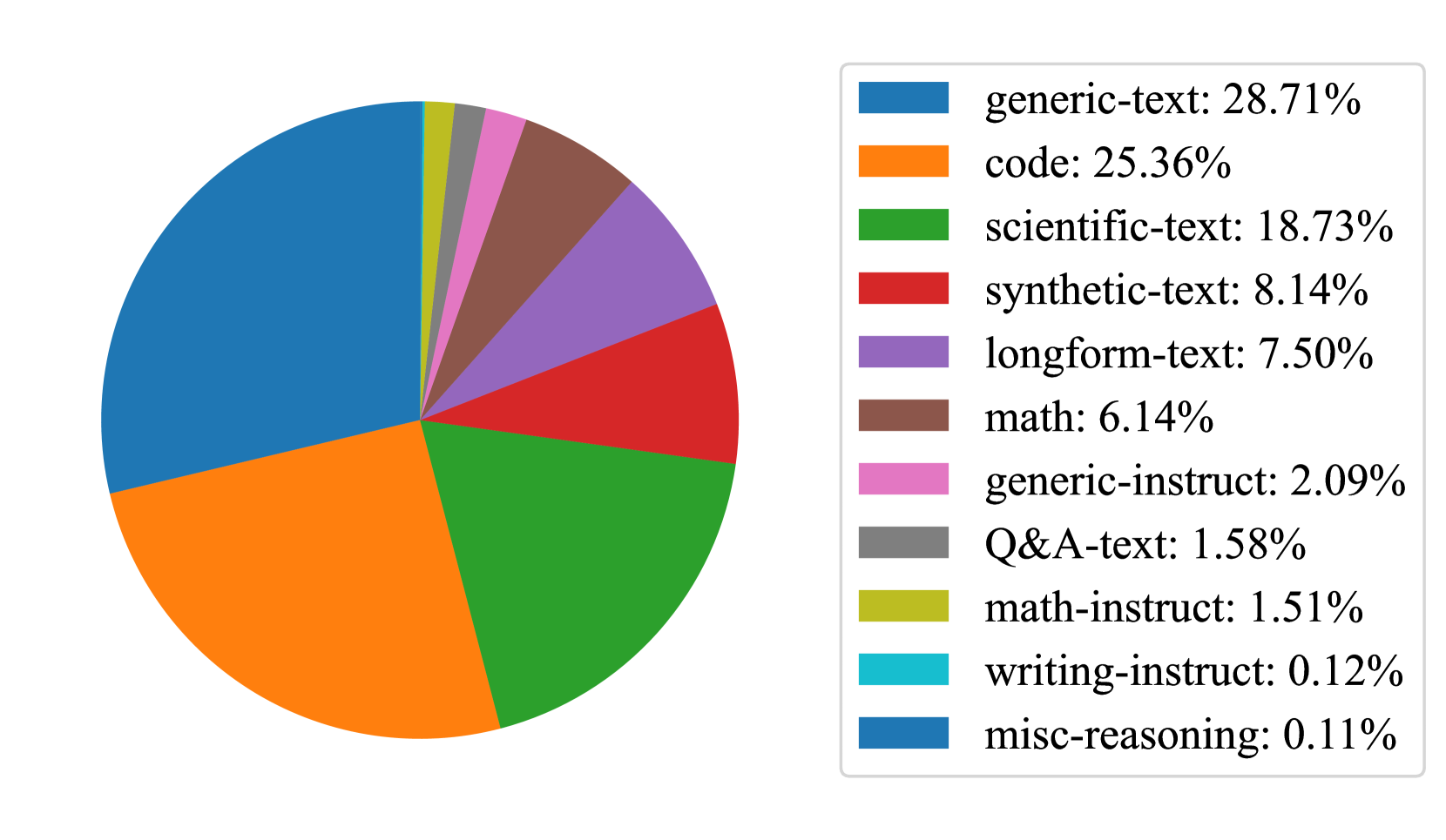
The image is a pie chart illustrating the distribution of data across several categories. The chart is segmented into eleven distinct sections, each representing a different category and its corresponding percentage of the total. A legend is positioned to the right of the chart, providing color-coded labels for each category.
### Components/Axes
The chart itself is a circular representation of data. There are no explicit axes, as pie charts represent proportions of a whole. The legend, located on the right side, lists the following categories and their associated colors:
* **generic-text:** 28.71% (Blue)
* **code:** 25.36% (Orange)
* **scientific-text:** 18.73% (Green)
* **synthetic-text:** 8.14% (Red)
* **longform-text:** 7.50% (Purple)
* **math:** 6.14% (Brown)
* **generic-instruct:** 2.09% (Pink)
* **Q&A-text:** 1.58% (Gray)
* **math-instruct:** 1.51% (Yellow)
* **writing-instruct:** 0.12% (Cyan)
* **misc-reasoning:** 0.11% (Dark Blue)
### Detailed Analysis
The largest segment of the pie chart is "generic-text" at 28.71%, represented by a blue color. The second largest segment is "code" at 25.36%, represented by an orange color. "scientific-text" occupies 18.73% of the chart, colored green. The remaining categories have significantly smaller proportions.
* **generic-text:** 28.71%
* **code:** 25.36%
* **scientific-text:** 18.73%
* **synthetic-text:** 8.14%
* **longform-text:** 7.50%
* **math:** 6.14%
* **generic-instruct:** 2.09%
* **Q&A-text:** 1.58%
* **math-instruct:** 1.51%
* **writing-instruct:** 0.12%
* **misc-reasoning:** 0.11%
The segments "writing-instruct" and "misc-reasoning" are very small, representing only 0.12% and 0.11% respectively.
### Key Observations
The data is heavily concentrated in the "generic-text", "code", and "scientific-text" categories, which together account for approximately 72.8% (28.71% + 25.36% + 18.73%) of the total. The remaining categories contribute relatively little to the overall distribution. The chart demonstrates a clear dominance of these three categories.
### Interpretation
The pie chart suggests that the dataset being represented is primarily composed of "generic text", "code", and "scientific text". This could indicate the nature of the data source or the focus of a particular analysis. The small proportions of "writing-instruct" and "misc-reasoning" suggest these are less frequent or less significant components of the dataset. The chart provides a clear visual representation of the relative importance of each category, allowing for quick identification of the dominant elements. The data could be related to the composition of a training dataset for a language model, where these categories represent the types of text used for training.