## Chart: Two Time Series Plots
### Overview
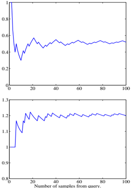
The image contains two time series plots, both showing the evolution of a value as the number of samples from a query increases. The top plot shows a value that starts high and decreases before stabilizing, while the bottom plot shows a value that starts low and increases before stabilizing.
### Components/Axes
**Top Plot:**
* **X-axis:** "Number of samples from query." Scale ranges from 0 to 100, with tick marks at 0, 20, 40, 60, 80, and 100.
* **Y-axis:** Scale ranges from 0 to 1, with tick marks at 0, 0.2, 0.4, 0.6, 0.8, and 1.
* **Data Series:** A single blue line.
**Bottom Plot:**
* **X-axis:** "Number of samples from query." Scale ranges from 0 to 100, with tick marks at 0, 20, 40, 60, 80, and 100.
* **Y-axis:** Scale ranges from 0.8 to 1.3, with tick marks at 0.8, 0.9, 1, 1.1, 1.2, and 1.3.
* **Data Series:** A single blue line.
### Detailed Analysis
**Top Plot:**
* **Trend:** The blue line starts at approximately 0.95. It rapidly decreases to around 0.3 by x=10. It then increases to approximately 0.6 by x=30, and then oscillates around 0.5, gradually stabilizing.
* **Data Points:**
* x=0, y ≈ 0.95
* x=10, y ≈ 0.3
* x=30, y ≈ 0.6
* x=100, y ≈ 0.55
**Bottom Plot:**
* **Trend:** The blue line starts at approximately 1.0. It increases to around 1.2 by x=20. It then oscillates around 1.2, gradually stabilizing.
* **Data Points:**
* x=0, y ≈ 1.0
* x=20, y ≈ 1.2
* x=100, y ≈ 1.2
### Key Observations
* Both plots show a stabilization of the value as the number of samples increases.
* The top plot starts with a high value and decreases, while the bottom plot starts with a low value and increases.
* The oscillations in both plots decrease as the number of samples increases.
### Interpretation
The plots likely represent the convergence of an estimate or statistic as more data is collected. The top plot could represent a precision metric that starts high due to a small sample size and then decreases as more data reveals the true value. The bottom plot could represent an accuracy metric that starts low and improves with more data. The oscillations suggest that the estimates are noisy, but the noise decreases as the sample size grows. The stabilization of the values indicates that the estimates are converging to a stable value, suggesting that the estimates are becoming more reliable with more data.