\n
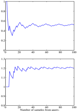
## Line Chart: Performance Metrics vs. Query Samples
### Overview
The image presents two line charts stacked vertically. Both charts depict a performance metric (y-axis) plotted against the number of samples from a query (x-axis), ranging from 0 to 100. The top chart shows a metric decreasing rapidly initially, then stabilizing around 0.5. The bottom chart shows a metric starting around 1.1 and increasing slowly, stabilizing around 1.2.
### Components/Axes
* **X-axis Label:** "Number of samples from query." Scale ranges from 0 to 100.
* **Y-axis (Top Chart) Label:** Not explicitly labeled, but the scale ranges from 0 to 1.
* **Y-axis (Bottom Chart) Label:** Not explicitly labeled, but the scale ranges from 0.8 to 1.3.
* **Data Series:** Two blue lines, one in each chart.
* **No Legend:** There is no legend provided.
### Detailed Analysis or Content Details
**Top Chart:**
The line starts at approximately y = 0.95 at x = 0. It rapidly decreases to approximately y = 0.3 at x = 5. It then fluctuates, reaching a minimum of approximately y = 0.25 at x = 15. From x = 15 to x = 100, the line oscillates between approximately y = 0.4 and y = 0.6, stabilizing around y = 0.5.
* x = 0, y ≈ 0.95
* x = 5, y ≈ 0.3
* x = 10, y ≈ 0.4
* x = 15, y ≈ 0.25
* x = 20, y ≈ 0.5
* x = 30, y ≈ 0.45
* x = 40, y ≈ 0.55
* x = 50, y ≈ 0.48
* x = 60, y ≈ 0.52
* x = 70, y ≈ 0.49
* x = 80, y ≈ 0.51
* x = 90, y ≈ 0.53
* x = 100, y ≈ 0.5
**Bottom Chart:**
The line starts at approximately y = 1.1 at x = 0. It increases to a peak of approximately y = 1.25 at x = 10. It then fluctuates, reaching a minimum of approximately y = 1.1 at x = 20. From x = 20 to x = 100, the line oscillates between approximately y = 1.15 and y = 1.25, stabilizing around y = 1.2.
* x = 0, y ≈ 1.1
* x = 5, y ≈ 1.18
* x = 10, y ≈ 1.25
* x = 15, y ≈ 1.22
* x = 20, y ≈ 1.1
* x = 30, y ≈ 1.18
* x = 40, y ≈ 1.23
* x = 50, y ≈ 1.19
* x = 60, y ≈ 1.21
* x = 70, y ≈ 1.24
* x = 80, y ≈ 1.17
* x = 90, y ≈ 1.22
* x = 100, y ≈ 1.2
### Key Observations
* The top chart shows a rapid initial decrease in the metric, suggesting a quick learning or convergence phase. After the initial drop, the metric stabilizes, indicating diminishing returns from adding more samples.
* The bottom chart shows a slow increase in the metric, suggesting a gradual improvement or accumulation of some property as more samples are processed.
* Both charts exhibit fluctuations, indicating some level of noise or variability in the data.
### Interpretation
The charts likely represent the performance of a system or algorithm as it processes an increasing number of samples from a query. The top chart could represent a metric like error rate or loss, which decreases rapidly initially as the system learns, then plateaus as it reaches its optimal performance. The bottom chart could represent a metric like confidence score or precision, which increases slowly as more samples are processed, providing more evidence for a decision.
The stabilization of both metrics suggests that adding more samples beyond a certain point does not significantly improve performance. This could be due to the inherent limitations of the system, the quality of the data, or the nature of the query itself. The fluctuations in both charts suggest that the system is sensitive to the specific samples it processes, and that the performance can vary depending on the input data.
The relationship between the two charts is interesting. The decreasing metric in the top chart and the increasing metric in the bottom chart could be related, for example, if the system is becoming more confident in its predictions as its error rate decreases. However, without more information about the specific metrics being plotted, it is difficult to draw definitive conclusions.