## Line Graphs: Value vs. Number of Samples from Query
### Overview
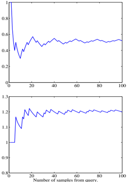
The image contains two vertically stacked line graphs. Both graphs plot a metric labeled "Value" against the "Number of samples from query" (x-axis: 0–100). The top graph shows a blue line with significant initial volatility followed by stabilization, while the bottom graph displays a blue line with moderate fluctuations after an initial drop. No legends or explicit data labels are present.
---
### Components/Axes
- **X-axis (both graphs):**
- Label: "Number of samples from query"
- Scale: 0 to 100 (linear increments of 20)
- **Y-axis (top graph):**
- Label: "Value"
- Scale: 0 to 1 (linear increments of 0.2)
- **Y-axis (bottom graph):**
- Label: "Value"
- Scale: 0.8 to 1.3 (linear increments of 0.1)
- **Lines:**
- Both graphs use a single blue line. No legend or data series labels are visible.
---
### Detailed Analysis
#### Top Graph:
- **Initial Drop:** The line starts at **1.0** (x=0) and plunges sharply to **~0.3** by x=10.
- **Fluctuation Phase:** From x=10 to x=100, the line oscillates between **~0.2** and **~0.8**, with no clear upward or downward trend.
- **Final Value:** At x=100, the line stabilizes near **~0.55**.
#### Bottom Graph:
- **Initial Drop:** The line starts at **1.0** (x=0) and drops to **~0.85** by x=10.
- **Fluctuation Phase:** From x=10 to x=100, the line oscillates between **~0.8** and **~1.2**, with a slight upward bias in later segments.
- **Final Value:** At x=100, the line stabilizes near **~1.15**.
---
### Key Observations
1. **Initial Volatility:** Both graphs exhibit a sharp decline in the first 10 samples, suggesting a rapid adjustment or filtering effect.
2. **Stabilization:** After x=10, both graphs show reduced volatility, though the bottom graph retains higher variability.
3. **Divergent Ranges:** The bottom graph’s y-axis spans a broader range (0.8–1.3 vs. 0–1), indicating a different scale or metric.
4. **No Outliers:** No extreme spikes or anomalies beyond the described fluctuations.
---
### Interpretation
- **Top Graph:** The metric likely represents a normalized or bounded value (e.g., probability, percentage) that stabilizes after an initial adjustment period. The final value (~0.55) suggests a mid-range equilibrium.
- **Bottom Graph:** The metric appears unbounded or scaled differently, with a higher baseline (~1.15) and greater sensitivity to fluctuations. This could reflect a raw count, error rate, or unnormalized measurement.
- **Relationship:** The two graphs may represent related but distinct processes. For example, the top graph could show a success rate after query sampling, while the bottom graph tracks cumulative errors or resource usage.
- **Uncertainty:** Without explicit labels or context, the exact meaning of "Value" remains ambiguous. The absence of legends or units limits interpretability.
---
### Spatial Grounding
- **Legend:** None present.
- **Line Placement:** Both lines occupy the central region of their respective graphs, with no annotations or markers.
- **Axis Alignment:** Y-axes are left-aligned, with labels vertically oriented.
---
### Conclusion
The graphs illustrate two metrics with divergent behaviors: one stabilizes at a mid-range value, while the other exhibits higher variability and a higher baseline. The lack of contextual labels or legends necessitates further investigation to determine causality or domain-specific significance.