\n
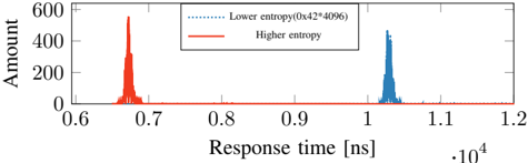
## Chart: Response Time Distribution by Entropy
### Overview
The image presents a line chart illustrating the distribution of response times for two entropy levels: "Lower entropy" and "Higher entropy". The x-axis represents response time in nanoseconds (ns), and the y-axis represents the amount or frequency of occurrences.
### Components/Axes
* **X-axis:** Response time [ns] (scaled from approximately 0.6 x 10<sup>4</sup> to 1.2 x 10<sup>4</sup>).
* **Y-axis:** Amount (scaled from 0 to 600).
* **Legend:** Located in the top-center of the chart.
* "Lower entropy (0x42-4096)" - represented by a dotted black line.
* "Higher entropy" - represented by a solid red line.
### Detailed Analysis
The chart displays two distinct peaks, one for each entropy level.
**Lower Entropy (dotted black line):**
The line shows a peak around 0.7 x 10<sup>4</sup> ns. The amount at the peak is approximately 500. The distribution is concentrated within a narrow range, from approximately 0.66 x 10<sup>4</sup> ns to 0.74 x 10<sup>4</sup> ns. The line quickly descends to zero on either side of the peak.
**Higher Entropy (solid red line):**
The line shows a peak around 1.05 x 10<sup>4</sup> ns. The amount at the peak is approximately 480. The distribution is also concentrated, but slightly broader than the lower entropy distribution, ranging from approximately 0.98 x 10<sup>4</sup> ns to 1.12 x 10<sup>4</sup> ns. The line quickly descends to zero on either side of the peak.
### Key Observations
* The response times for lower entropy are significantly faster (around 0.7 x 10<sup>4</sup> ns) than those for higher entropy (around 1.05 x 10<sup>4</sup> ns).
* Both distributions are relatively narrow, indicating a consistent response time within each entropy level.
* The amount (frequency) of occurrences is comparable for both entropy levels, with the peak amounts being approximately 500 and 480 respectively.
### Interpretation
The data suggests that lower entropy conditions lead to faster response times compared to higher entropy conditions. This could be due to several factors, such as reduced computational complexity or more predictable system behavior under lower entropy. The narrow distributions indicate that the system is relatively stable and consistent within each entropy level. The peaks represent the most common response times for each condition. The difference in peak locations (0.7 x 10<sup>4</sup> ns vs 1.05 x 10<sup>4</sup> ns) is a clear indicator of the impact of entropy on response time. The values "0x42-4096" in the legend for lower entropy likely represent a specific configuration or seed value used to generate the lower entropy condition. This chart is likely demonstrating the performance impact of entropy on a system, potentially related to randomness or unpredictability in the system's operation.