## Heatmap: Response Time Distribution
### Overview
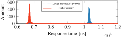
The heatmap illustrates the distribution of response times in nanoseconds (ns) for two different conditions: lower entropy and higher entropy. The x-axis represents the response time in nanoseconds, while the y-axis represents the amount of data points.
### Components/Axes
- **X-Axis**: Response time [ns]
- **Y-Axis**: Amount
- **Legend**:
- Lower entropy (0x42*4096)
- Higher entropy
### Detailed Analysis or ### Content Details
The heatmap shows two distinct peaks, one for lower entropy and one for higher entropy. The lower entropy peak is located around 0.7 ns, with a value of approximately 600 data points. The higher entropy peak is located around 1.1 ns, with a value of approximately 400 data points.
### Key Observations
- The lower entropy condition has a higher peak, indicating a higher frequency of response times around 0.7 ns.
- The higher entropy condition has a lower peak, indicating a lower frequency of response times around 1.1 ns.
- There is a noticeable difference in the distribution between the two conditions, suggesting that the response time is more consistent in the lower entropy condition.
### Interpretation
The data suggests that the response time is more consistent in the lower entropy condition, with a higher frequency of response times around 0.7 ns. This could indicate that the lower entropy condition is more efficient or that the system is better optimized for lower entropy conditions. The higher entropy condition, on the other hand, has a lower frequency of response times around 1.1 ns, which could indicate that the system is less efficient or that the system is not as well optimized for higher entropy conditions. Overall, the data suggests that the lower entropy condition is more efficient than the higher entropy condition.