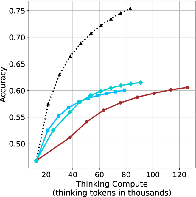
## Line Chart: Accuracy vs. Thinking Compute
### Overview
This image presents a line chart illustrating the relationship between "Thinking Compute" (measured in thousands of tokens) and "Accuracy". The chart displays four distinct data series, each represented by a different colored line, showing how accuracy changes as thinking compute increases. The chart is set against a white background with a grid for easier readability.
### Components/Axes
* **X-axis:** Labeled "Thinking Compute (thinking tokens in thousands)". The scale ranges from approximately 0 to 120 (in thousands of tokens). Markers are present at 20, 40, 60, 80, 100, and 120.
* **Y-axis:** Labeled "Accuracy". The scale ranges from approximately 0.48 to 0.76. Markers are present at 0.50, 0.55, 0.60, 0.65, 0.70, and 0.75.
* **Data Series:** Four lines are present, each with a distinct color and marker style:
* Black dotted line with diamond markers.
* Cyan line with square markers.
* Blue line with triangular markers.
* Red line with circular markers.
* **Grid:** A light gray grid is overlaid on the chart area to aid in reading values.
### Detailed Analysis
Let's analyze each data series individually:
* **Black (Dotted Line with Diamonds):** This line exhibits the steepest upward trend. It starts at approximately (20, 0.52), rises rapidly, and plateaus around (80, 0.74), remaining relatively constant until (120, 0.74). Approximate data points: (20, 0.52), (40, 0.68), (60, 0.72), (80, 0.74), (100, 0.74), (120, 0.74).
* **Cyan (Line with Squares):** This line shows a moderate upward trend, less steep than the black line. It begins at approximately (20, 0.56), increases steadily, and levels off around (60, 0.62), with slight fluctuations until (120, 0.62). Approximate data points: (20, 0.56), (40, 0.59), (60, 0.62), (80, 0.62), (100, 0.62), (120, 0.62).
* **Blue (Line with Triangles):** This line demonstrates a similar trend to the cyan line, but starts at a slightly lower accuracy. It begins at approximately (20, 0.54), increases steadily, and plateaus around (60, 0.61), remaining relatively constant until (120, 0.61). Approximate data points: (20, 0.54), (40, 0.57), (60, 0.61), (80, 0.61), (100, 0.61), (120, 0.61).
* **Red (Line with Circles):** This line exhibits the slowest upward trend. It starts at approximately (20, 0.50), increases gradually, and reaches approximately (120, 0.60). Approximate data points: (20, 0.50), (40, 0.53), (60, 0.56), (80, 0.59), (100, 0.60), (120, 0.60).
### Key Observations
* The black data series consistently outperforms the other three, achieving the highest accuracy levels.
* The red data series consistently underperforms the other three, achieving the lowest accuracy levels.
* The cyan and blue data series exhibit similar performance, with cyan slightly outperforming blue.
* Accuracy gains diminish as "Thinking Compute" increases beyond approximately 80,000 tokens, particularly for the black data series.
* The initial increase in accuracy is most pronounced for the black data series, suggesting a significant benefit from increased compute in the early stages.
### Interpretation
The chart demonstrates the impact of "Thinking Compute" on "Accuracy" for four different models or configurations. The significant difference in performance between the black line and the others suggests that the black line represents a more effective approach or a more advanced model. The diminishing returns observed at higher compute levels indicate that there's a point where increasing compute yields only marginal improvements in accuracy. This could be due to limitations in the model architecture, the dataset, or the task itself. The consistent ranking of the lines suggests inherent differences in the capabilities of the underlying systems. The data suggests that investing in "Thinking Compute" is beneficial, but there's an optimal point beyond which further investment provides limited value. Further investigation would be needed to understand *why* the black line performs so much better – is it a different algorithm, more training data, or a larger model size? The chart provides a clear visual representation of the trade-off between computational cost and performance.