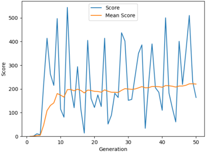
## Line Chart: Score vs. Generation
### Overview
The image displays a line chart tracking two metrics—"Score" and "Mean Score"—over 50 generations. The chart illustrates the performance of a system or process across iterations, showing high volatility in individual scores contrasted with a smoother, improving trend in the average score.
### Components/Axes
* **Chart Type:** Line chart with two data series.
* **X-Axis:**
* **Label:** "Generation"
* **Scale:** Linear, from 0 to 50.
* **Major Ticks:** Marked at intervals of 10 (0, 10, 20, 30, 40, 50).
* **Y-Axis:**
* **Label:** "Score"
* **Scale:** Linear, from 0 to 500.
* **Major Ticks:** Marked at intervals of 100 (0, 100, 200, 300, 400, 500).
* **Legend:**
* **Position:** Top-right corner of the plot area.
* **Series 1:** "Score" - Represented by a blue line.
* **Series 2:** "Mean Score" - Represented by an orange line.
### Detailed Analysis
**1. "Score" (Blue Line) Trend & Data Points:**
* **Trend:** The blue line exhibits extreme volatility, characterized by sharp, frequent peaks and troughs throughout the 50 generations. There is no clear long-term upward or downward trend in the peaks themselves; they fluctuate wildly between approximately 0 and 550.
* **Approximate Key Points (Generation, Score):**
* Starts near (0, 0).
* First major peak: (~5, ~410).
* Deepest trough: (~17, ~10).
* Highest peak: (~12, ~550).
* Other notable peaks: (~8, ~500), (~28, ~440), (~41, ~500), (~48, ~510).
* Final point: (~50, ~160).
**2. "Mean Score" (Orange Line) Trend & Data Points:**
* **Trend:** The orange line shows a clear, smooth, and generally upward trend. It starts near zero, rises steeply until approximately generation 15, then continues to increase at a slower rate, appearing to plateau or stabilize in the range of 200-220 from generation 30 onward.
* **Approximate Key Points (Generation, Mean Score):**
* Starts near (0, 0).
* Rises to (~10, ~140).
* Reaches (~15, ~200).
* Fluctuates slightly around 200 between generations 15-30.
* Shows a gentle rise to (~40, ~210).
* Ends at (~50, ~220).
### Key Observations
1. **Volatility vs. Stability:** The most striking feature is the dramatic contrast between the erratic, high-variance "Score" and the stable, converging "Mean Score."
2. **Mean Score Convergence:** The "Mean Score" line shows clear signs of convergence, flattening out after generation 30, suggesting the average performance of the system has stabilized.
3. **Outliers:** The blue line has multiple extreme outliers (very high peaks and very low troughs) that do not significantly pull the mean score away from its stable path after the initial learning phase.
4. **Initial Phase:** Both scores start at zero. The mean score lags behind the first few individual score spikes, which is expected as an average requires multiple data points.
### Interpretation
This chart is characteristic of an optimization or evolutionary algorithm process.
* The volatile **"Score"** likely represents the fitness or performance of individual candidates or trials within each generation. The wild fluctuations suggest a process involving significant exploration (trying very different solutions, some failing badly, some succeeding exceptionally).
* The smooth **"Mean Score"** represents the average fitness of the entire population or the running average. Its steady rise and eventual plateau indicate that the system is successfully learning or evolving. The population's overall quality improves rapidly at first and then reaches a point of diminishing returns, where further generations yield only marginal improvements in the average.
* The relationship between the two lines demonstrates a key principle: while individual attempts (blue) can be highly unpredictable, the collective progress (orange) can show a clear and stable trend toward improvement. The plateau suggests the process may have reached a local optimum or that the parameters for improvement are exhausted under current conditions.