\n
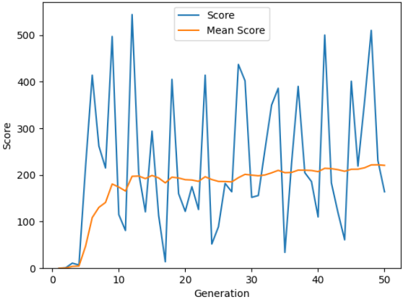
## Line Chart: Score vs. Generation
### Overview
This image presents a line chart illustrating the relationship between 'Generation' and 'Score'. Two data series are plotted: 'Score' and 'Mean Score'. The chart appears to track the performance or progress of something over successive generations.
### Components/Axes
* **X-axis:** Labeled "Generation", ranging from approximately 0 to 50.
* **Y-axis:** Labeled "Score", ranging from 0 to 500.
* **Legend:** Located in the top-right corner.
* 'Score' - Represented by a blue line.
* 'Mean Score' - Represented by an orange line.
### Detailed Analysis
The 'Score' line (blue) exhibits high volatility, fluctuating significantly across all generations. It starts near 0 at Generation 0, rises sharply to a peak around 500 at Generation 7, then oscillates with large amplitude throughout the remaining generations.
The 'Mean Score' line (orange) shows a more stable trend. It begins at 0 at Generation 0, increases steadily to approximately 180 by Generation 15, and then plateaus, fluctuating around 180-240 for the remainder of the generations.
Here's a breakdown of approximate data points (with uncertainty due to visual estimation):
| Generation | Score (approx.) | Mean Score (approx.) |
|---|---|---|
| 0 | 0 | 0 |
| 2 | 50 | 50 |
| 4 | 150 | 100 |
| 6 | 400 | 140 |
| 7 | 500 | 160 |
| 8 | 200 | 170 |
| 10 | 400 | 180 |
| 15 | 200 | 180 |
| 20 | 50 | 190 |
| 25 | 400 | 210 |
| 30 | 450 | 200 |
| 35 | 300 | 220 |
| 40 | 350 | 210 |
| 45 | 450 | 230 |
| 50 | 200 | 240 |
### Key Observations
* The 'Score' line demonstrates substantial variance, indicating that individual performance varies greatly from generation to generation.
* The 'Mean Score' line shows a general upward trend initially, followed by stabilization. This suggests that while individual scores fluctuate, the average performance tends to improve and then level off.
* There are several instances where the 'Score' line significantly exceeds the 'Mean Score', indicating exceptional performance in specific generations.
* The 'Score' line frequently dips below the 'Mean Score', suggesting periods of poor performance.
### Interpretation
The chart likely represents the results of an evolutionary algorithm or a similar iterative process. The 'Generation' axis represents the iteration number, and the 'Score' represents the fitness or performance of an individual within that generation. The 'Mean Score' represents the average fitness of the population.
The initial increase in 'Mean Score' suggests that the algorithm is effectively improving the population's overall performance. The subsequent plateau indicates that the algorithm may have reached a local optimum or that further improvements are becoming increasingly difficult to achieve.
The high variance in the 'Score' line suggests that there is significant diversity within the population. This diversity is crucial for continued evolution, as it provides the raw material for the algorithm to explore new solutions. The occasional high-scoring individuals may represent promising new directions for the algorithm to pursue.
The chart suggests that the algorithm is functioning as expected, but that further optimization may require more sophisticated techniques to overcome the plateau in 'Mean Score'. It could also indicate the need for increased diversity or a different search strategy.