## Line Graph: Score vs. Mean Score Over Generations
### Overview
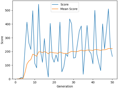
The image depicts a line graph comparing two metrics across 50 generations: "Score" (blue line) and "Mean Score" (orange line). The y-axis represents the score magnitude (0–500), while the x-axis represents generations (0–50). The graph shows significant variability in the "Score" line, with sharp peaks and troughs, while the "Mean Score" line exhibits a smoother, gradual upward trend.
---
### Components/Axes
- **X-axis (Horizontal)**: Labeled "Generation," ranging from 0 to 50 in increments of 10.
- **Y-axis (Vertical)**: Labeled "Score," ranging from 0 to 500 in increments of 100.
- **Legend**: Located in the top-right corner, with:
- **Blue line**: Labeled "Score"
- **Orange line**: Labeled "Mean Score"
---
### Detailed Analysis
1. **Score (Blue Line)**:
- Exhibits extreme volatility, with sharp peaks reaching ~500 and troughs near 0.
- Notable spikes occur at generations ~5, 15, 25, 35, 45, and 50.
- Troughs (near 0) are observed at generations ~10, 20, 30, and 40.
- No consistent pattern; fluctuations appear random or context-dependent.
2. **Mean Score (Orange Line)**:
- Shows a steady, gradual increase.