## Bar Chart: Yearwise Average Reference Count
### Overview
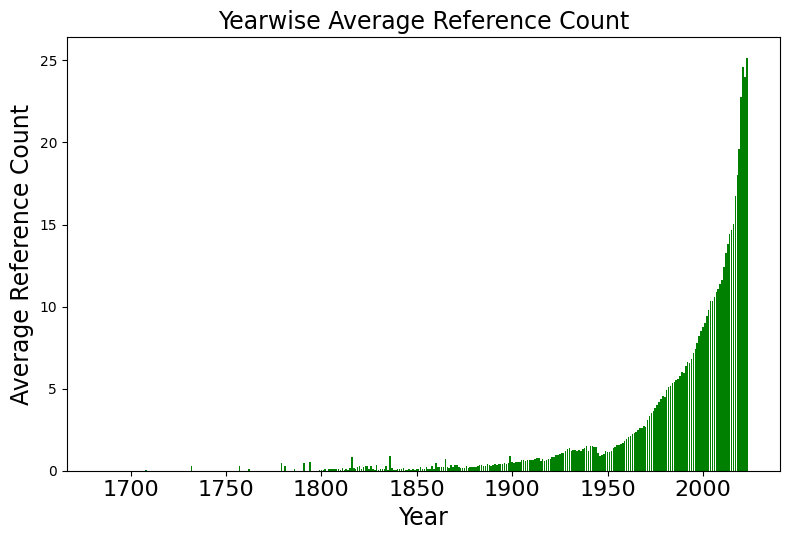
The image is a vertical bar chart titled "Yearwise Average Reference Count." It visualizes the growth of average reference counts over time, spanning from the year 1700 to approximately 2020. The chart displays a clear, long-term trend of exponential growth, particularly accelerating in the latter half of the 20th century.
### Components/Axes
* **Title:** "Yearwise Average Reference Count" (centered at the top).
* **X-Axis:** Labeled "Year". The scale spans from 1700 to 2000+, with major tick marks at 50-year intervals (1700, 1750, 1800, 1850, 1900, 1950, 2000).
* **Y-Axis:** Labeled "Average Reference Count". The scale ranges from 0 to 25, with major tick marks at intervals of 5 (0, 5, 10, 15, 20, 25).
* **Data Series:** Represented by solid green vertical bars for each year.
### Detailed Analysis
The chart can be segmented into three distinct temporal phases based on the visual density and height of the bars:
1. **1700–1850 (The Stagnant Phase):**
* **Trend:** The bars are extremely sparse and very low in height, often appearing as thin lines or gaps.
* **Values:** The average reference count is effectively near zero, with only minor, sporadic spikes.
2. **1850–1950 (The Incubation Phase):**
* **Trend:** The bars become more consistent and begin to show a very slight, gradual upward slope.
* **Values:** By 1900, the average count is approximately 0.5 to 1.0. By 1950, the count has risen to approximately 1.5 to 2.0.
3. **1950–2020 (The Exponential Growth Phase):**
* **Trend:** The chart exhibits a sharp, continuous upward curve (a "hockey stick" pattern).
* **Values:**
* **1975:** The average reference count reaches approximately 5.
* **2000:** The average reference count reaches approximately 10.
* **2010:** The average reference count reaches approximately 15.
* **2020:** The average reference count reaches its peak on the chart, approximately 25.
### Key Observations
* **Exponential Acceleration:** The most striking feature is the rapid acceleration of the reference count starting around 1950. The growth is not linear; it compounds over time.
* **Data Sparsity:** The lack of consistent data points before 1850 suggests either a lack of digitized records, a very low volume of academic publishing, or a different citation culture in earlier centuries.
* **Consistency:** The growth curve is remarkably smooth, suggesting a systemic change in how references are utilized or recorded in literature rather than isolated anomalies.
### Interpretation
This data is a classic visualization of the "information explosion" or the exponential growth of scientific and academic literature.
* **What the data demonstrates:** The chart likely tracks the average number of citations or references per academic paper or document. The shift post-1950 correlates strongly with the post-WWII expansion of higher education, the proliferation of scientific journals, and the eventual digitization of academic databases.
* **Why it matters:** The transition from an average of ~2 references per document in 1950 to ~25 in 2020 indicates a fundamental shift in research methodology. It suggests that modern research is increasingly interconnected, requiring a broader synthesis of existing knowledge, or perhaps that citation practices have become more rigorous and extensive over time.
* **Peircean Investigative Note:** The "gap" in the early years (1700-1850) is as informative as the growth in the later years. It highlights the limitations of historical data collection or the infancy of the "reference" as a standardized academic unit during that era.