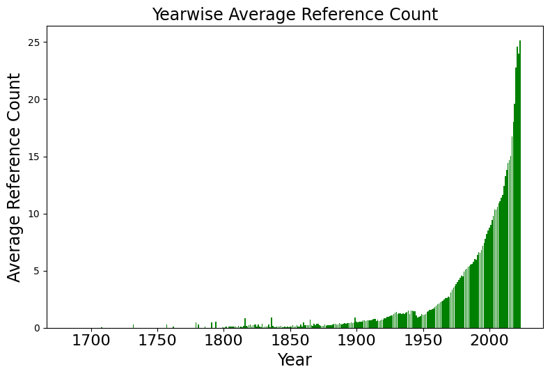
## Line Chart: Yearwise Average Reference Count
### Overview
The chart displays a single data series representing the average reference count over time, spanning from approximately 1700 to 2020. The y-axis measures reference counts (0–25), while the x-axis tracks years. Data points are represented by green vertical bars with white vertical lines, and a legend confirms the color association.
### Components/Axes
- **Title**: "Yearwise Average Reference Count" (centered at the top).
- **X-axis (Horizontal)**: Labeled "Year," with markers at 1700, 1750, 1800, 1850, 1900, 1950, 2000, and 2020. The scale is linear, with equal spacing between intervals.
- **Y-axis (Vertical)**: Labeled "Average Reference Count," with markers at 0, 5, 10, 15, 20, and 25. The scale is linear, with increments of 5.
- **Legend**: Located in the top-right corner, showing a green square labeled "Average Reference Count" (no additional labels or categories).
- **Data Series**: A single green line with vertical bars, starting near 1700 and ending at 2020.
### Detailed Analysis
- **Early Period (1700–1850)**:
- Reference counts remain near 0.1–0.2 for most of this period, with minimal fluctuations.
- A slight increase to ~0.3 is observed around 1850.
- **Late 19th Century (1850–1900)**:
- Gradual rise to ~0.5 by 1900, with intermittent small spikes (e.g., ~0.4 in 1875).
- **Early 20th Century (1900–1950)**:
- Steady growth from ~0.5 (1900) to ~1.2 (1950), with a notable acceleration post-1925.
- **Post-1950 Surge**:
- Exponential increase from ~1.2 (1950) to ~25 (2020), with sharp rises observed after 2000.
- Notable peaks: ~5 (2000), ~10 (2005), ~15 (2010), ~20 (2015), and ~25 (2020).
### Key Observations
1. **Stagnation Pre-1900**: Reference counts were negligible until the late 19th century.
2. **Gradual Growth (1900–1950)**: A slow but consistent upward trend, likely tied to early industrialization or data collection practices.
3. **Exponential Growth Post-1950**: A dramatic rise correlates with technological advancements (e.g., digitalization, internet proliferation).
4. **2020 Peak**: The highest recorded value (~25) suggests a saturation or critical threshold in reference counts.
### Interpretation
The chart illustrates a **J-curve trend**, where reference counts remained stagnant for centuries before experiencing rapid growth in the 20th century. This pattern likely reflects:
- **Historical Context**: Pre-industrial societies (pre-1900) had limited data generation, resulting in low reference counts.
- **Technological Drivers**: Post-1950 growth aligns with the digital revolution, increased academic publishing, and global data sharing.
- **Anomalies**: The sharpest rise post-2000 may indicate the impact of open-access platforms, big data, or AI-driven reference systems.
The data underscores the transformative role of technology in reference count dynamics, with implications for fields like information science, library studies, and data analytics.