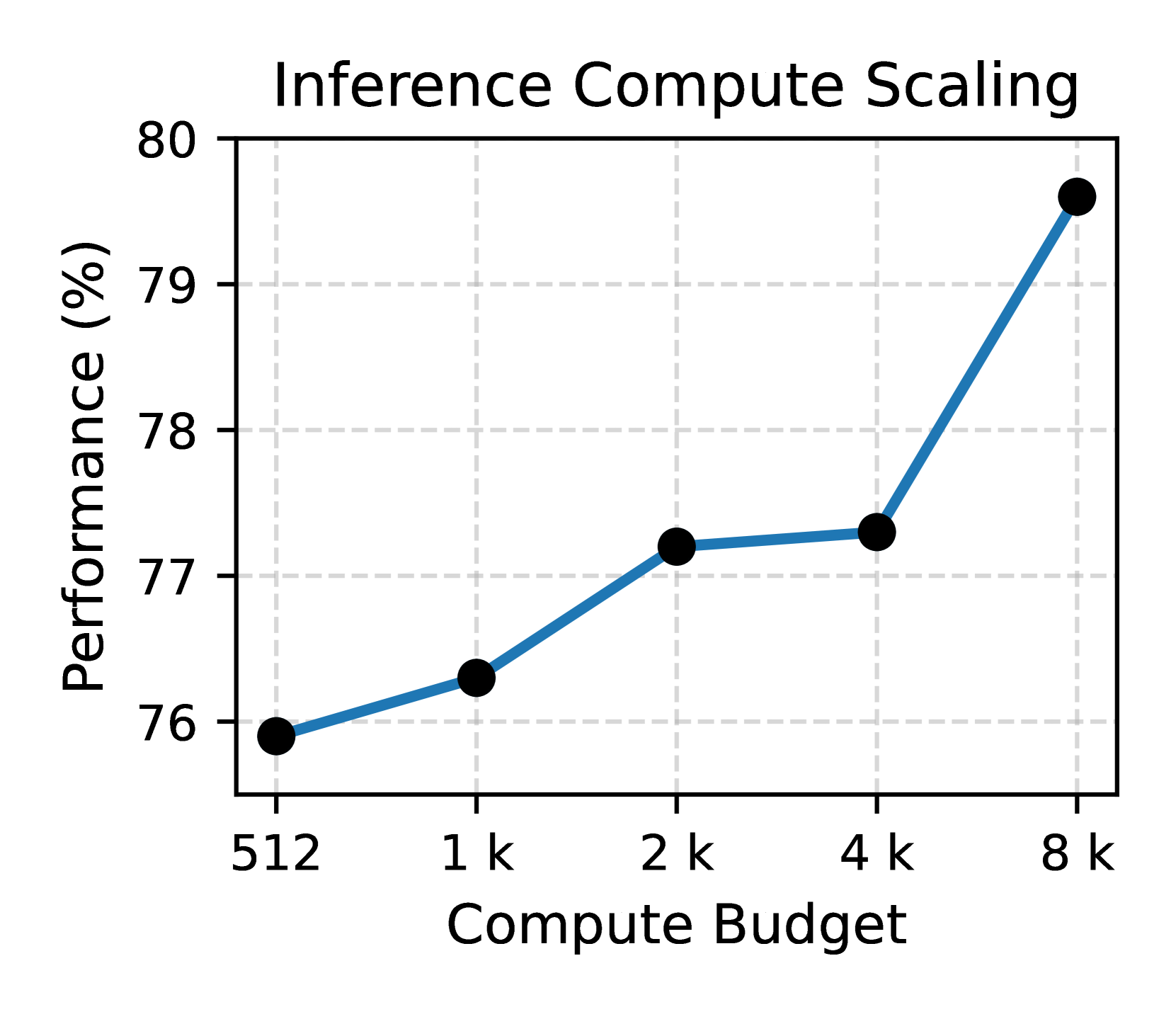
## Line Chart: Inference Compute Scaling
### Overview
The image is a line chart titled "Inference Compute Scaling". It illustrates the relationship between compute budget (x-axis) and performance (y-axis). The chart shows how performance, measured as a percentage, scales with increasing compute budget.
### Components/Axes
* **Title:** Inference Compute Scaling
* **X-axis:** Compute Budget, with markers at 512, 1 k, 2 k, 4 k, and 8 k.
* **Y-axis:** Performance (%), with markers at 76, 77, 78, 79, and 80.
* **Data Series:** A single blue line with black circular markers indicating data points.
### Detailed Analysis
The blue line represents the performance scaling with the compute budget.
* **Compute Budget 512:** Performance is approximately 75.9%.
* **Compute Budget 1 k:** Performance is approximately 76.3%.
* **Compute Budget 2 k:** Performance is approximately 77.2%.
* **Compute Budget 4 k:** Performance is approximately 77.3%.
* **Compute Budget 8 k:** Performance is approximately 79.7%.
The line slopes upward, indicating a positive correlation between compute budget and performance. The slope is steeper between 4k and 8k compute budget.
### Key Observations
* Performance generally increases with compute budget.
* The most significant performance jump occurs between compute budgets of 4k and 8k.
* The performance increase is less pronounced between 1k and 4k.
### Interpretation
The chart suggests that increasing the compute budget for inference leads to improved performance. However, the rate of performance gain is not constant. The substantial increase in performance between 4k and 8k compute budget suggests diminishing returns at lower budgets and a more significant impact at higher budgets. This information is valuable for optimizing resource allocation in inference tasks, indicating that investing in a higher compute budget (specifically around 8k) may yield the most significant performance improvements.