\n
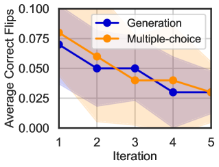
## Line Chart: Average Correct Flips vs. Iteration
### Overview
This image presents a line chart illustrating the relationship between the iteration number and the average number of correct flips for two different methods: "Generation" and "Multiple-choice". The chart displays a decreasing trend for both methods as the iteration number increases. A shaded region behind the lines suggests a possible range of variation or confidence interval.
### Components/Axes
* **X-axis:** Labeled "Iteration", with markers at 1, 2, 3, 4, and 5.
* **Y-axis:** Labeled "Average Correct Flips", with a scale ranging from 0.000 to 0.100, incrementing by 0.025.
* **Legend:** Located in the top-right corner, identifying two data series:
* "Generation" – represented by a blue line with circular markers.
* "Multiple-choice" – represented by an orange line with circular markers.
* **Shaded Region:** A light purple/gray shaded area fills the background, potentially representing a standard deviation or confidence interval.
### Detailed Analysis
**Generation (Blue Line):**
The blue line representing "Generation" shows a clear downward trend.
* Iteration 1: Approximately 0.077
* Iteration 2: Approximately 0.052
* Iteration 3: Approximately 0.047
* Iteration 4: Approximately 0.032
* Iteration 5: Approximately 0.024
**Multiple-choice (Orange Line):**
The orange line representing "Multiple-choice" also exhibits a downward trend, but with more fluctuation.
* Iteration 1: Approximately 0.082
* Iteration 2: Approximately 0.055
* Iteration 3: Approximately 0.042
* Iteration 4: Approximately 0.038
* Iteration 5: Approximately 0.028
### Key Observations
* Both methods demonstrate a decrease in average correct flips as the iteration number increases. This suggests that the methods become less effective with each iteration, or that the task becomes more difficult.
* The "Multiple-choice" method starts with a slightly higher average correct flips than the "Generation" method at Iteration 1, but the difference diminishes over subsequent iterations.
* The shaded region indicates variability in the data, and the lines represent the average trend.
### Interpretation
The chart suggests that both the "Generation" and "Multiple-choice" methods experience diminishing returns as the number of iterations increases. This could be due to several factors: the task becoming inherently more challenging, the methods converging on a suboptimal solution, or the introduction of noise or errors in later iterations. The initial higher performance of the "Multiple-choice" method might indicate that it is easier to achieve initial success with this approach, but the "Generation" method maintains a more consistent decline. The shaded region highlights the uncertainty in the data, suggesting that the observed trends may not be universally applicable and could vary depending on the specific conditions of the experiment. Further investigation would be needed to determine the underlying causes of the observed trends and to identify strategies for improving the performance of these methods.