## Line Chart: KNN vs. SVM Prediction Over Time
### Overview
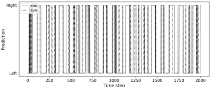
The image displays a line chart comparing the binary prediction outputs of two machine learning models, K-Nearest Neighbors (KNN) and Support Vector Machine (SVM), over a sequence of 2000 time steps. The chart visualizes how each model's classification (either "Left" or "Right") changes dynamically across the timeline.
### Components/Axes
* **Chart Type:** Binary time-series line chart.
* **Y-Axis (Vertical):**
* **Label:** "Prediction"
* **Categories:** Two discrete, categorical values: "Left" (bottom) and "Right" (top). There is no numerical scale.
* **X-Axis (Horizontal):**
* **Label:** "Time step"
* **Scale:** Linear, ranging from 0 to 2000.
* **Major Tick Marks:** Located at intervals of 250 (0, 250, 500, 750, 1000, 1250, 1500, 1750, 2000).
* **Legend:**
* **Position:** Top-left corner of the chart area.
* **Entries:**
1. **KNN:** Represented by a solid black line.
2. **SVM:** Represented by a dotted black line.
* **Data Series:** Two vertical lines that oscillate between the "Left" and "Right" positions. The lines are not continuous curves but series of vertical segments, indicating instantaneous switches in prediction at specific time steps.
### Detailed Analysis
The chart does not show continuous trends but rather discrete state changes. The primary data is the sequence of switches.
* **Prediction Pattern:** Both models exhibit a highly volatile prediction pattern, frequently switching between "Left" and "Right" classifications throughout the entire 2000-step period.
* **KNN (Solid Line) Behavior:** The solid line shows rapid, near-constant oscillation. It appears to switch predictions at almost every time step or in very short bursts of one state. The density of vertical lines is extremely high, making individual transitions difficult to count precisely.
* **SVM (Dotted Line) Behavior:** The dotted line follows a very similar oscillatory pattern to the KNN line. The switches for SVM often occur at the same time steps as KNN, but there are visible instances where the two lines are out of phase—one model predicts "Left" while the other predicts "Right" for a given step.
* **Spatial Relationship:** The two lines are plotted directly over each other in the same chart space. Their frequent overlapping and close proximity create a dense, barcode-like visual effect, especially in the central region of the chart (approximately time steps 250 to 1750).
### Key Observations
1. **High Volatility:** Neither model settles into a stable prediction for any significant duration. The dominant pattern is rapid alternation.
2. **Synchronized Oscillation:** The models are largely synchronized in their switching behavior, suggesting they are responding to similar underlying patterns or noise in the input data stream.
3. **Phase Differences:** Despite the overall synchronization, there are clear, intermittent discrepancies where the models disagree. For example, around time step 1000, there is a brief period where the solid line (KNN) and dotted line (SVM) are offset.
4. **No Clear Trend:** There is no discernible long-term trend toward either "Left" or "Right." The frequency and distribution of switches appear relatively uniform across the entire x-axis range.
5. **Visual Density:** The chart is information-dense due to the high frequency of events. The use of a solid vs. dotted line is the only visual differentiator between the two dense data series.
### Interpretation
This chart likely visualizes the output of two classifiers on a challenging, non-stationary, or noisy sequential dataset. The key takeaways are:
* **Model Instability:** The extreme volatility suggests the underlying data may have a very low signal-to-noise ratio, or the decision boundary between "Left" and "Right" classes is highly complex and changes rapidly. The models are not confident, leading to constant re-evaluation.
* **Model Similarity:** The high degree of synchronization indicates that KNN and SVM, despite their different algorithmic foundations, are extracting similar (though not identical) signals from the data. Their points of disagreement are as informative as their agreements, highlighting edge cases where model assumptions lead to different outcomes.
* **Data Characteristics:** The pattern implies the input features at each time step are not strongly indicative of a single class. This could represent a scenario like sensor data with high variance, financial market tick data, or a adversarial testing environment designed to probe model robustness.
* **Practical Implication:** For a real-world application, such unstable predictions would be problematic. This visualization argues for the need for temporal smoothing (e.g., a moving average on predictions), model ensembling, or a re-evaluation of the feature engineering process to create more stable inputs. The chart serves as a diagnostic tool showing that raw, step-by-step predictions from these models are too noisy for reliable direct use.