TECHNICAL ASSET FINGERPRINT
a5f3ade99ad0405547fc842c
Click to view fullscreen
Press ESC or click to close
FOUND IN PAPERS
EXPERT: healer-alpha-free VERSION 1
RUNTIME: free/openrouter/healer-alpha
INTEL_VERIFIED
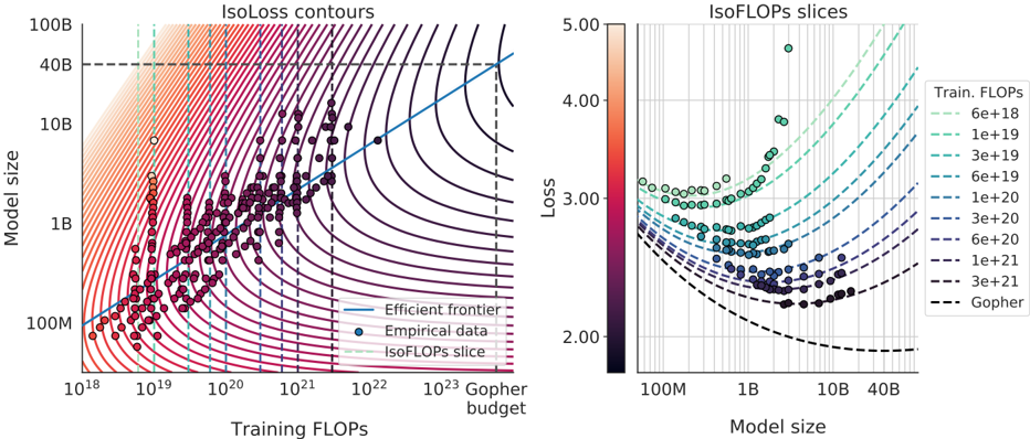
## IsoLoss Contours and IsoFLOPs Slices: Model Scaling Efficiency Analysis
### Overview
The image contains two side-by-side charts analyzing the relationship between neural network model size, training computational cost (FLOPs), and resulting loss. The left chart ("IsoLoss contours") plots model size against training FLOPs with overlaid iso-loss curves and empirical data points. The right chart ("IsoFLOPs slices") shows loss versus model size for specific, fixed training FLOP budgets. Together, they illustrate the trade-offs and efficiency frontiers in scaling language models.
### Components/Axes
**Left Chart: IsoLoss contours**
* **Title:** "IsoLoss contours"
* **X-axis:** "Training FLOPs" (logarithmic scale). Major ticks at 10¹⁸, 10¹⁹, 10²⁰, 10²¹, 10²², 10²³.
* **Y-axis:** "Model size" (logarithmic scale). Major ticks at 100M, 1B, 10B, 40B, 100B.
* **Legend (Bottom-Right):**
* Solid blue line: "Efficient frontier"
* Dark blue circle: "Empirical data"
* Dashed green line: "IsoFLOPs slice"
* **Additional Annotations:**
* A vertical dashed black line at approximately 10²³ FLOPs, labeled "Gopher budget" at the bottom.
* A horizontal dashed black line at 40B model size.
* **Data Series:**
* **IsoLoss Contours:** A series of curved lines (contours) representing constant loss values. They transition in color from dark purple (lower loss) in the bottom-right to light orange/peach (higher loss) in the top-left.
* **Empirical Data:** Numerous dark blue/purple circular data points scattered across the plot, generally following the trend of the efficient frontier.
* **Efficient Frontier:** A solid blue line that passes through the lower envelope of the empirical data points, indicating the optimal model size for a given training FLOP budget to minimize loss.
* **IsoFLOPs Slices:** Several vertical dashed green lines at specific FLOP values (e.g., ~10¹⁹, ~3e19, ~1e20), indicating the slices visualized in the right chart.
**Right Chart: IsoFLOPs slices**
* **Title:** "IsoFLOPs slices"
* **X-axis:** "Model size" (logarithmic scale). Major ticks at 100M, 1B, 10B, 40B.
* **Y-axis:** "Loss" (linear scale). Major ticks at 2.00, 3.00, 4.00, 5.00.
* **Color Bar (Left):** Labeled "Loss," ranging from 2.00 (dark purple/black) to 5.00 (light peach).
* **Legend (Right):** "Train. FLOPs" with line styles and values:
* `---` (dashed, light green): 6e+18
* `---` (dashed, green): 1e+19
* `---` (dashed, teal): 3e+19
* `---` (dashed, dark teal): 6e+19
* `---` (dashed, blue): 1e+20
* `---` (dashed, dark blue): 3e+20
* `---` (dashed, purple): 6e+20
* `---` (dashed, dark purple): 1e+21
* `---` (dashed, black): 3e+21
* `---` (dashed, black): Gopher
* **Data Series:**
* **Scatter Points:** Circles colored according to the "Loss" color bar. They form distinct curves for each fixed FLOP budget.
* **IsoFLOPs Lines:** Dashed lines corresponding to the legend, each tracing the expected loss vs. model size for a fixed training FLOP budget. They are color-coded to match the legend.
### Detailed Analysis
**Left Chart (IsoLoss contours):**
* **Trend Verification:** The "Efficient frontier" line slopes upward from bottom-left to top-right, indicating that to achieve lower loss (moving towards the bottom-right of the plot), one must increase both model size and training FLOPs. The empirical data points cluster around this frontier.
* **Spatial Grounding:** The "Gopher budget" line is a vertical dashed line at the far right of the x-axis (~10²³ FLOPs). The horizontal dashed line at 40B model size intersects the efficient frontier at approximately 10²³ FLOPs.
* **Contour Interpretation:** The iso-loss contours are closer together in the top-left (high loss region) and spread out towards the bottom-right (low loss region). This suggests diminishing returns: achieving incremental loss reduction requires exponentially more resources (FLOPs and/or parameters) as you move to the efficient frontier.
**Right Chart (IsoFLOPs slices):**
* **Trend Verification:** For each fixed training FLOP budget (each dashed line), loss initially decreases as model size increases, reaches a minimum, and then begins to increase again. This creates a U-shaped or convex curve for each slice.
* **Data Point Extraction (Approximate from visual inspection):**
* For the **Gopher** slice (black dashed line, lowest curve): Minimum loss ~2.0 occurs at a model size between 1B and 10B (approx. 5-7B).
* For the **3e+21** FLOPs slice (black dashed line): Minimum loss ~2.1 at ~10B model size.
* For the **1e+21** FLOPs slice (dark purple dashed line): Minimum loss ~2.3 at ~5B model size.
* For the **6e+20** FLOPs slice (purple dashed line): Minimum loss ~2.5 at ~2B model size.
* For the **1e+20** FLOPs slice (blue dashed line): Minimum loss ~2.8 at ~500M model size.
* The trend continues: lower FLOP budgets have higher minimum loss values achieved at smaller model sizes.
* **Color Cross-Reference:** The scatter points' colors align with the loss value on the y-axis, as per the color bar. Points on the "Gopher" curve are dark (low loss ~2.0), while points on the "6e+18" curve (topmost, light green) are light-colored (high loss ~3.0-3.5).
### Key Observations
1. **Optimal Scaling Path:** The "Efficient frontier" in the left chart represents the optimal combination of model size and training compute. Deviating from this line (e.g., using a much larger model with insufficient data, or a small model with excessive data) results in higher loss for the same total FLOPs.
2. **Compute-Optimal Model Size:** The right chart clearly demonstrates that for any fixed training budget (FLOPs), there exists an optimal model size that minimizes loss. Using a model smaller or larger than this optimum is inefficient.
3. **Diminishing Returns:** The spacing of the iso-loss contours shows that pushing the loss lower requires disproportionately more resources. The gap between the 10B and 100B model size on the efficient frontier corresponds to a much smaller loss improvement than the gap between 100M and 1B.
4. **Gopher Reference:** The "Gopher" model (likely a reference to a known large model) is positioned at the intersection of ~40B parameters and ~10²³ FLOPs, sitting on the efficient frontier.
### Interpretation
These charts provide a foundational framework for understanding neural scaling laws. They move beyond simple "bigger is better" heuristics to show a nuanced, resource-constrained optimization problem.
* **What the data suggests:** The data empirically validates the existence of a smooth, predictable relationship between scale (model size, data/compute) and performance (loss). The U-shaped curves in the right chart are particularly critical—they prove that simply increasing model size without a corresponding increase in training data (FLOPs) eventually harms performance, a phenomenon known as "overtraining" or being "undertrained" for a given size.
* **How elements relate:** The left chart is the master map, showing the global landscape. The right chart provides detailed cross-sections (slices) of that landscape at specific compute budgets. The "Efficient frontier" is the ridge line of optimal performance. The iso-loss contours are the topographic lines of constant performance.
* **Notable implications:** For a practitioner with a fixed compute budget (e.g., 1e21 FLOPs), these charts provide a direct method to select the model size (~5B parameters) that will yield the best possible model (lowest loss). Conversely, if a target model size is fixed (e.g., 40B), the charts indicate the minimum training FLOPs (~10²³) required to train it optimally. The "Gopher budget" line serves as a real-world benchmark against this theoretical framework. The charts argue that efficient scaling is not about maximizing one variable, but about finding the precise balance between model capacity and the data used to train it.
DECODING INTELLIGENCE...