\n
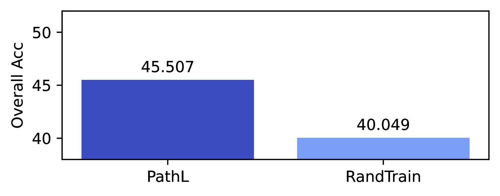
## Bar Chart: Overall Accuracy Comparison
### Overview
This image presents a bar chart comparing the "Overall Acc" (Overall Accuracy) achieved by two methods: "PathL" and "RandTrain". The chart visually represents the accuracy scores using bar heights.
### Components/Axes
* **X-axis:** Represents the methods being compared: "PathL" and "RandTrain".
* **Y-axis:** Labeled "Overall Acc", representing the Overall Accuracy. The scale ranges from approximately 35 to 50, with markings at 40, 45, and 50.
* **Bars:** Two bars, one for each method, indicating their respective accuracy scores. The bar for "PathL" is a darker shade of blue, while the bar for "RandTrain" is a lighter shade of blue.
* **Data Labels:** Numerical values are displayed above each bar, representing the accuracy score for that method.
### Detailed Analysis
* **PathL:** The bar for "PathL" is positioned on the left side of the chart. The bar height corresponds to an Overall Accuracy of approximately 45.507. The bar extends to roughly the 45.5 mark on the Y-axis.
* **RandTrain:** The bar for "RandTrain" is positioned on the right side of the chart. The bar height corresponds to an Overall Accuracy of approximately 40.049. The bar extends to roughly the 40.05 mark on the Y-axis.
* **Trend:** The "PathL" bar is significantly taller than the "RandTrain" bar, indicating a higher Overall Accuracy for "PathL".
### Key Observations
* "PathL" demonstrates a higher Overall Accuracy compared to "RandTrain".
* The difference in accuracy between the two methods is approximately 5.458 (45.507 - 40.049).
### Interpretation
The data suggests that the "PathL" method outperforms the "RandTrain" method in terms of Overall Accuracy. This could indicate that "PathL" is a more effective approach for the task being evaluated. The substantial difference in accuracy suggests a meaningful advantage for "PathL". Further investigation would be needed to understand *why* "PathL" performs better – for example, examining the specific algorithms or data used by each method. The chart provides a clear, quantitative comparison, allowing for a straightforward assessment of the relative performance of the two methods.