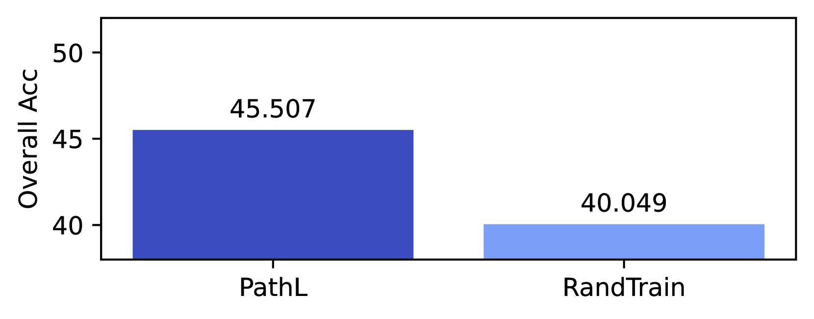
## Bar Chart: Overall Accuracy Comparison of PathL and RandTrain
### Overview
The chart compares the overall accuracy of two methods, **PathL** and **RandTrain**, using vertical bars. The y-axis represents "Overall Acc" (accuracy percentage), ranging from 40 to 50. The x-axis lists the two methods. PathL achieves significantly higher accuracy than RandTrain.
### Components/Axes
- **Y-Axis**: Labeled "Overall Acc" with a scale from 40 to 50 in increments of 5.
- **X-Axis**: Categories labeled "PathL" (left) and "RandTrain" (right).
- **Legend**: Implied by bar colors:
- **Dark Blue**: PathL
- **Light Blue**: RandTrain
### Detailed Analysis
- **PathL**: Bar height corresponds to **45.507** (dark blue), occupying ~45.5% of the y-axis range.
- **RandTrain**: Bar height corresponds to **40.049** (light blue), occupying ~40.0% of the y-axis range.
- **Spatial Grounding**:
- Bars are centered over their respective x-axis labels.
- Y-axis values are positioned to the left of the bars.
- No gridlines or error bars are visible.
### Key Observations
1. **Performance Gap**: PathL outperforms RandTrain by **5.458 percentage points**.
2. **Color Coding**: Dark blue (PathL) is visually dominant, emphasizing its superiority.
3. **Axis Alignment**: Values are explicitly labeled above each bar for clarity.
### Interpretation
The data demonstrates that **PathL is substantially more accurate than RandTrain** in this evaluation. The stark difference suggests PathL’s methodology or implementation is more effective for the measured task. The use of distinct colors and explicit numerical labels ensures the comparison is unambiguous. No anomalies or outliers are present, as both values fall within the expected 40–50% range. This chart likely supports a conclusion favoring PathL in technical or research contexts.