## Line Chart: Attention over Values, a=12
### Overview
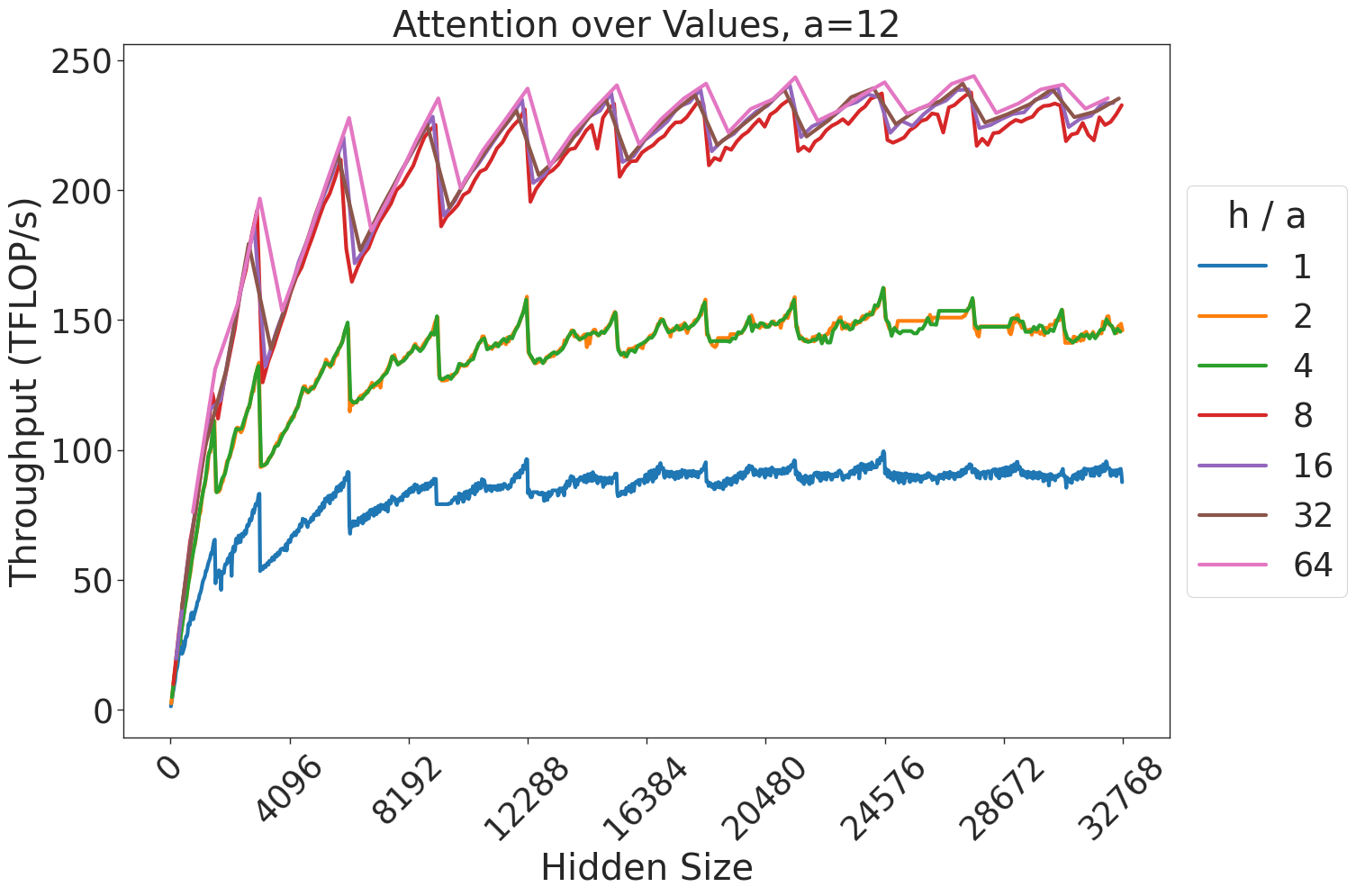
This chart illustrates the relationship between "Hidden Size" and "Throughput (TFLOP/s)" for varying ratios of `h / a` (where `a=12`). The data shows a general upward trend in throughput as the hidden size increases, characterized by a distinct "sawtooth" pattern of periodic performance drops. The performance is grouped into three distinct tiers based on the `h / a` ratio.
### Components/Axes
* **Title:** "Attention over Values, a=12" (Top center).
* **Y-Axis:** "Throughput (TFLOP/s)". The scale ranges from 0 to 250.
* **X-Axis:** "Hidden Size". The scale ranges from 0 to 32768, with major tick marks at intervals of 4096 (0, 4096, 8192, 12288, 16384, 20480, 24576, 28672, 32768).
* **Legend:** Located on the right side of the chart. It defines the `h / a` ratio for seven data series, color-coded as follows:
* **Blue:** 1
* **Orange:** 2
* **Green:** 4
* **Red:** 8
* **Purple:** 16
* **Brown:** 32
* **Pink:** 64
### Detailed Analysis
The chart displays seven distinct data series, all originating from the origin (0,0).
**Trend Verification:**
All seven lines exhibit a sharp, near-linear increase in throughput during the initial phase (Hidden Size 0 to ~4096). Following this, all lines transition into a "sawtooth" pattern, where throughput rises steadily and then drops sharply at regular intervals.
**Data Grouping:**
The lines cluster into three distinct performance tiers:
1. **Tier 1 (Lowest Performance):** Represented by the **Blue** line (`h/a = 1`). It remains significantly below the other lines, peaking at approximately 90-100 TFLOP/s.
2. **Tier 2 (Intermediate Performance):** Represented by the **Orange** (`h/a = 2`) and **Green** (`h/a = 4`) lines. These lines track closely together, peaking at approximately 150-160 TFLOP/s.
3. **Tier 3 (Highest Performance):** Represented by the **Red** (`h/a = 8`), **Purple** (`h/a = 16`), **Brown** (`h/a = 32`), and **Pink** (`h/a = 64`) lines. These four lines are tightly clustered at the top of the chart, reaching peak throughput values between 230 and 250 TFLOP/s.
### Key Observations
* **Diminishing Returns:** There is a clear saturation point. Increasing the `h/a` ratio from 1 to 4 provides substantial throughput gains. However, increasing the ratio from 8 to 64 yields negligible improvements, as the lines for 8, 16, 32, and 64 are nearly overlapping.
* **Sawtooth Pattern:** The periodic drops in throughput are consistent across all series. This is a classic indicator of memory alignment, cache blocking, or tiling strategies in GPU kernel execution, where performance efficiency resets when data sizes cross specific power-of-two or memory-boundary thresholds.
* **Saturation:** The system appears to reach a compute-bound state at higher `h/a` ratios, where further increasing the ratio does not improve throughput.
### Interpretation
This chart likely represents a performance benchmark for a GPU-accelerated attention mechanism (common in Transformer models).
* **The "Sawtooth" Effect:** The periodic drops suggest that the underlying implementation uses a tiling strategy. When the "Hidden Size" is not a perfect multiple of the tile size, the kernel likely incurs overhead or underutilizes the GPU cores, leading to the observed drops.
* **Optimal Configuration:** The data suggests that for this specific hardware/software configuration, an `h/a` ratio of 8 is the "sweet spot." It achieves the maximum performance tier, and increasing the ratio further (to 16, 32, or 64) provides no additional throughput benefit, likely wasting resources.
* **Scalability:** The throughput scales well with "Hidden Size" up to a point, but the sawtooth pattern indicates that performance is sensitive to specific input dimensions. Users of this system should ideally align their hidden sizes with the peaks of these sawtooth waves to maximize efficiency.