\n
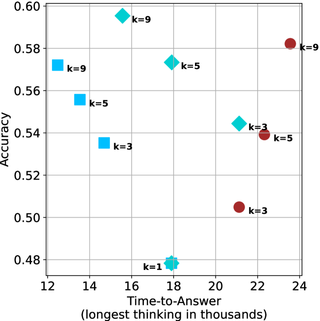
## Scatter Plot: Accuracy vs. Time-to-Answer for Different k Values
### Overview
This image presents a scatter plot illustrating the relationship between Accuracy and Time-to-Answer (measured in thousands of units) for different values of 'k'. Each point on the plot represents a data point for a specific 'k' value. The plot uses different marker shapes and colors to distinguish between different 'k' values.
### Components/Axes
* **X-axis:** Time-to-Answer (longest thinking in thousands). Scale ranges from approximately 12 to 24.
* **Y-axis:** Accuracy. Scale ranges from approximately 0.48 to 0.60.
* **Legend:** The legend is not explicitly present as a separate block, but the 'k' values are directly labeled next to each data point.
* **Data Series:** The data is represented by points with different shapes and colors, each corresponding to a specific 'k' value:
* k=1 (represented by a brown circle)
* k=3 (represented by a purple square)
* k=5 (represented by a blue diamond)
* k=9 (represented by a light blue square)
### Detailed Analysis
Let's analyze each 'k' value's data points:
* **k=1:** One data point at approximately (17.5, 0.48).
* **k=3:** Three data points:
* (14.5, 0.54)
* (22.5, 0.54)
* (24.5, 0.50)
* **k=5:** Three data points:
* (14.5, 0.56)
* (19.5, 0.58)
* (22.5, 0.54)
* **k=9:** Three data points:
* (16.5, 0.59)
* (14.5, 0.56)
* (24.5, 0.58)
**Trends:**
* **k=1:** The accuracy increases with time-to-answer.
* **k=3:** The accuracy is relatively stable, with a slight decrease at the highest time-to-answer.
* **k=5:** The accuracy generally increases with time-to-answer, peaking around 19.5 and then decreasing.
* **k=9:** The accuracy is relatively stable, with some variation across different time-to-answer values.
### Key Observations
* The data points for k=1 are clustered at the lower end of both the Time-to-Answer and Accuracy scales.
* The data points for k=9 are generally higher in accuracy compared to k=1 and k=3.
* There is considerable overlap in the Time-to-Answer ranges for different 'k' values.
* The highest accuracy values are achieved with k=9, but there is significant variance.
### Interpretation
The scatter plot suggests a relationship between the parameter 'k', Time-to-Answer, and Accuracy. Higher values of 'k' generally correlate with higher accuracy, but this relationship isn't strictly linear. The spread of data points for each 'k' value indicates that other factors besides 'k' influence accuracy.
The 'Time-to-Answer' likely represents the computational effort or time taken to arrive at an answer. The 'Accuracy' represents the correctness of the answer. The parameter 'k' could represent the number of neighbors considered in a k-nearest neighbors algorithm, the complexity of a model, or a similar parameter controlling the scope of a search or decision-making process.
The observation that accuracy plateaus or even decreases with increasing Time-to-Answer for some 'k' values (e.g., k=3) suggests that there's a point of diminishing returns. Beyond a certain computational effort, additional processing doesn't necessarily lead to improved accuracy and might even introduce errors.
The data suggests that choosing an appropriate 'k' value is crucial for balancing accuracy and computational cost. A higher 'k' might yield better accuracy, but it also requires more Time-to-Answer. The optimal 'k' value depends on the specific application and the trade-off between these two factors.