## Chart: Dual-Fitted Distribution Curves on Complexity Data
### Overview
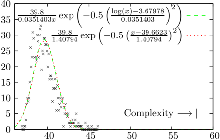
The image displays a 2D scatter plot with two overlaid fitted probability distribution curves. The chart compares how well a log-normal distribution (green dashed line) and a normal distribution (red dotted line) model a set of empirical data points (black 'x' marks). The data appears to represent some measure of "Complexity" on the x-axis against an unspecified frequency or density on the y-axis.
### Components/Axes
* **X-Axis:**
* **Label:** `Complexity → |`
* **Scale:** Linear, ranging from approximately 35 to 60.
* **Major Tick Marks:** 35, 40, 45, 50, 55, 60.
* **Y-Axis:**
* **Label:** Not explicitly labeled. Represents frequency, count, or probability density.
* **Scale:** Linear, ranging from 0 to 40.
* **Major Tick Marks:** 0, 5, 10, 15, 20, 25, 30, 35, 40.
* **Data Series:**
1. **Empirical Data:** Represented by black 'x' markers. The points are densely clustered between x=37 and x=43, with a peak density around x=40. The distribution is right-skewed, with a long tail extending to approximately x=48.
2. **Model 1 (Green Dashed Line):** A fitted log-normal distribution curve. Its equation is provided in the legend.
3. **Model 2 (Red Dotted Line):** A fitted normal (Gaussian) distribution curve. Its equation is provided in the legend.
* **Legend:**
* **Position:** Top-right corner of the plot area.
* **Content:**
* **Green Dashed Line:** `(39.8 / (0.0351403 * x)) * exp( -0.5 * ( (log(x) - 3.67978) / 0.0351403 )^2 )`
* **Red Dotted Line:** `(39.8 / 1.40794) * exp( -0.5 * ( (x - 39.6623) / 1.40794 )^2 )`
### Detailed Analysis
* **Data Point Distribution:** The black 'x' markers form a unimodal, right-skewed distribution. The highest concentration of points (peak) is visually estimated at approximately **x = 40, y = 30**. The data spans from a minimum near **x ≈ 37** to a maximum near **x ≈ 48**.
* **Curve Trends & Key Points:**
* **Green Dashed Line (Log-Normal Model):**
* **Trend:** Rises steeply from the left, peaks, and then declines more gradually, following the right skew of the data.
* **Peak:** Visually aligns closely with the data's peak at approximately **x = 40, y ≈ 30**.
* **Fit:** Appears to follow the overall shape and skew of the data points very well, especially in the tail region (x > 43).
* **Red Dotted Line (Normal Model):**
* **Trend:** Symmetrical bell curve.
* **Peak:** Centered at approximately **x = 39.7** (as per its equation: mean = 39.6623), with a peak height of approximately **y ≈ 28.3** (calculated as 39.8 / 1.40794).
* **Fit:** Captures the central tendency but fails to model the right skew. It underestimates the peak density and overestimates the density on the left side (x < 38) while underestimating it on the right tail (x > 43).
### Key Observations
1. **Skewness:** The empirical data is clearly right-skewed (positively skewed), with a tail extending towards higher complexity values.
2. **Model Superiority:** The log-normal distribution (green dashed line) provides a visually superior fit to the data compared to the normal distribution (red dotted line). It better matches both the peak location/height and the asymmetric tail.
3. **Parameter Insight:** The equations reveal both models are scaled by the same factor (39.8), likely related to the total area under the curve or sample size. The log-normal model's parameters (log-mean ≈ 3.68, log-std ≈ 0.035) describe the distribution of the logarithm of the complexity values.
### Interpretation
This chart demonstrates a classic statistical modeling scenario where the underlying data-generating process is better described by a multiplicative (log-normal) rather than an additive (normal) process. In contexts like software complexity, biological measurements, or financial returns, this is common.
* **What it Suggests:** The "Complexity" metric being measured likely results from the product of many small, independent factors, leading to the log-normal distribution. A normal distribution would imply complexity results from the sum of many independent factors, which does not fit the observed skew.
* **Why it Matters:** Choosing the correct distributional model is critical for accurate statistical inference, prediction, and understanding the system's nature. Using the normal model here would lead to systematic errors: underestimating the probability of high-complexity events (the right tail) and overestimating the probability of very low-complexity events.
* **Anomaly/Note:** The y-axis lacks a formal label, which is a minor omission for a technical document. Its meaning (e.g., "Frequency," "Probability Density," "Count") must be inferred from context. The arrow in the x-axis label (`→ |`) is also unconventional and its specific meaning is unclear without additional context.