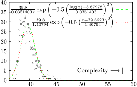
## Line Graph: Relationship Between Complexity and a Metric
### Overview
The image depicts a line graph with two distinct curves (dashed green and dotted red) plotted against a scatter of data points marked with 'x'. The x-axis is labeled "Complexity" (ranging from 40 to 60), and the y-axis represents a numerical metric (0 to 40). The graph includes two mathematical equations in the legend, describing the trends of the curves.
### Components/Axes
- **X-Axis (Complexity)**:
- Label: "Complexity"
- Scale: 40 to 60, with ticks at 40, 45, 50, 55, 60.
- **Y-Axis (Metric)**:
- Label: Numerical value (no explicit label provided).
- Scale: 0 to 40, with increments of 5.
- **Legends**:
1. **Dashed Green Line**:
- Equation: $ \frac{39.8}{0.0351403x} \exp\left(-0.5\left(\frac{\log(x) - 3.67978}{0.0351403}\right)^2\right) $
2. **Dotted Red Line**:
- Equation: $ \frac{39.8}{1.40794} \exp\left(-0.5\left(\frac{x - 39.6623}{1.40794}\right)^2\right) $
### Detailed Analysis
- **Dashed Green Curve (Logarithmic Function)**:
- Peaks near **x ≈ 40** with a y-value of approximately **35**.
- Broad, symmetric distribution with a gradual decline on both sides.
- Data points ('x') align closely with the curve, showing minor deviations.
- **Dotted Red Curve (Linear Function)**:
- Peaks near **x ≈ 39.8** with a y-value of approximately **30**.
- Narrower, steeper distribution, declining sharply after the peak.
- Data points ('x') cluster near the peak but spread more widely at higher x-values (45–60).
- **Data Points**:
- Scattered 'x' markers are concentrated around the peaks of both curves.
- At higher x-values (>50), data points diverge significantly from both curves, suggesting potential outliers or experimental variability.
### Key Observations
1. The logarithmic curve (green) exhibits a broader, more gradual trend, while the linear curve (red) is sharper and narrower.
2. Data points align better with the logarithmic curve at lower x-values (40–45) but show greater dispersion at higher x-values (50–60).
3. The red curve’s peak (x ≈ 39.8) occurs slightly left of the green curve’s peak (x ≈ 40), indicating a subtle shift in optimal complexity.
### Interpretation
The graph likely models how a specific metric (e.g., efficiency, error rate) varies with system complexity. The logarithmic trend suggests diminishing returns or a peak performance at moderate complexity, while the linear trend implies a more direct, localized relationship. The data points’ divergence at higher complexity values may indicate:
- Experimental noise or measurement errors.
- A transition to a different regime where neither model applies.
- The presence of additional variables not accounted for in the equations.
The coexistence of two models highlights the importance of context: the logarithmic function may better represent systems with gradual complexity increases, while the linear model could apply to abrupt changes. Further investigation is needed to determine which trend dominates under specific conditions.