# Technical Document Analysis of Stacked Bar Chart
## 1. Chart Type and Structure
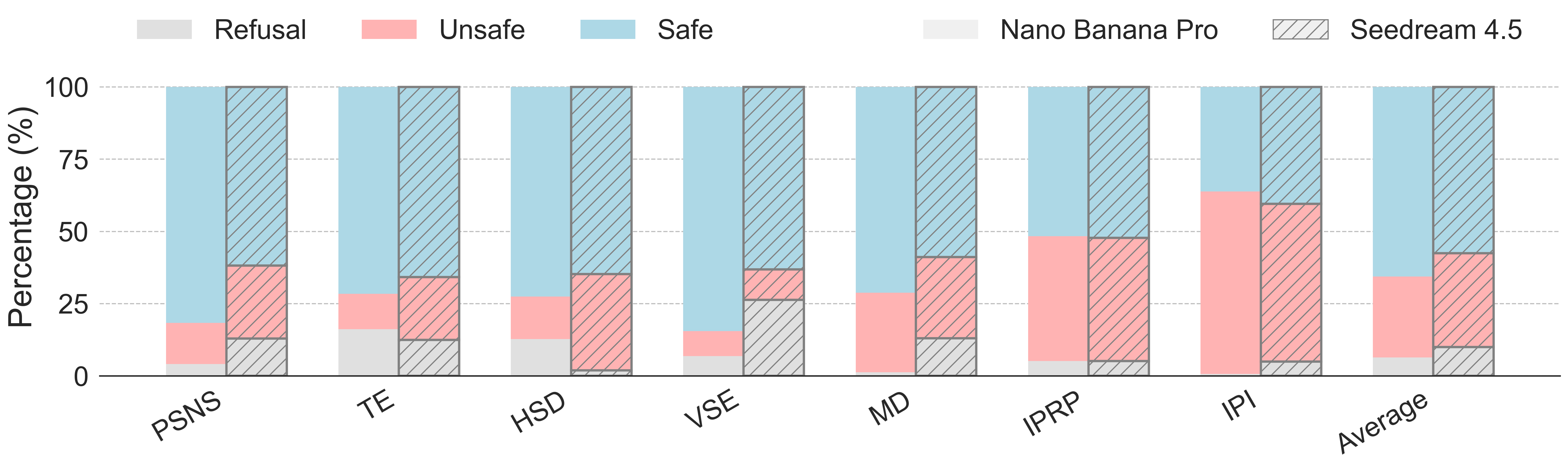
The image is a **stacked bar chart** comparing categorical data across multiple groups. Each bar represents a category (e.g., PSNS, TE, HSD, etc.) with three sub-categories: **Refusal**, **Unsafe**, and **Safe**, visualized as stacked segments. Two additional labels (**Nano Banana Pro** and **Seedream 4.5**) appear in the legend but are not directly tied to the bar segments.
---
## 2. Axis Labels and Markers
- **Y-Axis**:
- Label: **"Percentage (%)"**
- Range: **0% to 100%** (in 25% increments)
- Ticks: Dashed lines at 0, 25, 50, 75, 100.
- **X-Axis**:
- Categories (left to right):
1. PSNS
2. TE
3. HSD
4. VSE
5. MD
6. IPRP
7. IPI
8. Average
---
## 3. Legend and Color Coding
- **Legend Position**: Top-right corner of the chart.
- **Color Assignments**:
- **Gray**: Refusal
- **Red**: Unsafe
- **Blue**: Safe
- **Light Gray (Nano Banana Pro)**: Not visually represented in bars.
- **Dark Gray (Seedream 4.5)**: Not visually represented in bars.
---
## 4. Key Trends and Data Points
### Category-Specific Observations:
1. **PSNS**:
- Refusal: ~5%
- Unsafe: ~15%
- Safe: ~80%
2. **TE**:
- Refusal: ~10%
- Unsafe: ~20%
- Safe: ~70%
3. **HSD**:
- Refusal: ~5%
- Unsafe: ~20%
- Safe: ~75%
4. **VSE**:
- Refusal: ~25% (highest Refusal percentage)
- Unsafe: ~10%
- Safe: ~65%
5. **MD**:
- Refusal: ~5%
- Unsafe: ~25%
- Safe: ~70%
6. **IPRP**:
- Refusal: ~5%
- Unsafe: ~45% (highest Unsafe percentage)
- Safe: ~50%
7. **IPI**:
- Refusal: ~5%
- Unsafe: ~50% (highest Unsafe percentage)
- Safe: ~45%
8. **Average**:
- Refusal: ~5%
- Unsafe: ~30%
- Safe: ~65%
### Cross-Category Trends:
- **Safe** consistently dominates most categories (e.g., PSNS: 80%, TE: 70%).
- **Unsafe** peaks in **IPI** (50%) and **IPRP** (45%).
- **Refusal** is highest in **VSE** (25%) and lowest in **PSNS**, **HSD**, and **MD** (~5%).
- The **Average** bar reflects a balanced distribution but retains Safe as the largest segment (~65%).
---
## 5. Additional Notes
- **Nano Banana Pro** and **Seedream 4.5** are listed in the legend but do not correspond to any visible segments in the bars. Their purpose is unclear from the chart alone.
- All data points align with the legend colors (e.g., red = Unsafe, blue = Safe).
---
## 6. Conclusion
The chart illustrates variability in **Refusal**, **Unsafe**, and **Safe** percentages across categories. **IPI** and **IPRP** show the highest **Unsafe** rates, while **VSE** has the highest **Refusal**. The **Average** category summarizes trends but does not override category-specific extremes.
---
### Notes on Missing Information:
- The chart does not explicitly define the meaning of **Refusal**, **Unsafe**, or **Safe** (e.g., safety compliance, user feedback, etc.).
- The purpose of **Nano Banana Pro** and **Seedream 4.5** in the legend remains undefined.
- No numerical values are explicitly labeled on the bars; percentages are estimated visually.